Subject: Mathematics | Level: GCSE | Exam Board: Edexcel
Master the art of data with this comprehensive guide to GCSE Statistics. From calculating averages to interpreting complex scatter graphs and cumulative frequency curves, this topic is packed with highly predictable, winnable marks that appear in every single exam series.
Revision Notes & Key Concepts
Key Terms & Definitions
- Continuous Data
- Data that can take any value within a range (e.g., height, time, weight). It is measured, not counted.
- Discrete Data
- Data that can only take specific, exact values (e.g., shoe size, number of siblings). It is counted.
- Extrapolation
- Estimating a value outside the range of the given data points using a line of best fit.
- Outlier (Anomaly)
- A data point that differs significantly from other observations in the same dataset.
- Bivariate Data
- Data for two variables (e.g., height and weight for the same person).
- Frequency Density
- The frequency divided by the class width.
Worked Examples
Worked Example
Question: The table shows information about the heights, $h$ cm, of 40 plants. | Height ($h$ cm) | Frequency | |-------------------|-----------| | $10 < h \leq 20$ | 4 | | $20 < h \leq 30$ | 9 | | $30 < h \leq 40$ | 15 | | $40 < h \leq 50$ | 12 | Calculate an estimate for the mean height of the plants. (4 marks)
Solution: Step 1: Find the midpoint ($x$) for each class interval. $10 < h \leq 20 \rightarrow x = 15$ $20 < h \leq 30 \rightarrow x = 25$ $30 < h \leq 40 \rightarrow x = 35$ $40 < h \leq 50 \rightarrow x = 45$ Step 2: Multiply each midpoint by its frequency ($f \times x$). $4 \times 15 = 60$ $9 \times 25 = 225$ $15 \times 35 = 525$ $12 \times 45 = 540$ Step 3: Calculate the total sum of $fx$ ($\sum fx$). $60 + 225 + 525 + 540 = 1350$ Step 4: Divide the total sum by the total frequency. $\text{Mean} = \frac{1350}{40} = 33.75$ Final answer: 33.75 cm
Worked Example
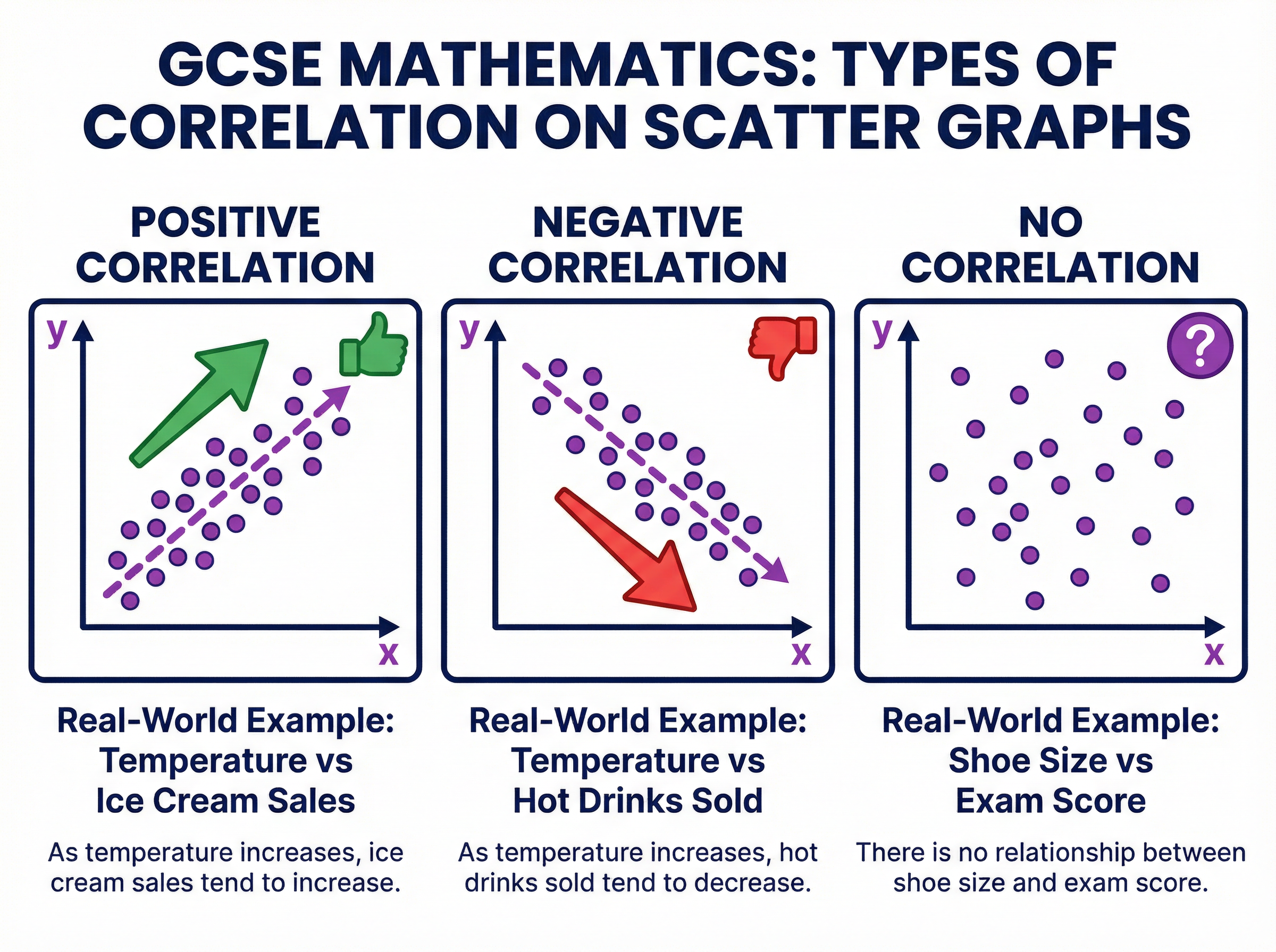
Question: A scatter graph shows the relationship between the outside temperature and the number of umbrellas sold. The points show a negative correlation. (a) Describe the relationship between the outside temperature and the number of umbrellas sold. (1 mark) (b) Explain why it might not be sensible to use the line of best fit to estimate the number of umbrellas sold when the temperature is 40°C. The data was collected between 5°C and 20°C. (1 mark)
Solution: (a) As the outside temperature increases, the number of umbrellas sold decreases. (b) 40°C is outside the range of the given data (extrapolation), so the trend may not continue and the estimate would be unreliable.
Worked Example
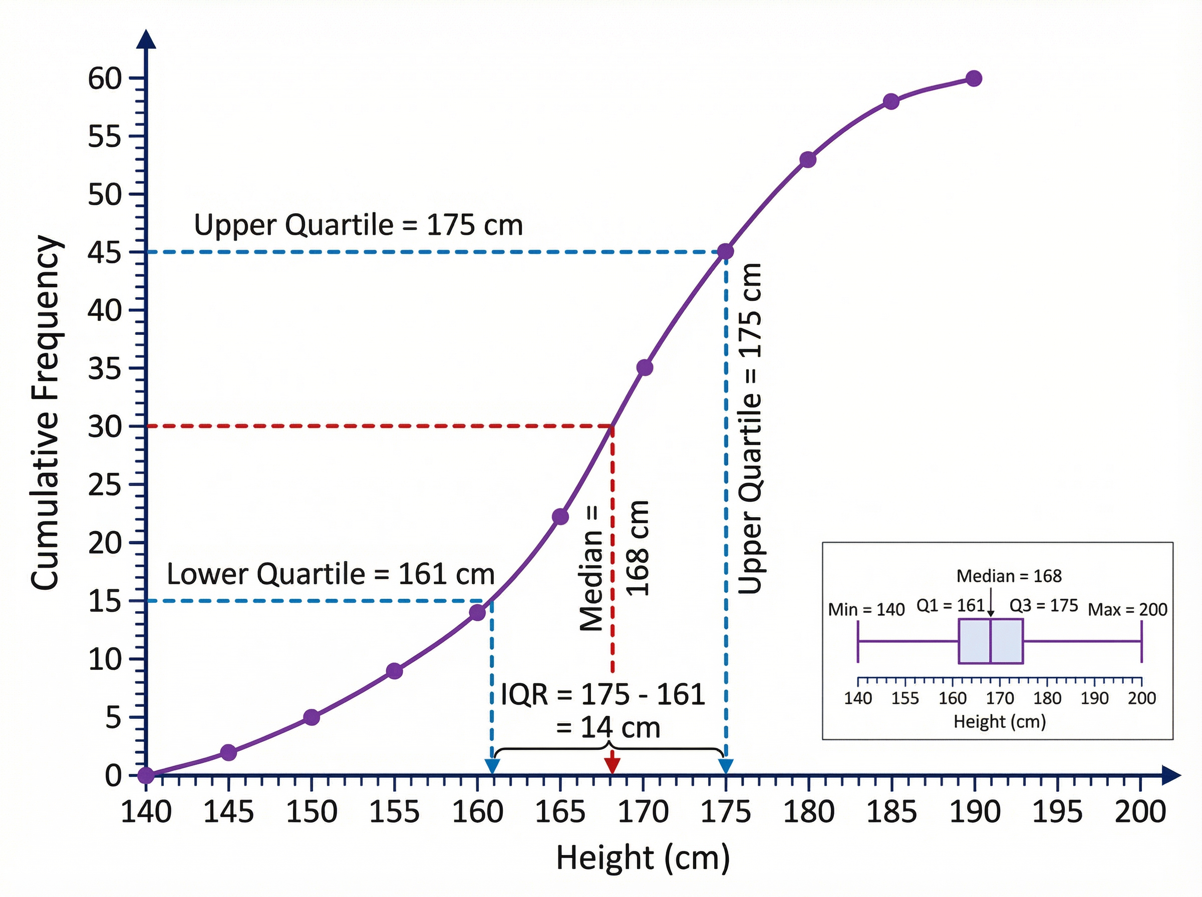
Question: The cumulative frequency graph shows the weights of 60 apples. Use the graph to find an estimate for the interquartile range. (3 marks) [Assume graph shows: Median at 30=150g, Lower Quartile at 15=135g, Upper Quartile at 45=170g]
Solution: Step 1: Find the position of the Lower Quartile (Q1). $60 \div 4 = 15$th value. Reading from cumulative frequency 15 to the curve and down: Q1 = 135g. Step 2: Find the position of the Upper Quartile (Q3). $60 \times \frac{3}{4} = 45$th value. Reading from cumulative frequency 45 to the curve and down: Q3 = 170g. Step 3: Calculate the Interquartile Range. $\text{IQR} = \text{Q3} - \text{Q1}$ $\text{IQR} = 170 - 135 = 35$ Final answer: 35g
Practice Questions
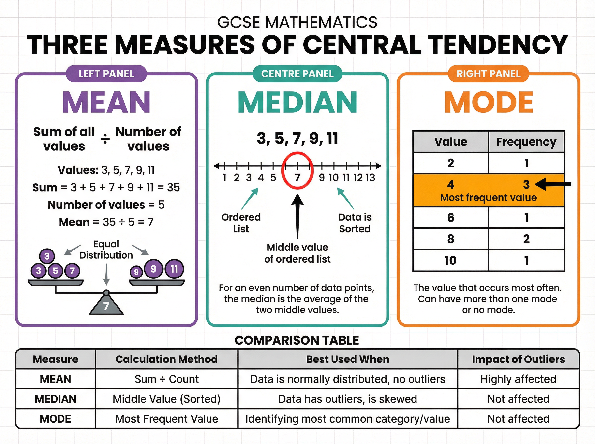
Question: Here is a list of numbers: 12, 15, 14, 17, 22, 19, 14. Find the median. (2 marks)
Answer:
Question: A student measures the time taken for 20 people to complete a puzzle. The times are recorded in a grouped frequency table. Explain why calculating the mean from this table only gives an *estimate*. (1 mark)
Answer:
Question: The scatter graph shows the engine size and the fuel efficiency (mpg) of 15 cars. The line of best fit has been drawn. A car has an engine size of 4.5 litres. This is outside the range of the plotted data. Explain why using the line of best fit to estimate its fuel efficiency might not be reliable. (1 mark)
Answer:
Question: Compare the distribution of test scores for Class A and Class B. Class A: Median = 65, IQR = 12 Class B: Median = 72, IQR = 20 (2 marks)
Answer:
Question: A histogram is drawn to show the weights of parcels. The class interval $2 < w \leq 5$ has a frequency of 18. Calculate the frequency density for this class. (2 marks)
Answer: