Subject: Mathematics | Level: GCSE | Exam Board: WJEC
Statistics is the mathematics of collecting, analysing, and interpreting data to make informed decisions. Mastering this topic is essential for your exams, as it appears heavily on both calculator and non-calculator papers and rewards methodical working.
Revision Notes & Key Concepts
Key Terms & Definitions
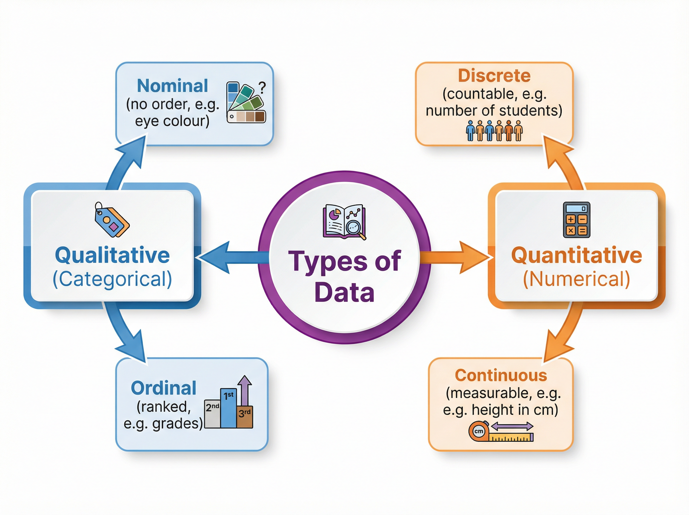
- Qualitative Data
- Non-numerical data that is descriptive or categorical.
- Discrete Data
- Numerical data that can only take specific, countable values.
- Continuous Data
- Numerical data that can take any value within a given range, usually measured.
- Outlier
- An extreme value that lies far outside the overall pattern of a data set.
- Frequency Density
- The frequency per unit of class width, calculated as Frequency ÷ Class Width.
- Extrapolation
- Estimating a value outside the range of the given data points on a scatter graph.
Worked Examples
Worked Example
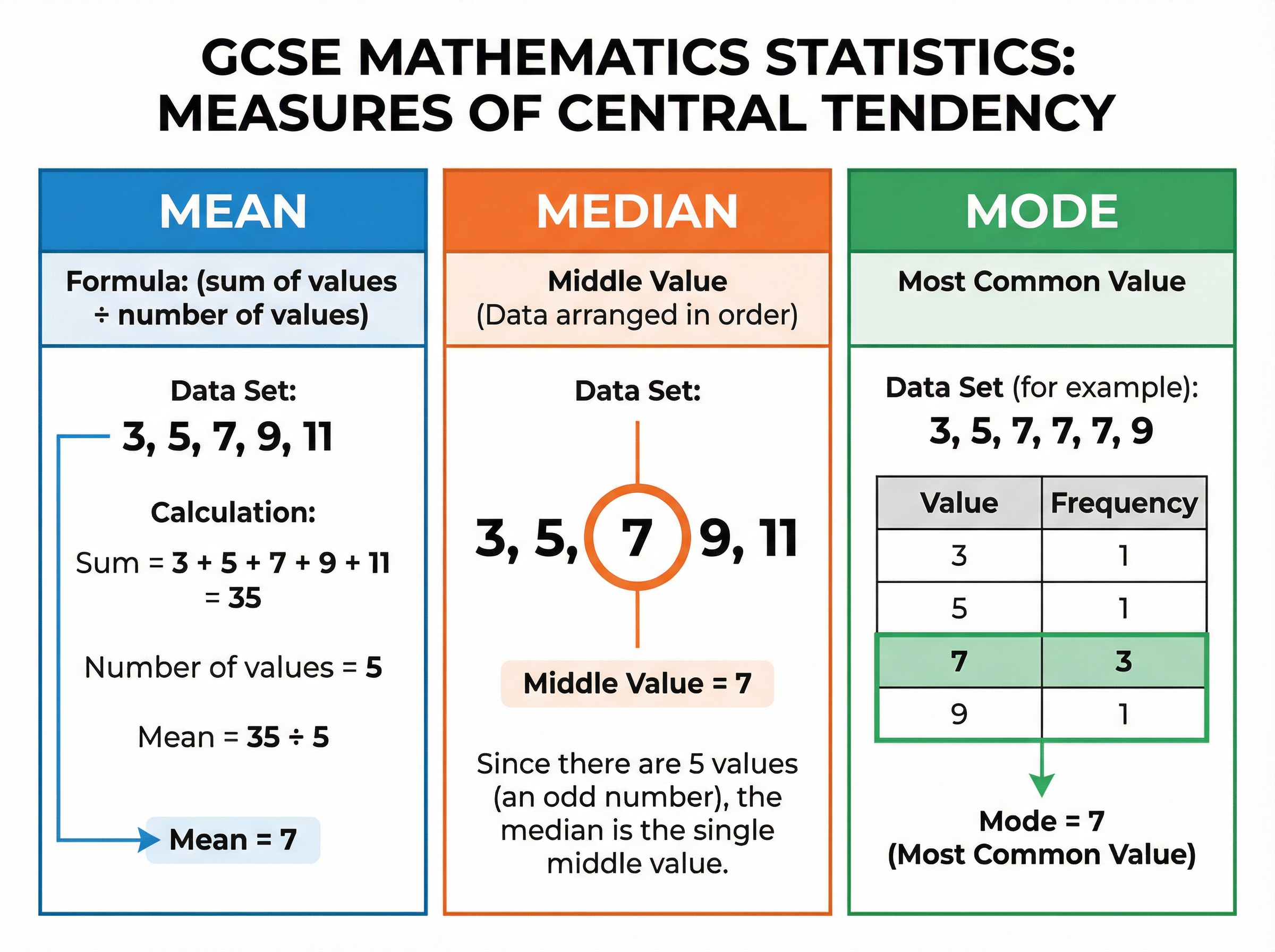
Question: A survey asked 20 students how many pets they own. The results are shown in the frequency table below. Number of pets (x): 0, 1, 2, 3, 4 Frequency (f): 5, 8, 4, 2, 1 Calculate the mean number of pets.
Solution: Step 1: Add a new column to the table for $f \times x$. $0 \times 5 = 0$ $1 \times 8 = 8$ $2 \times 4 = 8$ $3 \times 2 = 6$ $4 \times 1 = 4$ Step 2: Calculate the total frequency ($\sum f$) and the total of the $fx$ column ($\sum fx$). $\sum f = 5 + 8 + 4 + 2 + 1 = 20$ $\sum fx = 0 + 8 + 8 + 6 + 4 = 26$ Step 3: Divide $\sum fx$ by $\sum f$. Mean = $26 \div 20 = 1.3$ Final answer: 1.3 pets.
Worked Example
Question: The heights of two groups of plants were measured. Group A: Median = 14.2 cm, Interquartile Range = 3.1 cm Group B: Median = 18.5 cm, Interquartile Range = 5.4 cm Compare the heights of the plants in Group A and Group B.
Solution: Step 1: Compare the averages using the median. On average, the plants in Group B are taller than those in Group A, because their median height is greater (18.5 cm > 14.2 cm). Step 2: Compare the spread using the interquartile range. The heights of the plants in Group A are more consistent (less spread out) than those in Group B, because their interquartile range is smaller (3.1 cm < 5.4 cm).
Worked Example
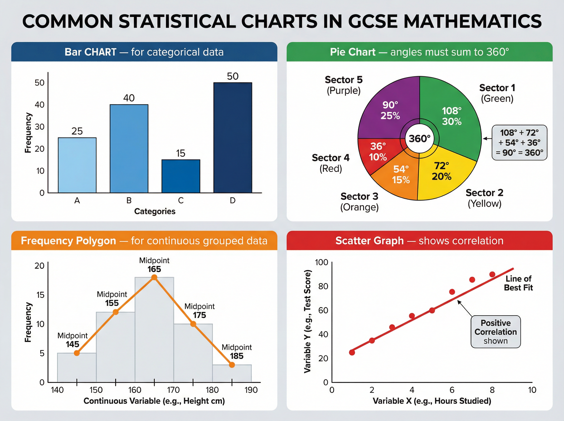
Question: The table shows information about the time, $t$ minutes, taken by 50 people to complete a puzzle. Time ($t$): $0 < t \le 10$, $10 < t \le 20$, $20 < t \le 40$, $40 < t \le 60$ Frequency: 8, 14, 20, 8 Calculate the frequency density for the class interval $20 < t \le 40$.
Solution: Step 1: Calculate the class width for the interval $20 < t \le 40$. Class width = $40 - 20 = 20$ Step 2: Use the formula Frequency Density = Frequency $\div$ Class Width. Frequency Density = $20 \div 20 = 1$ Final answer: 1
Practice Questions
Question: A set of five numbers has a mean of 6, a median of 5, and a mode of 4. What could the five numbers be?
Answer:
Question: Explain why the line of best fit on a scatter graph should not be extended far beyond the plotted data points to make predictions.
Answer:
Question: The mean weight of 10 boys is 65 kg. The mean weight of 15 girls is 58 kg. Calculate the mean weight of all 25 students.
Answer:
Question: In a histogram, the class interval $0 < x \le 20$ has a frequency of 40. The bar drawn for this interval has a height of 2 cm. For the interval $20 < x \le 50$, the frequency is 90. Calculate the height of the bar for this second interval.
Answer:
Question: A bag contains only red, blue, and green counters. A pie chart is drawn to show the number of each colour. The angle for red is 120°. The angle for blue is 150°. There are 15 green counters. How many counters are in the bag in total?
Answer: