Pearson Edexcel · GCSE · Art and Design
Course version: Pearson-GCSE-Art-and-Design · Version from Mar 2026
Graphic Communication – Advertising
This topic covers Graphic Communication with a focus on Advertising Design, exploring how visual language is used to persuade and inform audiences. It is essential for developing your ability to combine typography, imagery, and layout to communicate powerful messages, a core skill assessed across all four Assessment Objectives in your GCSE.
- 8 min read
- 3 worked examples
- 4 practice questions
- 6 key terms
Check what you remember
Read the wording for your board, then hide it and explain Visual Hierarchy in your own words. Rough notes are fine. This is a self-check, with no mark or grade.
Reference: Pearson Edexcel
The arrangement and presentation of elements in a way that implies importance, guiding the viewer's eye through the design in a deliberate order.
Study Notes
Overview
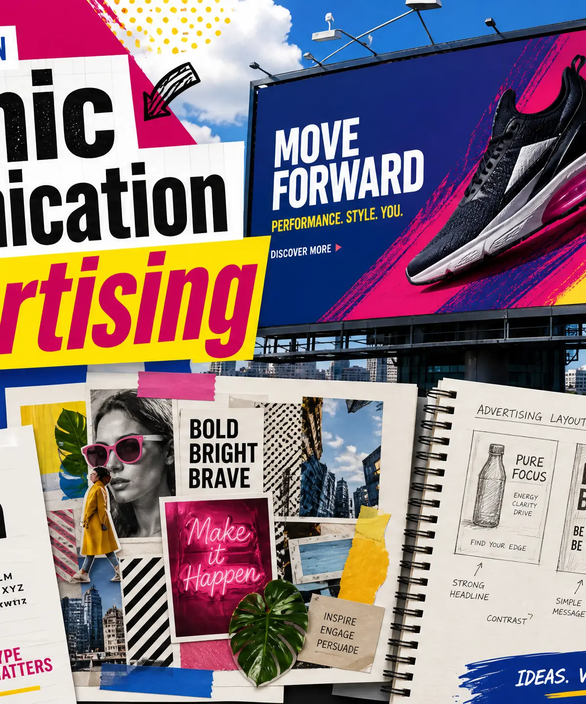
Graphic Communication within Art and Design is the practice of using visual language to convey messages, ideas, and information to an audience. In the context of Advertising, this means combining typography, imagery, colour, and layout to persuade, inform, or inspire action. Whether it is a digital campaign, a printed poster, or brand packaging, advertising design requires a deep understanding of how visual elements interact and how they are perceived by a specific target audience. Throughout your GCSE, you are expected to use drawing and digital mark-making as a core development tool, ensuring that your design process is rigorous, exploratory, and well-documented across all four Assessment Objectives.
Key Knowledge & Theory
Core Concepts
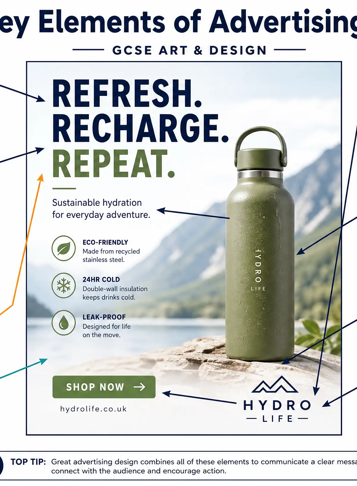
Visual HierarchyVisual hierarchy is the arrangement of design elements to guide the viewer's eye through a composition in a deliberate order. In advertising, the most critical element—often the headline or hero image—must command immediate attention, followed by supporting copy, and finally a call to action or logo. This ensures the message is communicated quickly and effectively.
TypographyTypography is the art of arranging type to make written language legible, readable, and visually appealing. In advertising, typography communicates brand personality. A bold sans-serif font might convey strength and modernity, while a delicate serif font might suggest elegance and tradition. Understanding font pairings, kerning, leading, and alignment is crucial for professional-level outcomes.
Colour Theory and PsychologyColour is a powerful tool for evoking emotion and creating brand recognition. Advertisers use colour psychology to influence perception: red for urgency and energy, blue for trust and professionalism, green for health and sustainability. You must also understand colour relationships, such as complementary colours (opposites on the colour wheel) to create high contrast, or analogous colours for harmony.
Composition and LayoutComposition refers to how elements are placed within the design space. Techniques such as the Rule of Thirds, the Golden Ratio, and the effective use of white space (negative space) are essential. White space gives the design room to breathe, preventing clutter and ensuring the core message stands out.
Key Practitioners/Artists/Designers
| Name | Period/Style | Key Works | Relevance |
|---|---|---|---|
| Saul Bass | Mid-20th Century / Modernism | AT&T logo, Vertigo and Psycho film posters | Master of reductive design; demonstrates how bold, simple geometric shapes and limited colour palettes communicate complex ideas instantly. |
| Barbara Kruger | Contemporary / Conceptual Art | I shop therefore I am | Uses the visual language of advertising (bold Futura type, red/black/white palette) to subvert commercial messages. Essential for exploring the social impact of graphic design. |
| Neville Brody | 1980s–Present / Post-Punk | The Face magazine, typography design | Revolutionised typography by treating letterforms as visual art rather than just carriers of meaning. Highly relevant for experimental typography projects. |
| David Carson | 1990s / Grunge Typography | Ray Gun magazine | Known for breaking traditional rules of grid and legibility to create visceral, emotional responses. Useful for expressive, non-traditional design approaches. |
Technical Vocabulary
- Kerning: The adjustment of space between individual characters in typography.
- Leading: The vertical space between lines of text.
- White Space (Negative Space): The unmarked areas of a design that help balance the composition.
- Call to Action (CTA): A design element (often a button or bold text) that prompts the audience to take a specific action (e.g., 'Buy Now', 'Discover More').
- Brand Identity: The visible elements of a brand, such as colour, design, and logo, that identify and distinguish the brand in consumers' minds.
- Complementary Colours: Colours positioned opposite each other on the colour wheel, used to create high contrast and visual tension.
Practical Skills
Techniques & Processes
The Iterative Design Process
- Research & Inspiration: Gather secondary sources (existing adverts, typography specimens) and primary sources (observational drawings, original photography). Annotate with critical analysis.
- Thumbnail Sketching: Use rapid, small-scale drawings to explore multiple layout options without committing to detail. This is vital for AO1 (Develop).
- Experimentation: Test different media. Combine hand-drawn elements with digital manipulation (e.g., scanning a watercolour texture and overlaying digital type in Photoshop or Illustrator). This secures marks for AO2 (Explore).
- Refinement: Select the strongest concepts and refine them. Adjust typographic hierarchies, fine-tune colour palettes, and ensure the design aligns with the target audience.
- Final Realisation: Produce the final outcome, ensuring high technical quality and clear communication of the intended message (AO4 Present).
Materials & Equipment
- Traditional Media: Graphite, fineliners, marker pens, and markers for thumbnailing and storyboarding; gouache or acrylics for exploring colour palettes.
- Digital Tools: Adobe Photoshop (for image manipulation and compositing), Adobe Illustrator (for vector graphics, logos, and precise typography), Adobe InDesign (for complex layouts).
- Hardware: Graphics tablets (e.g., Wacom) for digital illustration; high-quality scanners and digital cameras for capturing primary imagery.
Portfolio/Coursework Guidance
Assessment Criteria
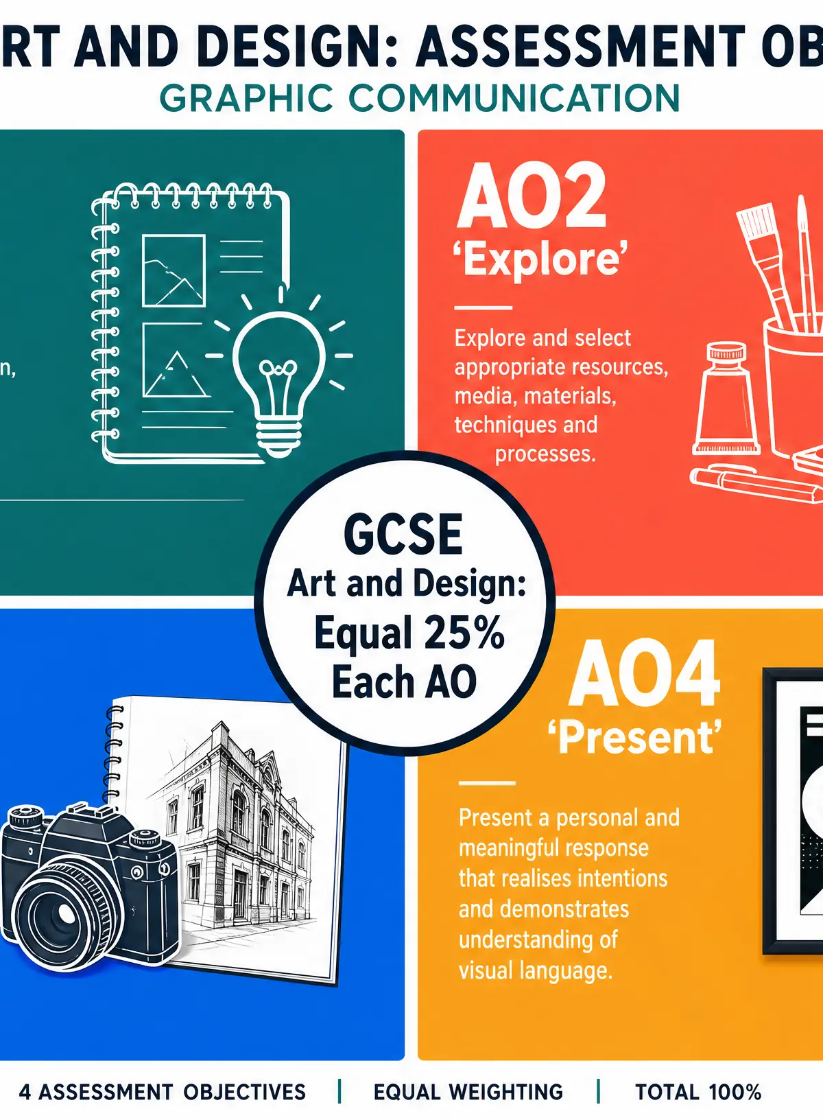
Your portfolio is assessed against four equally weighted Assessment Objectives (25% each):
- AO1 Develop: Examiners look for a clear journey of ideas. You must show how your research into practitioners (like Saul Bass or Neville Brody) has directly influenced your own design concepts.
- AO2 Explore: You must evidence experimentation with a range of materials and techniques. Do not just use digital tools; show hand-drawn typography, mixed media layouts, and varied colour tests.
- AO3 Record: This requires high-quality primary recording (drawing from observation, taking your own photographs) and purposeful annotation. Annotations must analyse why you made a design choice, not just describe what you did.
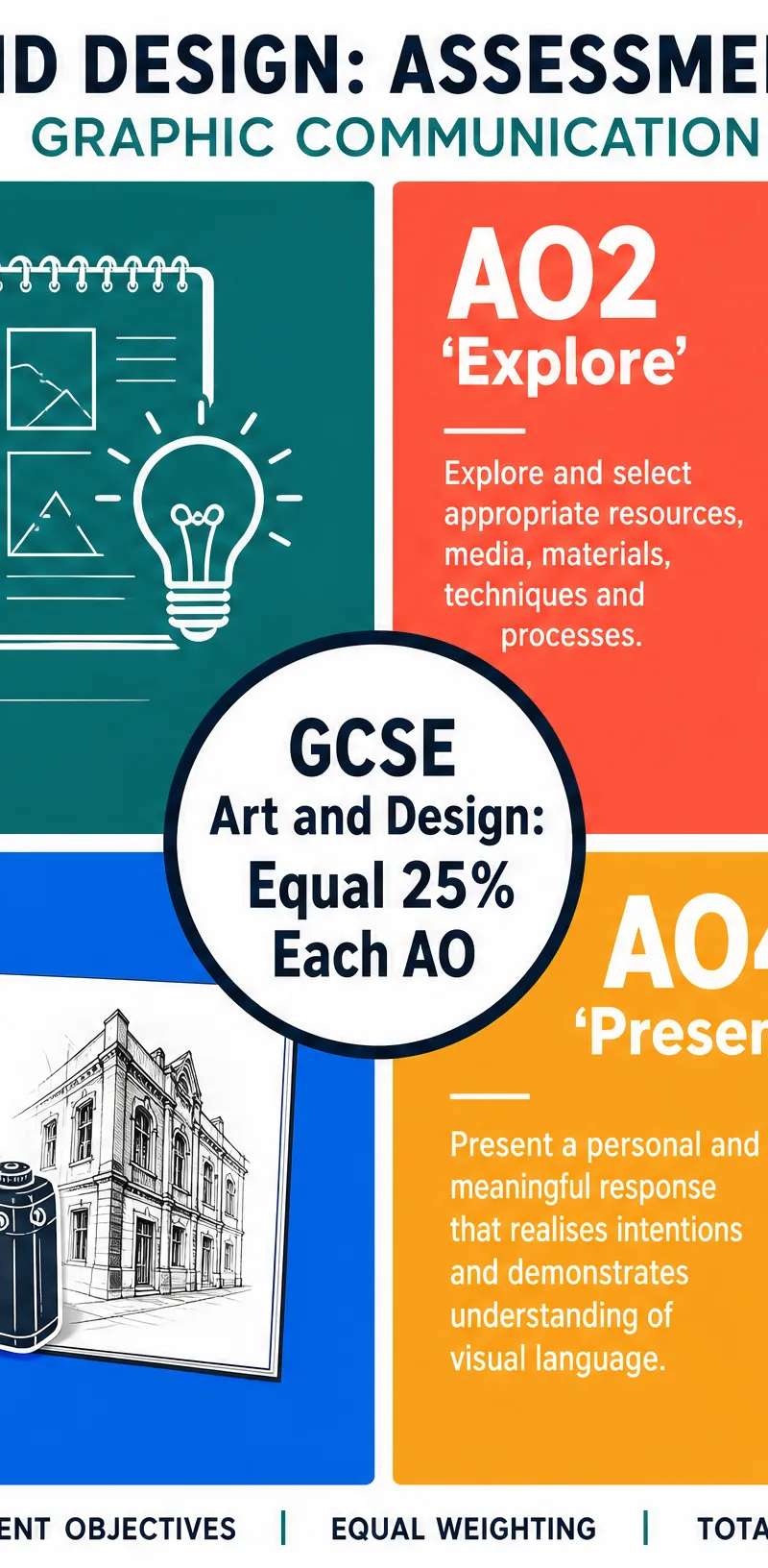
- AO4 Present: The final outcome must be a meaningful, highly finished piece of graphic communication that clearly answers the brief and demonstrates a strong grasp of visual language.
Building a Strong Portfolio
To build a strong portfolio, treat your sketchbook as a working document, not a pristine presentation book. Show your mistakes, your experiments, and your thought processes. Use annotation to explain your decision-making. For example, next to a layout test, write: 'I rejected this layout because the heavy serif font fought for attention with the complex background image, destroying the visual hierarchy.'
Exam Component
Practical Exam Preparation (Externally Set Task)
For the Externally Set Task (the timed practical exam), you will receive a starting point or brief. Your preparation period is crucial. You must rapidly move through the iterative design process:
- Deconstruct the brief and identify the target audience and core message.
- Select relevant practitioners to inspire your approach.
- Generate primary imagery (photographs, observational drawings) immediately.
- Produce a range of thumbnail layouts.
- Test typography and colour palettes.
- Plan exactly what you will execute during the timed supervised hours. Ensure your planned outcome is ambitious but achievable within the time limit.
Listen to this podcast for a complete overview of the topic, including expert advice on avoiding common mistakes and a quick-fire revision quiz.
Visual Resources
2 diagrams and illustrations
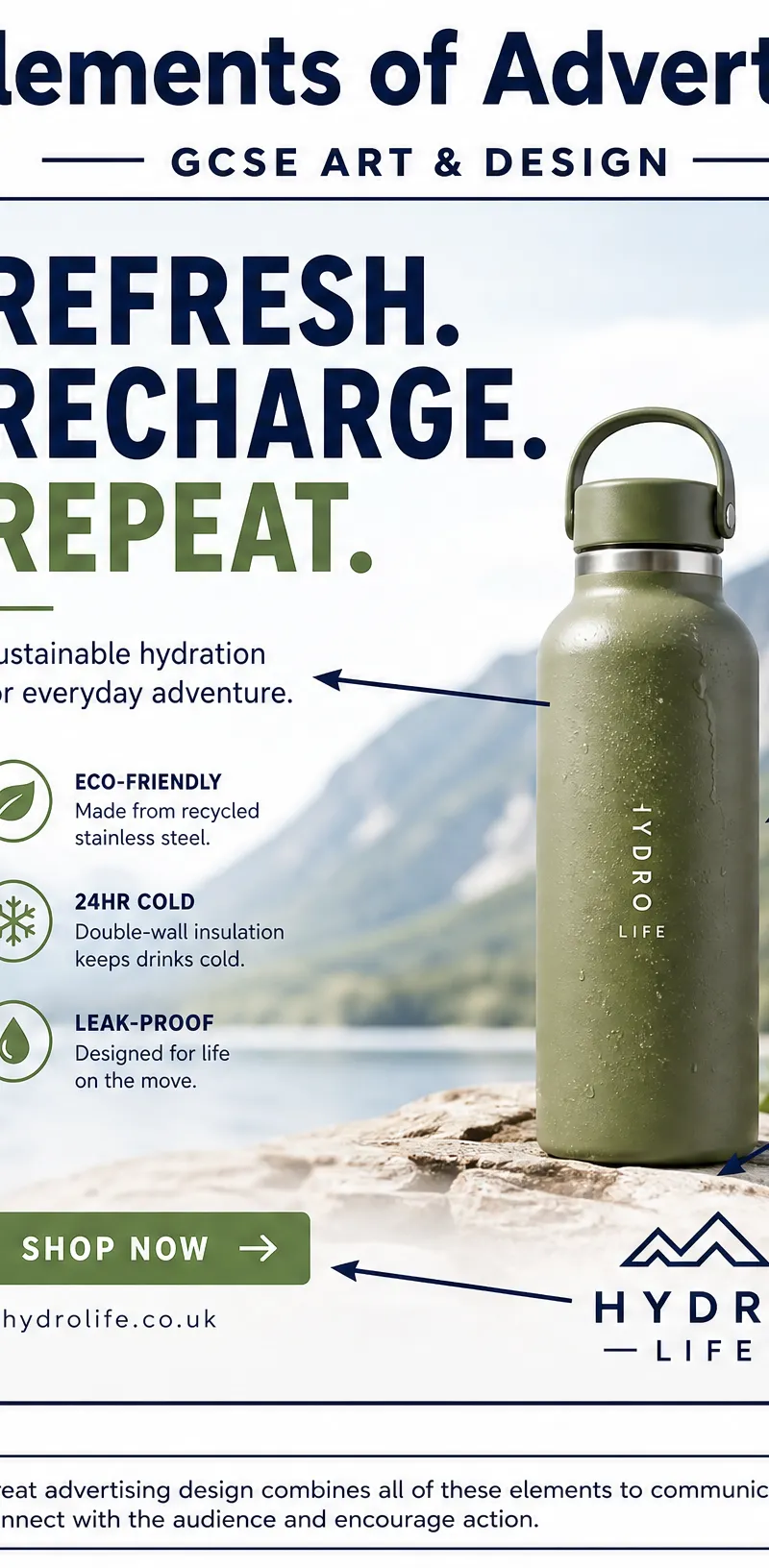
Interactive Diagrams
1 interactive diagram to visualise key concepts
Conceptual Flow Outline
The Iterative Design Process in Graphic Communication
Worked Examples
3 worked examples — open one to explore the question and available guidance.
Practice Questions
Try the question, then reveal an answer plan or example response
Identify three ways a graphic designer can create visual hierarchy in a poster advertisement.
Hint: Think about size, colour, and placement.
Explain how you would use typography to design an advertising campaign for a traditional, luxury heritage brand.
Hint: Consider the personality of different font families and how spacing affects perception.
Analyse how Barbara Kruger uses visual language to communicate her message, and evaluate how her approach could be applied to a modern social media campaign.
Hint: Break down her specific stylistic choices (colour, font, imagery) and explain their effect, then translate that to a digital format.
Evaluate the importance of 'Recording' (AO3) in a Graphic Communication project. How should a student evidence this effectively?
Hint: Think about both visual recording (drawing/photography) and written recording (annotation).
Exam technique
How to turn what you know into marks
How to approach the question
For practical tasks, always start by deconstructing the brief: Who is the audience? What is the message? What is the required format? For annotation, always use the 'What, How, Why' structure: What did you do? How did you do it (techniques/materials)? Why did you do it (effect on audience/link to practitioner)?
How to structure your answer
When writing annotations or evaluations: 1. Identify the technique/practitioner. 2. Describe the visual elements using specialist vocabulary. 3. Analyse the effect of these elements. 4. Evaluate how successfully it communicates the intended message to the target audience.
Timing
In practical coursework, do not measure by minutes per mark, but by Assessment Objective coverage. Ensure your portfolio time is split equally: 25% Research/Develop, 25% Experimenting with Media, 25% Recording/Annotating, 25% Final Outcome. For the timed Externally Set Task (usually 10 hours), allocate the first 2 hours to final layout testing, 6 hours to creating the main elements, and 2 hours to refinement and finishing.
Common pitfalls
- Using generic language ('it looks nice') instead of specialist terminology ('it creates strong visual hierarchy').
- Describing what is on the page without analysing why it was designed that way.
- Treating the sketchbook as a presentation portfolio rather than a messy, working document showing trial and error.
- Relying entirely on digital tools without showing any hand-drawn development or primary recording.
What the command words want
- Analyse
- Break the design down into its component parts (typography, colour, layout) and discuss how they work together to communicate the message.
- Compare
- Look at two designs or practitioners and discuss both similarities and differences in their approach to visual communication.
- Explain
- Give reasons for a design choice. Link the visual element to its psychological effect or practical function.
- Describe
- Detail the visual appearance of the design, mentioning layout, imagery, and typography.
- Evaluate
- Make a critical judgement on the success of the design. Does it appeal to the target audience? Does it meet the brief? What could be improved?
- Identify
- State the specific design element, font style, or colour scheme used.
Watch or listen (optional)
Test your understanding of Graphic Communication – Advertising
Active recall beats re-reading. Take an instant quiz now to test what you’ve learned and lock it into long-term memory.
7 days Premium · Then the free plan continues · No card, no charge