Pearson Edexcel · GCSE · Art and Design
Course version: Pearson-GCSE-Art-and-Design · Version from Mar 2026
Graphic Communication – Communication graphics
This topic explores Graphic Communication within GCSE Art and Design, focusing on how visual language—including mark-making, typography, and layout—is used to convey messages and ideas. It is crucial for developing a strong portfolio and demonstrating skills across all four Assessment Objectives.
- 6 min read
- 3 worked examples
- 3 practice questions
- 6 key terms
Check what you remember
Read the wording for your board, then hide it and explain Mark-making in your own words. Rough notes are fine. This is a self-check, with no mark or grade.
Reference: Pearson Edexcel
The creation of different patterns, lines, textures, and shapes on a surface.
Study Notes
Overview
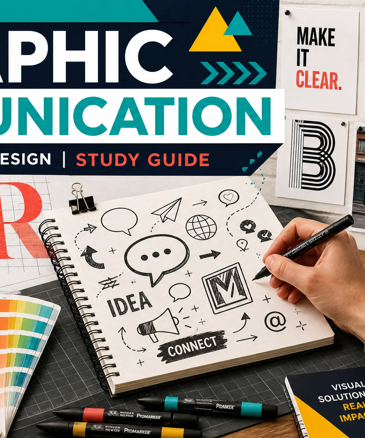
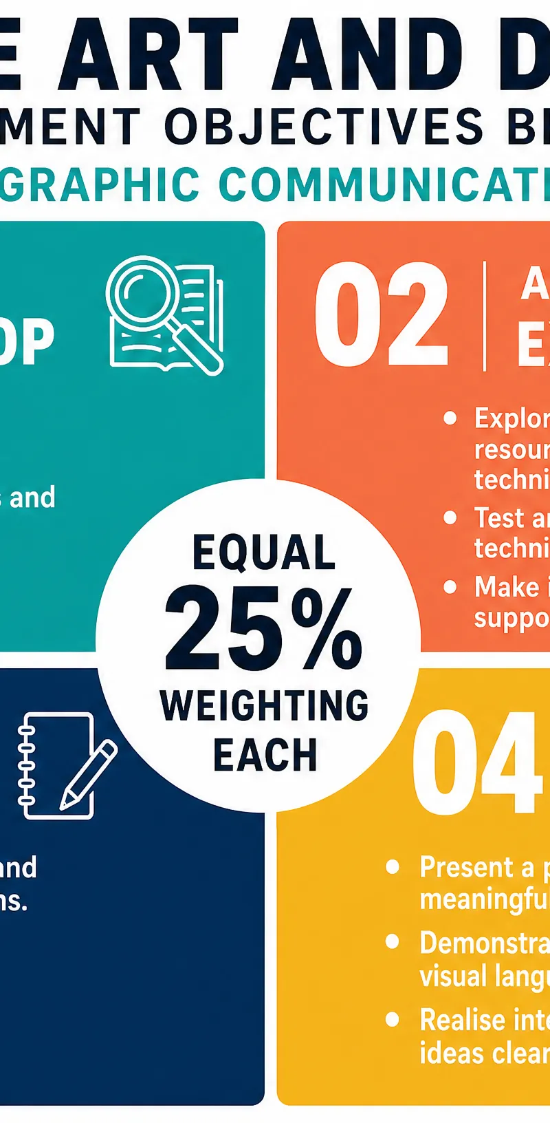
Graphic Communication is the art of using visual language to convey ideas, messages, and meaning to an audience. In the context of GCSE Art and Design, this involves exploring mark-making, drawing, typography, layout, colour, and imagery. It is a core practice that requires you to record observations, experiment with materials, and develop a personal, meaningful response. Your work will be assessed against four Assessment Objectives (AOs), each carrying an equal 25% weighting: AO1 (Develop), AO2 (Explore), AO3 (Record), and AO4 (Present).
Key Knowledge & Theory
Core Concepts
The foundation of graphic communication is mark-making. A mark is any line, dot, stroke, or texture created on a surface. However, examiners are looking for purposeful mark-making. Every mark should communicate something specific, whether it's form, texture, mood, or movement. You must also understand the visual elements of design:
- Line: Directs the eye and creates boundaries.
- Shape: Two-dimensional areas (geometric or organic).
- Form: Three-dimensional volume, often implied through tone.
- Tone: The range from light to dark, creating depth.
- Colour: Hue, saturation, and value; used to evoke emotion.
- Texture: The surface quality, actual or implied.
- Space: Positive (subject) and negative (background) space.
- Composition: The arrangement of elements within the picture plane.
Key Practitioners/Artists/Composers
| Name | Period/Style | Key Works | Relevance |
|---|---|---|---|
| Saul Bass | Mid-20th Century / Geometric, Reductive | Vertigo, Anatomy of a Murder title sequences and posters | Revolutionised graphic design with bold, simplified shapes and powerful typography to communicate narrative instantly. |
| Paula Scher | Contemporary / Bold Typography | Large-scale typographic maps, Public Theater identity | Essential for understanding typography as a visual element and image, blurring the boundary between fine art and graphic design. |
| Neville Brody | 1980s / Experimental Editorial Design | The Face magazine | Transformed magazine layout by breaking typographic conventions and treating the page as a visual composition. |
| Stefan Sagmeister | Contemporary / Concept-Driven | AIGA poster (carved into skin) | Illustrates that the concept behind the design is as important as the execution; uses unexpected materials and processes. |
Technical Vocabulary
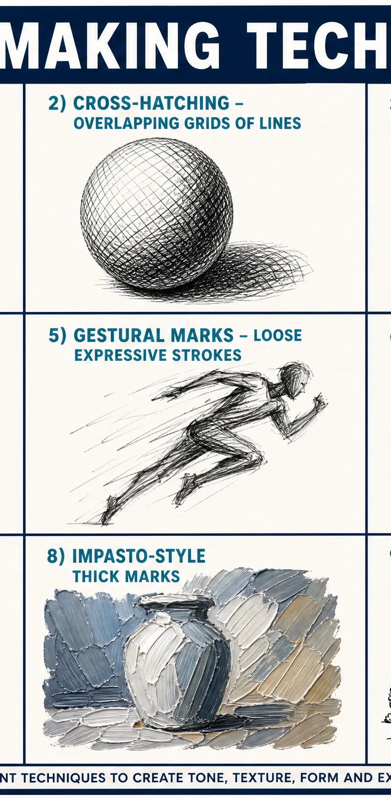
- Hatching & Cross-hatching: Using parallel or intersecting lines to build tone.
- Stippling: Using dots to create tone and texture.
- Contour Lines: Lines that follow the form of an object to suggest volume.
- Gestural Marks: Loose, expressive strokes capturing movement or emotion.
- Negative Space: The active use of the background area around a subject.
- Typography: The art and technique of arranging type.
- Composition: The spatial arrangement of visual elements.
Practical Skills
Techniques & Processes
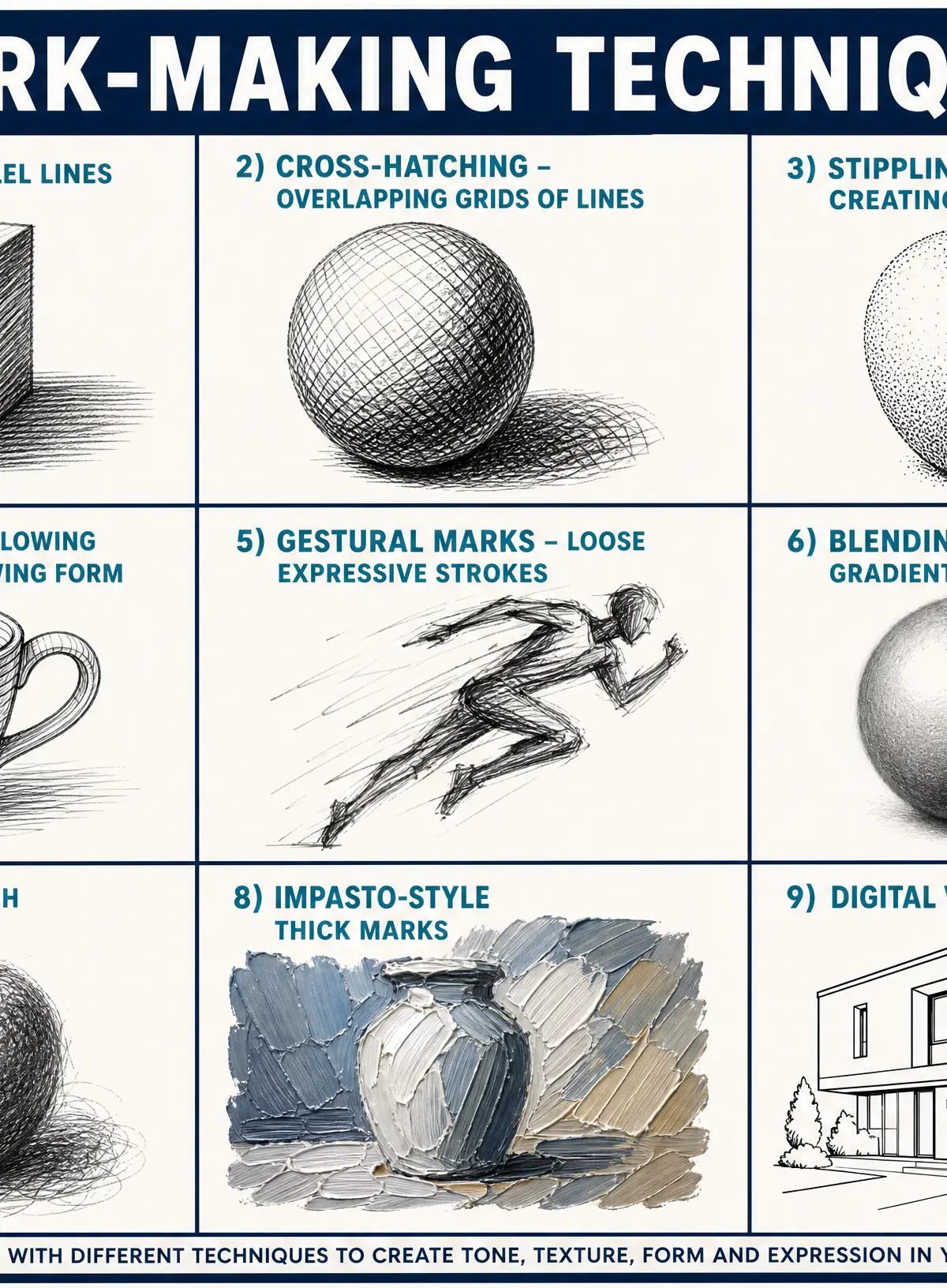
- Hatching: Draw parallel lines close together to create tone. The closer the lines, the darker the shadow.
- Cross-hatching: Layer sets of hatching lines at different angles to build richer, deeper tonal depth.
- Stippling: Apply clusters of dots. Vary the density to create gradients; excellent for textured surfaces.
- Contour Drawing: Use continuous lines that follow the edges and curves of the subject, emphasising its three-dimensional form.
- Gestural Drawing: Work quickly and loosely to capture the essence, energy, or movement of the subject rather than precise details.
Materials & Equipment
- Graphite Pencils: Essential for control, precision, technical drawing, and detailed observation.
- Charcoal: Highly expressive and atmospheric; ideal for bold tonal work, blending, and capturing mood.
- Ink (Pen/Brush): Creates strong, confident marks with high visual impact and contrast.
- Pastels (Soft/Oil): Allow for rich colour blending, vibrant hues, and textural effects.
- Digital Tools: Software like Adobe Illustrator, Photoshop, or Procreate are valid media. Ensure you document your digital process (e.g., screenshots of layers) to evidence AO2 experimentation.
Portfolio/Coursework Guidance
Assessment Criteria
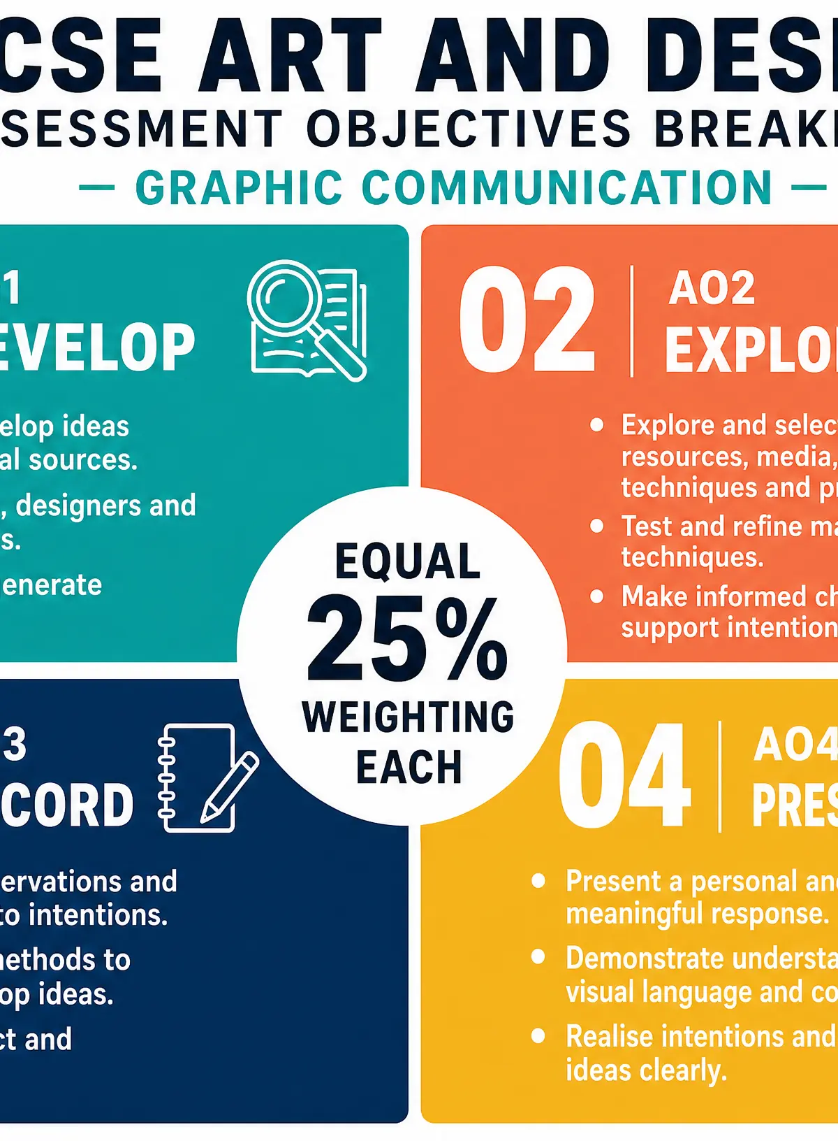
Examiners assess your portfolio across four equally weighted objectives:
- AO1 (Develop): Researching practitioners (like Bass or Scher) and using their work to inspire your own ideas.
- AO2 (Explore): Experimenting with different media (charcoal, digital, ink) and refining your techniques based on what works.
- AO3 (Record): Drawing from observation and annotating your thoughts, decisions, and insights clearly.
- AO4 (Present): Creating a final, meaningful outcome that ties all your research, experimentation, and recording together.
Building a Strong Portfolio
Your portfolio is a visual diary of your creative journey. Do not just present finished pieces. Show your mistakes, your tests, and your development. Annotation is critical. Do not simply describe what you did ("I used a 2B pencil"). Instead, critically analyse your choices: "I used a 2B pencil with aggressive cross-hatching to convey a sense of tension, inspired by the energetic layouts of Neville Brody."
Exam Component
Written Exam Knowledge
While Art and Design is primarily practical, you must demonstrate theoretical knowledge through your annotations and any written evaluations. You need to confidently use specialist vocabulary (e.g., composition, negative space, tonal contrast) and discuss how the work of key practitioners has influenced your development.
Practical Exam Preparation
For the Externally Set Task (the practical exam), you will receive a starting point or theme. You must independently develop a project from this starting point, covering all four AOs, culminating in a timed supervised period (usually 10 hours) where you produce your final outcome. Prepare by creating a clear plan, testing your final piece beforehand, and ensuring your preparatory studies clearly link to your intended final outcome.
Worked Examples
3 worked examples — open one to explore the question and available guidance.
Practice Questions
Try the question, then reveal an answer plan or example response
Identify and describe two different mark-making techniques you could use to create tone in a drawing.
Hint: Think about how you use a pen or pencil to make areas look darker without just pressing harder.
Explain how you would use the work of a chosen graphic designer to influence the development of your own poster design.
Hint: Name a specific designer, identify their key visual characteristics, and explain exactly how you will apply those characteristics to your own theme.
Analyse how negative space can be used as an active compositional device in graphic communication.
Hint: Go beyond just defining negative space. Discuss how it affects the viewer, balances the image, and can create dual meanings.
Exam technique
How to turn what you know into marks
How to approach the question
For portfolio annotations, always use the 'What, How, Why' structure: What technique did you use? How did you apply it? Why did you choose it (what effect does it create)?
How to structure your answer
When writing evaluations, use PEE: Point (identify the technique/element), Evidence (where is it in the work), Effect (analyse how it communicates your intention or links to a practitioner).
Timing
For the 10-hour practical exam, divide your time carefully: spend the first 1-2 hours finalising layout and preparing materials, 6-7 hours producing the work, and the final 1-2 hours on refinement and critical evaluation.
Common pitfalls
- Describing what you did instead of analysing why you did it.
- Treating the four AOs as separate tasks rather than an integrated journey.
- Failing to connect your own practical work to the designers you researched.
- Leaving annotations until the very end of the project.
What the command words want
- Analyse
- Break the image down into its visual elements (line, tone, composition) and discuss how they work together.
- Compare
- Discuss both similarities and differences between two approaches or practitioners.
- Explain
- Give reasons for your choices—link the technique used to the visual effect achieved.
- Describe
- State what is visually present using accurate subject-specific vocabulary.
- Evaluate
- Judge the success of the work against your intentions, noting strengths and areas for refinement.
- Identify
- Name the technique or element clearly and concisely.
Watch or listen (optional)
Test your understanding of Graphic Communication – Communication graphics
Active recall beats re-reading. Take an instant quiz now to test what you’ve learned and lock it into long-term memory.
7 days Premium · Then the free plan continues · No card, no charge