Pearson Edexcel · A-Level · Economics B
Course version: 9EB0 · Version from Sept 2015
Supply: b) The supply curve
The supply curve is a graphical representation of the relationship between the price of a good or service and the quantity that producers are willing and able to supply to the market at a given…
Checked against the Pearson Edexcel 9EB0 specification (opens in a new tab) on .
- Point 2 of 4
- 2 key terms
Study notes
From the checked teaching notes for this specification point.
The idea
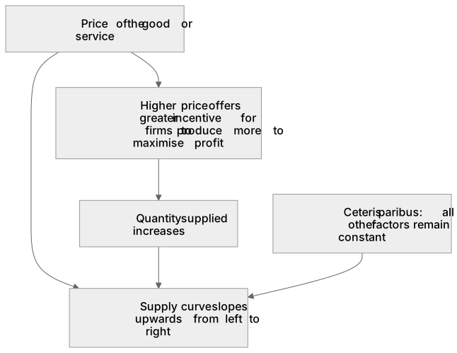
The supply curve is a graphical representation of the relationship between the price of a good or service and the quantity that producers are willing and able to supply to the market at a given time, ceteris paribus. It typically slopes upwards from left to right, illustrating the law of supply: as the price of a product increases, the quantity supplied also increases, because higher prices offer a greater incentive for firms to produce more to maximise profit.
For example: If the market price of coffee beans rises, farmers will allocate more land and resources to growing coffee rather than alternative crops, resulting in an upward-sloping supply curve on a price-quantity diagram.
What earns the marks
- Definition of the supply curve as the relationship between price and quantity supplied.
- Recognition that the supply curve typically slopes upwards from left to right.
- Understanding that price is plotted on the vertical axis and quantity on the horizontal axis.
- Explanation of the profit motive as the primary reason for the upward slope of the curve.
Common mistakes and how to put them right
Confusing the supply curve with the demand curve.
Put it right: Supply slopes upwards while demand slopes downwards.
Forgetting the ceteris paribus assumption.
Put it right: The curve only shows the relationship between price and quantity, assuming all other factors remain constant.
Plotting price on the horizontal axis and quantity on the vertical axis.
Put it right: Price always goes on the vertical axis.
Exam tips
- Always label your axes clearly with 'Price' and 'Quantity' when drawing a supply curve to secure full marks for diagrammatic analysis.
- Label the supply curve itself with an 'S' to distinguish it from other curves on the same diagram.
- Use the profit motive to explain why producers are willing to supply more at higher prices in written answers.
Try the lesson
The start of the Supply: b) The supply curve lesson, made from checked teaching notes for this specification point.
Have a go first
What does a standard upward-sloping supply curve illustrate in an economic model?
Listen
The supply curve is a graphical representation of the relationship between the price of a good or service and the quantity that producers are willing and able to supply to the market at a given time, ceteris paribus. It typically slopes upwards from left to right, illustrating the law of supply: as the price of a product increases, the quantity supplied also increases, because higher prices offer a greater incentive for firms to produce more to maximise profit. For example, if the market price of coffee beans rises, farmers will allocate more land and resources to growing coffee rather than alternative crops, resulting in an upward-sloping supply curve on a price-quantity diagram. A strong answer earns marks for these points. Definition of the supply curve as the relationship between price and quantity supplied. Recognition that the supply curve typically slopes upwards from left to right. Understanding that price is plotted on the vertical axis and quantity on the horizontal axis. Explanation of the profit motive as the primary reason for the upward slope of the curve. Exam tip: Always label your axes clearly with 'Price' and 'Quantity' when drawing a supply curve to secure full marks for diagrammatic analysis.
See it
Key words
Say what each word means before you turn the card.
Supply curve
Try answering aloud or in your head before turning the card.
Ceteris paribus
Try answering aloud or in your head before turning the card.
See every definition
- Supply curve
- A graphical representation of the relationship between the price of a good or service and the quantity that producers are willing and able to supply to the market at a given time, ceteris paribus.
- Ceteris paribus
- The assumption that all other factors remain constant, so the curve only shows the relationship between price and quantity.
Label the diagram
Some boxes have lost their names. Pick the right name for each number.
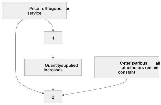
1Box 1
2Box 2
There is more to this lesson
The full lesson goes on to check your understanding and help you earn the marks. Create a free account to carry on, with your progress saved.
A week of Premium from your first lesson · Then the free plan continues · No card, no charge
Test your understanding of Supply: b) The supply curve
Active recall beats re-reading. Take an instant quiz now to test what you’ve learned and lock it into long-term memory.
A week of Premium from your first lesson · Then the free plan continues · No card, no charge