Subject: Mathematics | Level: GCSE | Exam Board: Pearson
Mastering data representation is your key to unlocking major marks in GCSE Mathematics. This guide covers everything from constructing basic charts to interpreting complex histograms and cumulative frequency graphs, ensuring you have the precise techniques examiners demand.
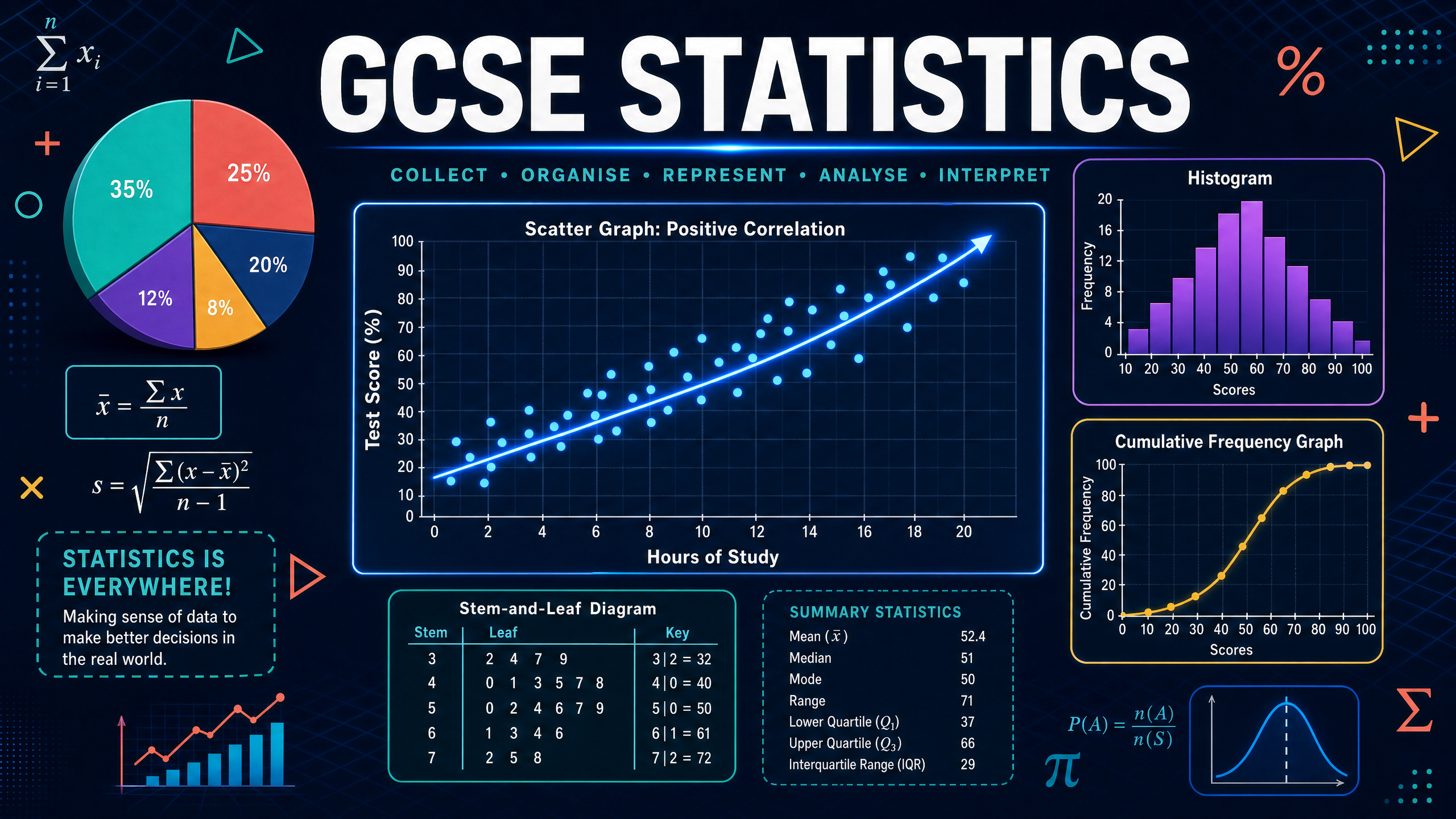
Revision Notes & Key Concepts
Revision Podcast Transcript
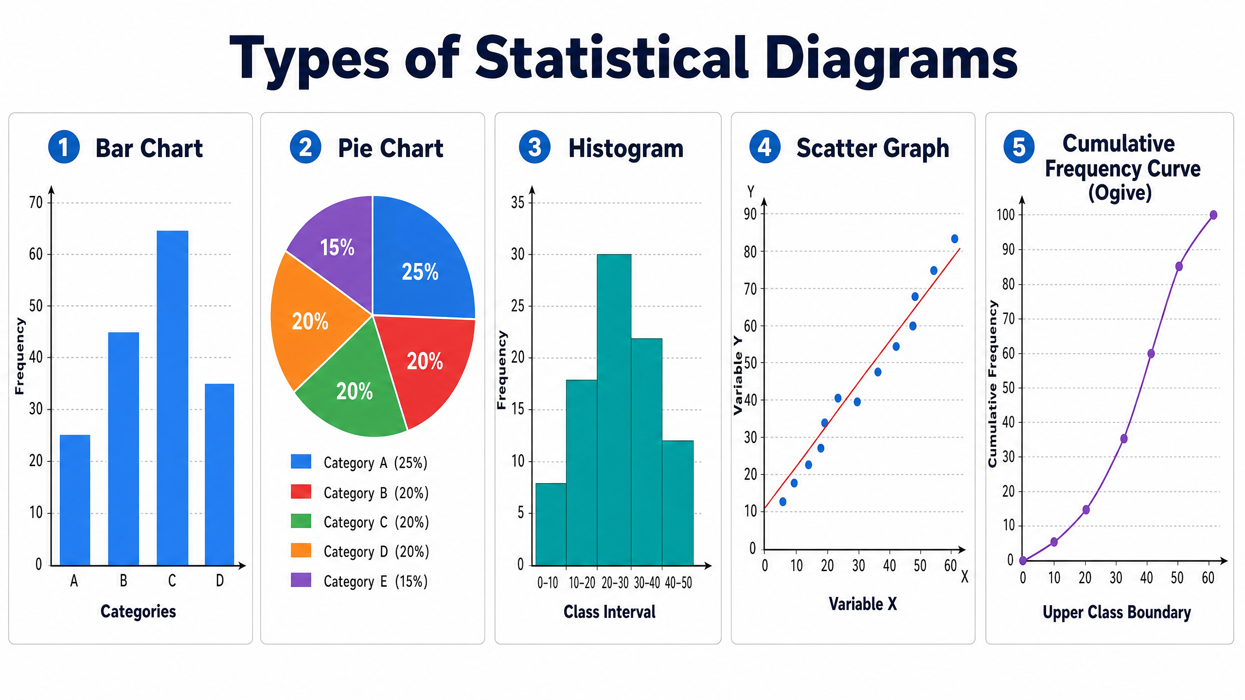
GCSE Mathematics Statistics — Revision Podcast Duration: approximately 10 minutes Voice: Female, warm, conversational, enthusiastic tutor ... [INTRO] Hello and welcome! I'm so glad you're here, because today we're diving into one of the most practical and exam-friendly topics in your entire GCSE Mathematics course — Statistics. Specifically, we're covering data representation and interpretation... [CORE CONCEPTS] Let's start with the big picture. In your GCSE Statistics topic, you need to be able to construct AND interpret five main types of diagrams. I want you to remember the acronym BPSHC — Bar charts, Pie charts, Stem-and-leaf diagrams, Histograms, and Cumulative frequency graphs... FIRST — Bar Charts and Frequency Tables. A frequency table is simply a tally... SECOND — Pie Charts. A pie chart represents data as proportions of a whole circle... THIRD — Stem-and-Leaf Diagrams. These are brilliant for showing the shape of a distribution... FOURTH — HISTOGRAMS. Here's the critical difference you must know: in a histogram, the vertical axis shows FREQUENCY DENSITY, not frequency... FIFTH — Cumulative Frequency Graphs. Cumulative frequency means "running total."... [EXAM TIPS AND COMMON MISTAKES] Right, let's talk exam technique. Tip one: ALWAYS use a ruler... [QUICK-FIRE RECALL QUIZ] Okay, quiz time! Question one: What goes on the y-axis of a histogram? ... Frequency density... [SUMMARY AND SIGN-OFF] Brilliant work for sticking with me to the end! Let's do a lightning summary...
Key Terms & Definitions
- Continuous Data
- Data that can take any value within a range (e.g., height, time).
- Discrete Data
- Data that can only take specific, exact values (e.g., number of siblings).
- Frequency Density
- The frequency per standard unit of data, calculated as Frequency ÷ Class Width.
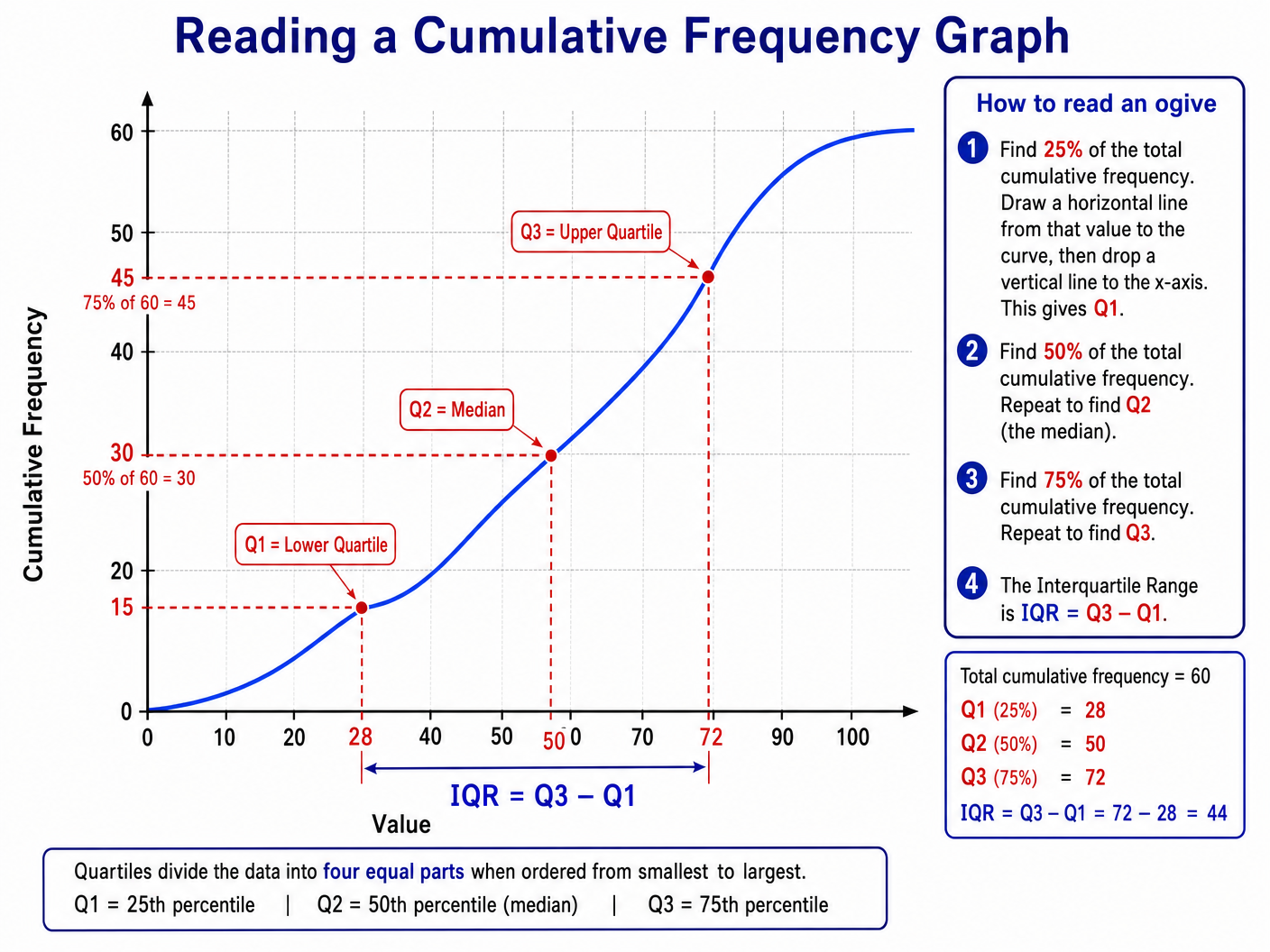
- Cumulative Frequency
- A running total of frequencies.
- Interquartile Range (IQR)
- The difference between the upper and lower quartiles, representing the middle 50% of the data.
- Extrapolation
- Making predictions outside the range of the given data on a scatter graph.
Worked Examples
Worked Example
Question: A survey asked 60 students about their favourite sport. 15 chose Football, 20 chose Rugby, 10 chose Tennis, and 15 chose Cricket. Draw a fully labelled pie chart to represent this data. (4 marks)
Solution: Step 1: Calculate the multiplier. 360° ÷ 60 students = 6° per student. Step 2: Calculate angles. Football: 15 × 6 = 90° Rugby: 20 × 6 = 120° Tennis: 10 × 6 = 60° Cricket: 15 × 6 = 90° Step 3: Check total angles: 90 + 120 + 60 + 90 = 360°. Step 4: Draw the pie chart accurately using a protractor and label each sector with the sport.
Worked Example
Question: The table shows the time taken, $t$ minutes, for 80 runners to complete a race. $0 < t \le 20$: frequency 10 $20 < t \le 30$: frequency 24 $30 < t \le 40$: frequency 30 $40 < t \le 60$: frequency 16 Calculate the frequency densities and construct a histogram. (4 marks)
Solution: Step 1: Identify class widths: 20, 10, 10, 20. Step 2: Calculate frequency densities (Frequency ÷ Class Width). $0 < t \le 20$: 10 ÷ 20 = 0.5 $20 < t \le 30$: 24 ÷ 10 = 2.4 $30 < t \le 40$: 30 ÷ 10 = 3.0 $40 < t \le 60$: 16 ÷ 20 = 0.8 Step 3: Draw axes. x-axis: Time (minutes), y-axis: Frequency Density. Step 4: Plot the bars with no gaps at the calculated heights.
Worked Example
Question: Use a cumulative frequency graph to estimate the interquartile range of a dataset with 120 values. The graph shows Q1 at 35 and Q3 at 62. (3 marks)
Solution: Step 1: Identify the position of the lower quartile (Q1). 25% of 120 = 30th value. Read across from 30 on the y-axis to the curve, then down. Value = 35. Step 2: Identify the position of the upper quartile (Q3). 75% of 120 = 90th value. Read across from 90 on the y-axis to the curve, then down. Value = 62. Step 3: Calculate IQR. IQR = Q3 - Q1 = 62 - 35 = 27.
Practice Questions
Question: A histogram is drawn to represent the weights of 50 apples. The class interval $100 < w \le 120$ has a frequency of 15. Calculate the frequency density for this class. (2 marks)
Answer:
Question: A scatter graph shows the relationship between temperature and ice cream sales. The correlation is positive. Describe what this means in context. (2 marks)
Answer:
Question: In a stem-and-leaf diagram, the data values are 12, 15, 15, 21, 24, 30. Write down the median value. (2 marks)
Answer:
Question: A cumulative frequency graph shows the heights of 80 plants. The median is 45cm and the IQR is 12cm. A second group of 80 plants has a median of 50cm and an IQR of 8cm. Compare the two distributions. (2 marks)
Answer:
Question: The histogram shows information about the time taken by customers to complete a shopping trip. The bar for $10 < t \le 30$ has a frequency density of 1.2. Calculate the number of customers in this interval. (2 marks)
Answer: