AQA · A-Level · Psychology
Course version: 7182 · Exams through 2026
Data handling and analysis
Mastering Data Handling and Analysis is your secret weapon for GCSE Psychology. This topic doesn't just test your mathematical skills; it tests your ability to interpret human behaviour through numbers, turning raw data into meaningful psychological insights.
- 5 min read
- 3 worked examples
- 5 practice questions
- 6 key terms
Check what you remember
Read the wording for your board, then hide it and explain Quantitative Data in your own words. Rough notes are fine. This is a self-check, with no mark or grade.
Reference: AQA
Data that is expressed numerically and can be statistically analysed.
Study Notes
Overview
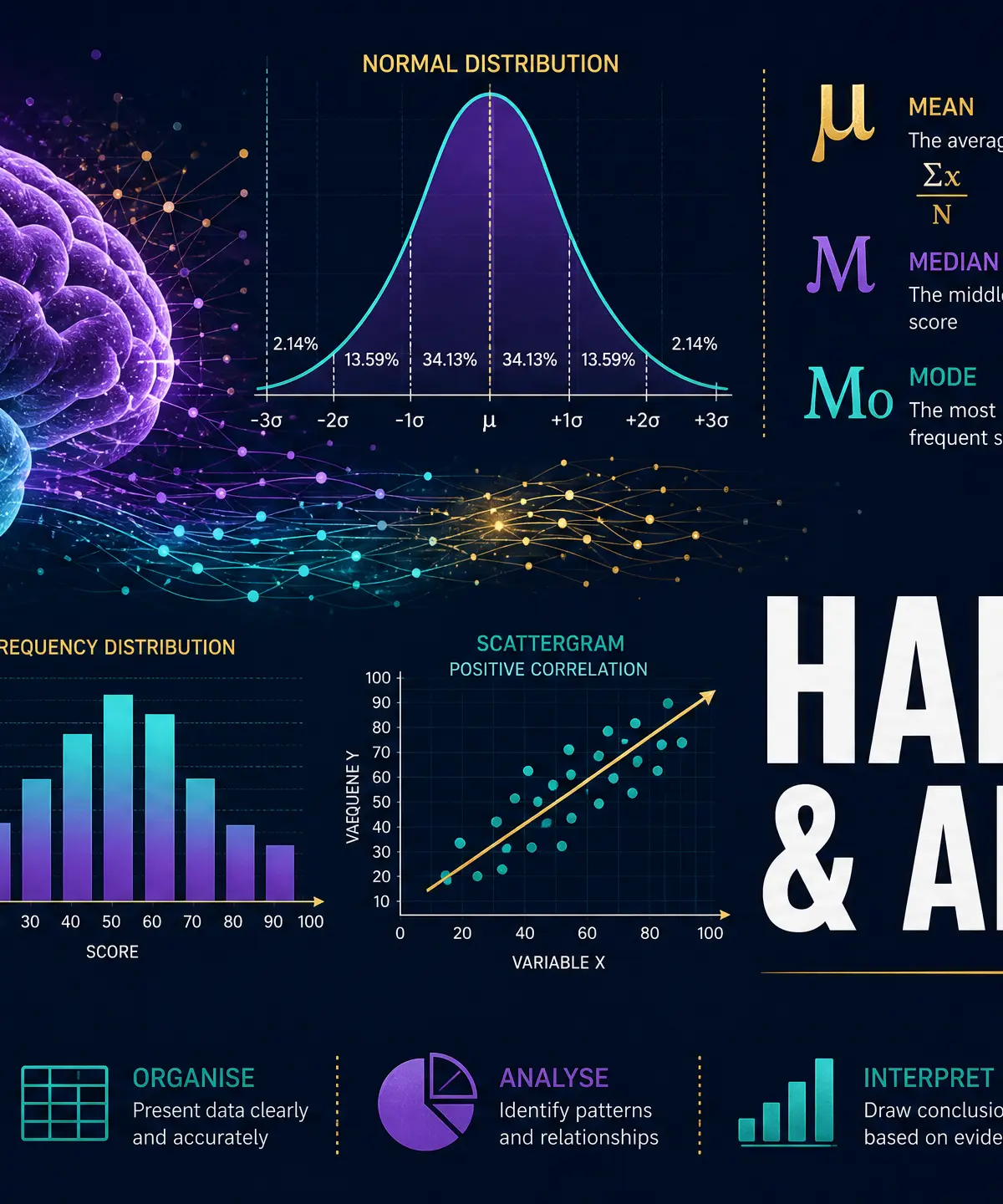
Data Handling and Analysis forms the backbone of psychological research. Examiners consistently report that candidates who perform well in this section tend to achieve higher overall grades, as these skills are tested across multiple papers. This topic covers the journey of data from its initial collection (primary vs. secondary) through to its processing (measures of central tendency and dispersion) and final presentation (graphs and distributions).
Examiners expect candidates not only to perform calculations but to justify their methodological choices. You must be able to explain why a median is more appropriate than a mean for a specific data set, or why a scattergram is the correct choice for correlational data. Precision in your terminology and showing clear working in your calculations are essential for securing maximum marks.
Types of Data
Quantitative vs Qualitative Data
Quantitative Data is numerical data that can be statistically analysed.
- Example: The number of words recalled in a memory test, or the time taken to complete a puzzle.
- Exam Focus: Examiners reward candidates who note that quantitative data is objective and easy to analyse, but may lack depth.
Qualitative Data is descriptive, non-numerical data expressed in words.
- Example: An interview transcript describing a patient's experience of phobia therapy.
- Exam Focus: Useful for gaining rich, detailed insights, but difficult to analyse statistically and open to subjective interpretation.
Primary vs Secondary Data
Primary Data is collected first-hand by the researcher for the specific purpose of the current study.
- Advantage: Highly relevant to the research aim.
- Disadvantage: Time-consuming and expensive to gather.
Secondary Data is data that already exists and was collected by someone else for a different purpose.
- Advantage: Quick and inexpensive to access.
- Disadvantage: May not perfectly fit the current research aim; quality is unknown.
Meta-Analysis is a specific type of secondary research where researchers combine findings from multiple independent studies to draw an overall conclusion. Examiners frequently test this concept.
Descriptive Statistics
Measures of Central Tendency
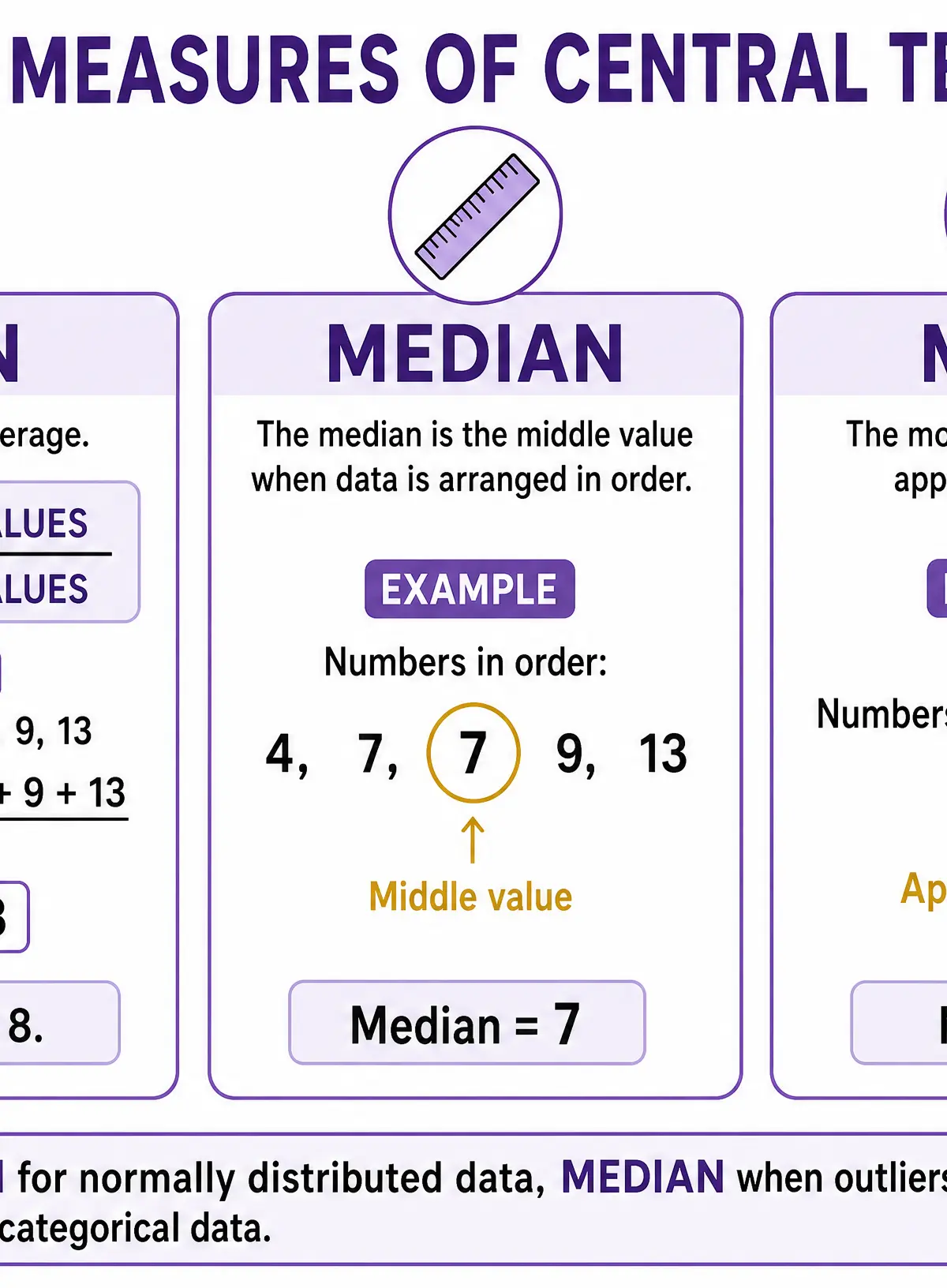
These measures provide a single value that represents the typical score in a data set.
- Mean: The arithmetic average (sum of all values divided by the total number of values).
- Strength: Uses all data points, making it highly sensitive.
- Weakness: Easily distorted by extreme values (outliers).
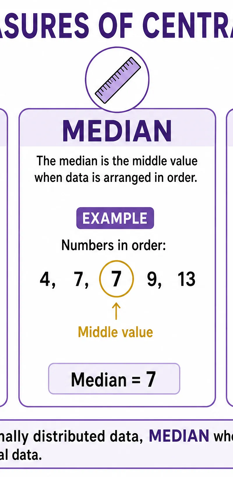
- Median: The middle value when data is arranged in ascending order.
- Strength: Unaffected by extreme outliers.
- Weakness: Does not use all the data values.
- Mode: The most frequently occurring value.
- Strength: The only measure suitable for categorical (nominal) data.
- Weakness: There can be multiple modes or no mode at all.
Measures of Dispersion
These measures describe how spread out the data is.
- Range: The difference between the highest and lowest value (Highest - Lowest).
- Strength: Quick and easy to calculate.
- Weakness: Only considers the two extreme values; highly sensitive to outliers.
- Standard Deviation: A sophisticated measure showing the average distance of each data point from the mean.
- Strength: Highly precise as it uses all data points.
- Weakness: Complex to calculate by hand (though usually, you only need to interpret it). A large standard deviation indicates high variability; a small one indicates consistency.
Graphical Representations
Choosing the correct graph is a frequent exam requirement:
- Bar Charts: Used for categorical data (e.g., comparing mean scores between two distinct groups). Bars do not touch.
- Histograms: Used for continuous numerical data (e.g., test scores from 0-100). Bars touch to show continuity.
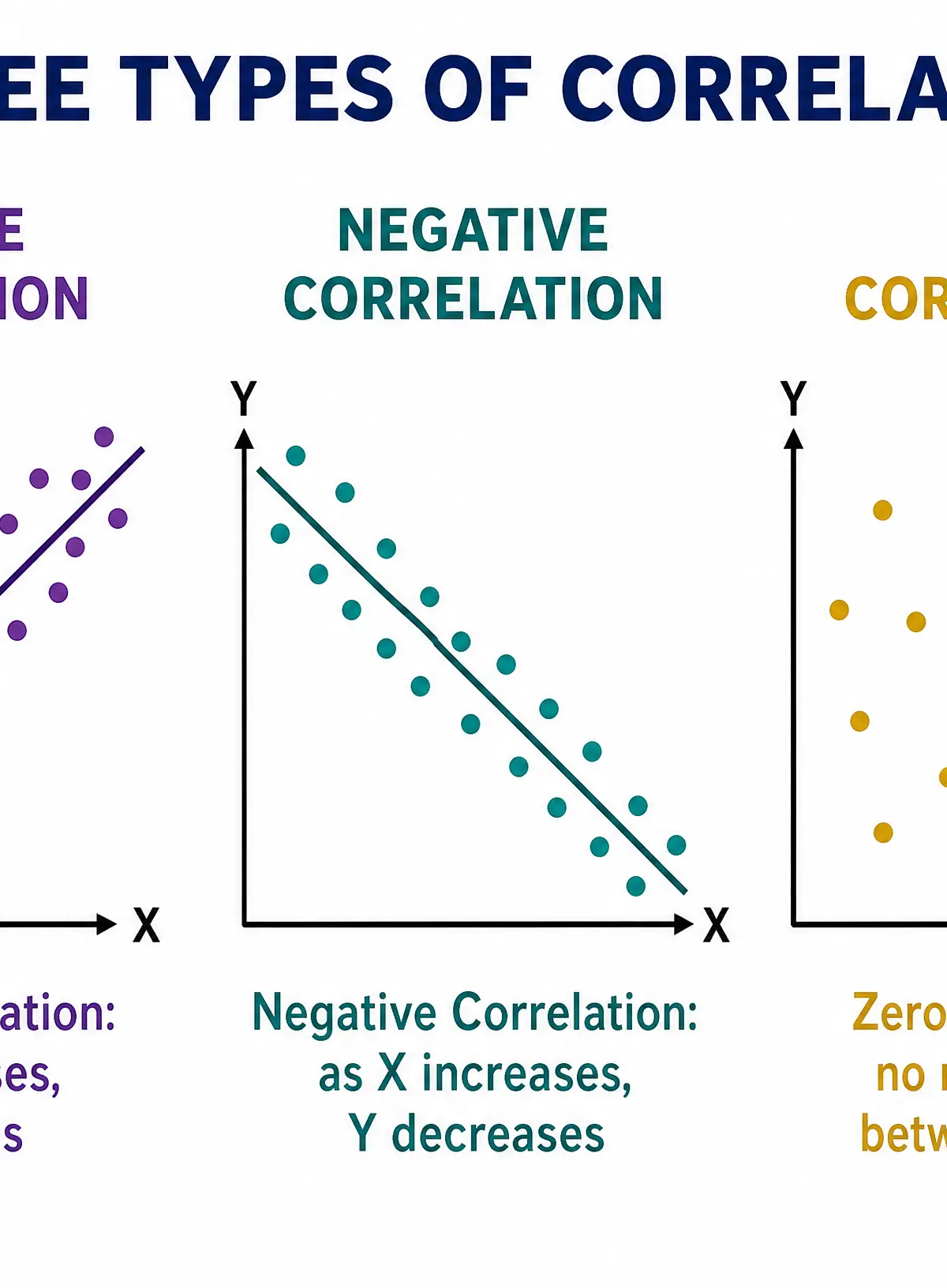
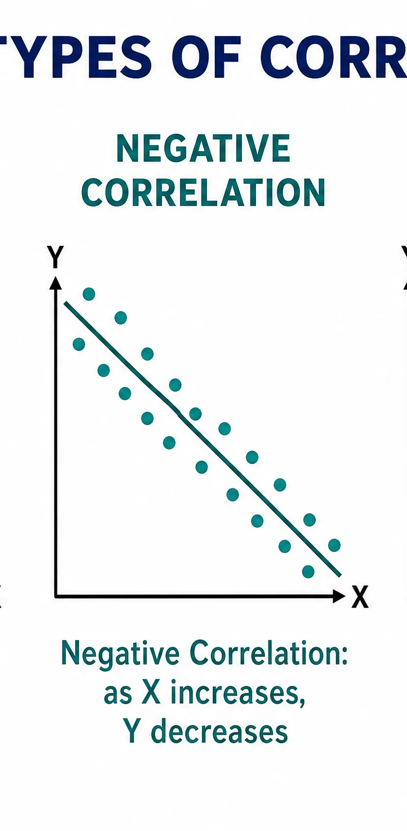
- Scattergrams: Used specifically for correlational data to show the relationship between two co-variables.
Distributions
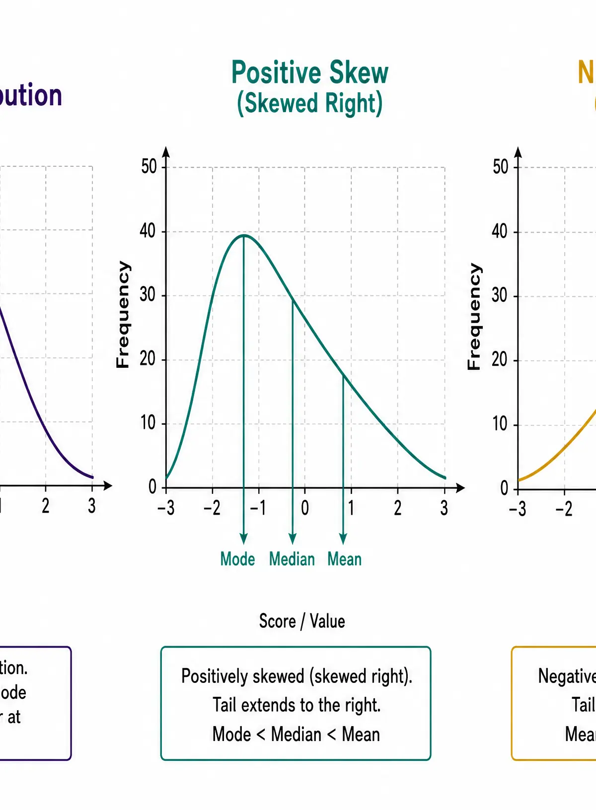
Understanding how data is distributed is crucial for interpreting results.
- Normal Distribution: A symmetrical bell curve where the mean, median, and mode are exactly equal and located at the centre peak.
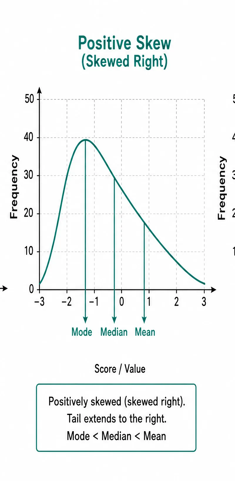
- Positive Skew: The tail extends to the right. Most scores are low, but extreme high scores pull the mean higher than the median and mode. (Mode < Median < Mean)
- Negative Skew: The tail extends to the left. Most scores are high, but extreme low scores pull the mean lower than the median and mode. (Mean < Median < Mode)
Revision Podcast
Listen to our comprehensive 10-minute audio guide covering all key concepts, exam tips, and a quick-fire quiz to test your knowledge.
Visual Resources
3 diagrams and illustrations
Interactive Diagrams
1 interactive diagram to visualise key concepts
Conceptual Flow Outline
Classification of Data Types and Sources
Worked Examples
3 worked examples — open one to explore the question and available guidance.
Practice Questions
Try the question, then reveal an answer plan or example response
A psychologist investigated the relationship between hours of sleep and scores on a stress questionnaire. The data showed that as hours of sleep increased, stress scores decreased. Name the type of graph that should be used to display this data and identify the type of correlation shown. (2 marks)
Hint: Think about how we visually represent relationships between two co-variables.
Explain why a researcher might choose to collect primary data rather than secondary data for an observational study on playground aggression. (3 marks)
Hint: Focus on control and relevance to the specific research aim.
In a test of reaction times, one participant took significantly longer than all the others due to a distraction. Explain which measure of central tendency would be most appropriate to summarise this data set. (3 marks)
Hint: Identify what the distracted participant represents statistically.
A set of exam results produces a positively skewed distribution. Describe the relationship between the mean, median, and mode in this distribution. (3 marks)
Hint: Think about where the tail is and which measure is pulled furthest by it.
Calculate the range for the following set of scores: 14, 22, 18, 9, 25, 17. Show your working. (2 marks)
Hint: Find the highest and lowest numbers first.
Exam technique
How to turn what you know into marks
How to approach the question
Always read the data table carefully before looking at the questions. Note the headings, units of measurement, and scan for obvious outliers.
How to structure your answer
- Essay questions
- If evaluating a research method, use PEEL: Point (e.g., strength of quantitative data), Evidence (example from the stem), Explain (why it's a strength), Link (how it impacts the study's validity).
- Source questions
- N/A for this specific mathematical topic.
- Explain questions
- State the point clearly, provide evidence from the data provided, and explain the consequence (e.g., 'This means that...').
Timing
Approximately 1 minute per mark. For a 4-mark calculation question, spend 2 minutes calculating and 2 minutes writing the justification.
Common pitfalls
- Failing to show working out for calculations. If you make a simple arithmetic error but your method is correct, you can still gain marks if your working is visible.
- Confusing the direction of a skew. Remember, the skew is named after the direction of the TAIL, not the peak.
- Stating 'it's easier' as an evaluation point. Examiners hate this. Use terms like 'less time-consuming', 'more cost-effective', or 'easier to analyse statistically'.
What the command words want
- Describe
- Give a detailed account of the characteristics (e.g., describe a normal distribution).
- How useful
- N/A for data handling.
- Explain why
- Provide a reasoned justification linking to the specific data set provided.
- How far do you agree
- N/A for data handling.
Watch or listen (optional)
Test your understanding of Data handling and analysis
Active recall beats re-reading. Take an instant quiz now to test what you’ve learned and lock it into long-term memory.
7 days Premium · Then the free plan continues · No card, no charge