Learning Analytics Explained: Data-Powered Revision Tips
You've done the work, or at least it feels like you have. You've clicked through quiz after quiz, marked practice papers, watched the score wobble up and down, and still ended up staring at a mock paper with that same hollow feeling, because the grades don't seem to match the effort. That gap, between being busy and getting better, is exactly where learning analytics starts to matter.
Why Your Revision Feels Busy but Not Better
A Year 11 student sits down after school with a stack of practice scores, most of them scribbled in the margins of a workbook, a few buried in a spreadsheet, and a couple trapped in a teacher's comments. They've done hundreds of questions, but when they open the next paper, the same mistakes come back, fractions slip, essay points drift, and command words still catch them out. That is a feedback problem.
The pattern is usually the same. Students collect activity, but they do not get a clear answer to the only question that matters, what should I revise next? If you are using active recall, like the method set out in the active recall revision guide, you already know the aim is to make memory do the work, not just to reread notes. Learning analytics goes one step further by showing where recall is breaking down, so the next session is based on evidence rather than guesswork.
Why effort can hide what's really going on
A lot of revision tools make you feel productive because they count things. Questions done. Sessions completed. Streaks kept alive. Those can be useful, but only if they connect to something more meaningful than activity.
Practical rule: if a metric does not change what you do next, it is probably not the metric you need.
That is why a student can look organised and still be stuck. They have spent time, but the feedback has not pointed to the exact topic, skill, or mistake pattern. A teacher looking at that same student sees effort and low confidence, but not the reason the grade is not moving.
What students need is a way to turn practice into a decision. What teachers need is a way to tell the difference between someone who is slipping on one topic and someone whose whole revision routine is off. That is the promise of analytics in revision, and it is why platforms built for GCSEs and A-Levels increasingly talk about data, not just content.
If you want a useful comparison from outside education, real time analytics for product teams shows the same principle in another setting, look at the signal, then act while it still matters. Revision works the same way.
What Learning Analytics Means
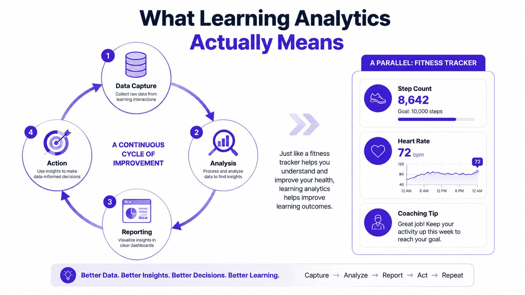
Learning analytics is the process of collecting learner data, analysing it, reporting it clearly, and then using it to take action. In plain English, it is the link between “what happened” and “what should I do next”. That loop matters because a dashboard on its own is just a mirror. It shows activity, but it does not point to the next revision step.
A fitness tracker is a useful comparison. It does not just count steps. It can show whether your heart rate is settling, whether your sleep is helping, and whether today's effort should change tomorrow's plan. Learning analytics works in the same way for GCSE and A-Level revision, it turns raw activity into something a student or teacher can use straight away.
Descriptive, predictive and prescriptive
Three layers help keep the idea clear. Descriptive analytics tells you where you are, predictive analytics warns you what might happen next, and prescriptive analytics suggests what you should do. The comparison with sat-nav is simple, current position, traffic ahead, and a faster route if you need one.
In education, that structure matters because Jisc's UK model has helped shape analytics around student support, not just reporting. UK institutions often use it to spot students who may be slipping, monitor engagement, and shape interventions. The point is practical. Analytics should sit inside the support workflow, not live as a separate tech toy.
What the loop looks like in revision
A revision platform can capture question attempts, time spent, topic choice, and whether a student returns to a topic after a gap. It then analyses those events, reports the pattern in a readable way, and suggests the next move. For a GCSE student, that might mean “fractions are fine, but rearranging formulae is still shaky”. That is far more useful than “you scored 62% overall”.
The same loop also sits behind systems built for fast decisions. A useful comparison is real time analytics for product teams, because it shows how quickly information has to move before anyone can act on it. Revision works the same way. If the feedback arrives too late, the student has already moved on with the wrong plan.
Learning analytics is only useful when the insight changes the next task, the next intervention, or the next revision session.
If you need a simple way to explain it to a parent, try this. Learning analytics shows what a student did, what that means, and what should happen next. That is the core idea. A system like AI Powered Revision is useful when it uses that loop to turn practice into a clearer next step rather than just another score.
The Metrics That Actually Predict Exam Success
Not every number is useful. In fact, some of the most common revision stats are mostly noise. Total questions attempted, time on platform, and streak length can all look impressive, but they don't always tell you whether a student is closer to a better grade.
What matters more is whether the data is tied to the exam itself. AQA, Edexcel, OCR and WJEC practice only becomes useful when the platform can break performance down by topic, skill, and mark scheme behaviour. That's why question-level data is more revealing than a single overall score.
A simple way to sort the metrics
| Metric | What it measures | Best for | Limitation |
|---|---|---|---|
| Total questions attempted | Volume of practice | Spotting low engagement | Can hide repeated guessing |
| Time on platform | Study time | Broad activity tracking | More time doesn't mean better learning |
| Topic-level mastery | Strength by subject area | Deciding what to revise next | Needs enough question data |
| AO mark-band movement | How answers match assessment objectives | A-Level essay improvement | Can be hard to read quickly |
| Accuracy by command word | Whether a student can explain, analyse or evaluate on demand | GCSE and A-Level exam readiness | Needs question tagging to be useful |
| Retention after spaced review | Whether learning sticks after a gap | Long-term exam preparation | Takes time to measure properly |
Dashboards become useful if they're built well. A platform that tracks performance by topic and command word can show that a student is not failing English because they “can't write essays”, but because their evaluation is strong and their structure is weak. That's a very different revision problem.
If you're comparing targeted practice methods in another subject, browse targeted CogAT practice methods is a good reminder that the same principle holds across tests, diagnose the weak area, then practise that exact skill.
What teachers should trust first
For teachers, the safest starting point is always the most exam-aligned signal. Question-level accuracy tells you more than session length. Topic mastery tells you more than a big list of attempts. Retention after spaced review tells you whether the learning stuck, not just whether it felt familiar for an hour.
Teacher's shortcut: if a dashboard can't separate “did lots of work” from “got better at the exam”, it's not ready for serious intervention decisions.
MasteryMind's Exam Practice for GCSE is one example of how that kind of alignment can be built around real exam tasks, not generic practice. The point isn't the platform name. The point is that the analytics should sit on top of proper exam structure, or the numbers won't mean much.
Three Revision Workflows That Put Analytics to Work
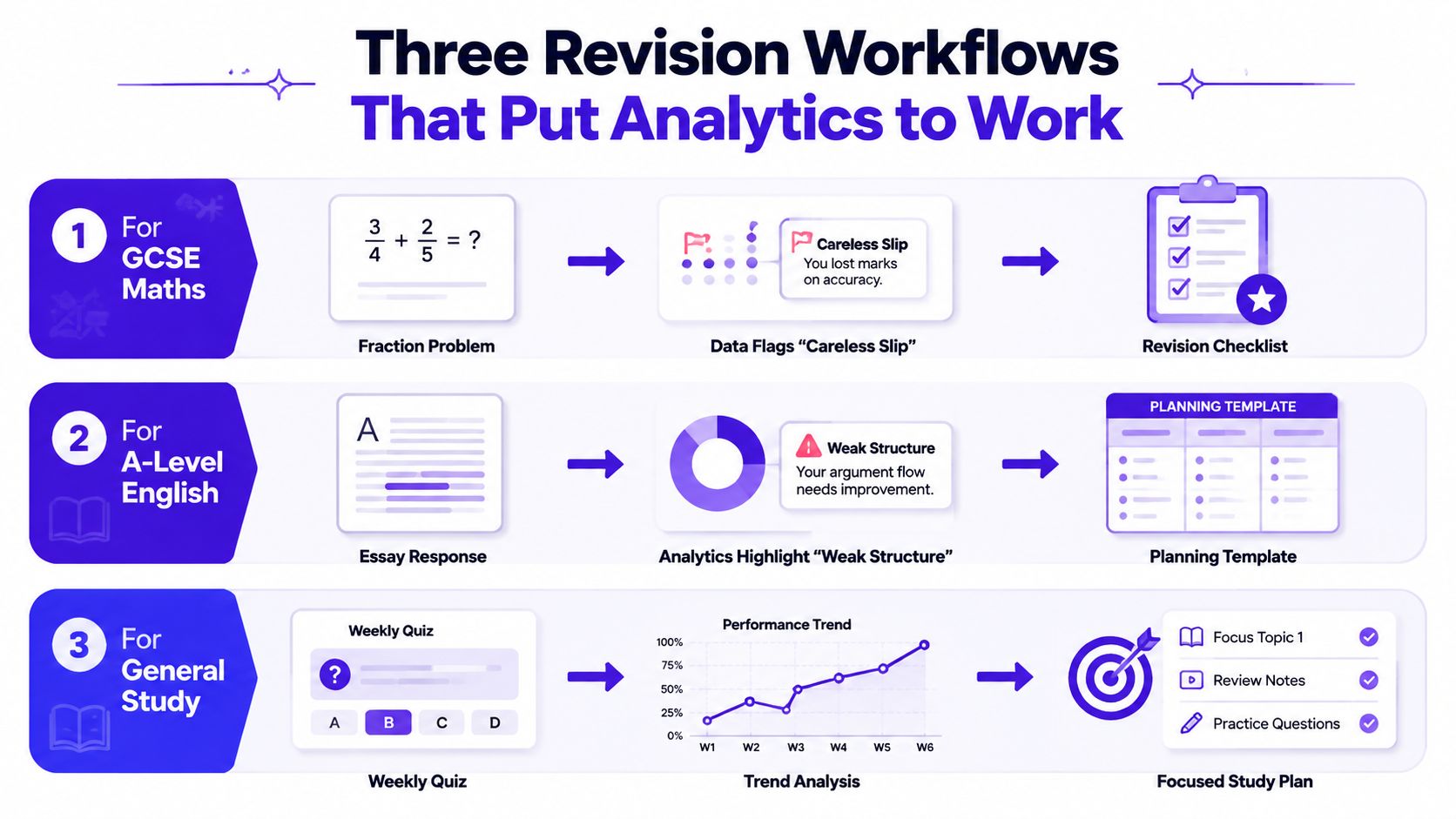
A student doesn't need a lecture about data. They need to know what to do on Tuesday evening when the next mock is close and the weak spot is obvious. These three workflows show how learning analytics turns into action in real exam prep.
GCSE Maths and the careless slip problem
A GCSE Maths student keeps losing marks on fractions and rearranging formulae. The first instinct is to say they “don't know the topic”, but the data shows something narrower. They're getting most of the method right and dropping marks through slips, usually in the final line of the working.
That changes the revision plan immediately. Instead of re-teaching the whole topic, the student does short sets focused on checking steps, then compares the wrong answer against the correct method to see where the error starts. A platform with step-by-step verification can make this easier by showing exactly where the working diverged from the correct path.
A-Level English and the AO problem
An A-Level English Literature student is doing okay on content but flatlining on essay marks. The analytics show that AO2 is decent across poetry comparison, yet the responses still lose marks because the argument isn't carrying through the paragraph structure. The issue isn't effort, it's that the writing is not landing in the right exam shape.
That means the next task isn't “write another essay from scratch”. It's to track how each essay hits the AOs, compare the weaker ones, and fix the structure before writing again. A platform that gives AO breakdowns can make that visible quickly, which matters because English students often think they need more ideas when they really need tighter control of evidence and explanation.
Year 12 teaching and the heatmap problem
A Year 12 teacher looks at a topic-mastery heatmap and sees one class falling behind on a specific content strand while another class is steady. That doesn't automatically mean the first class needs more homework. It may mean they need a different explanation, a short retrieval starter, or a targeted intervention lesson.
That's the practical value of analytics for staff. The teacher doesn't have to guess which group needs the next lesson because the data shows where mastery is thin. MasteryMind's topic dashboards, mixed practice and spaced review approach fit that style of decision-making because they keep the focus on the next action, not just the score history.
Setting Up Learning Analytics in Your School or Home
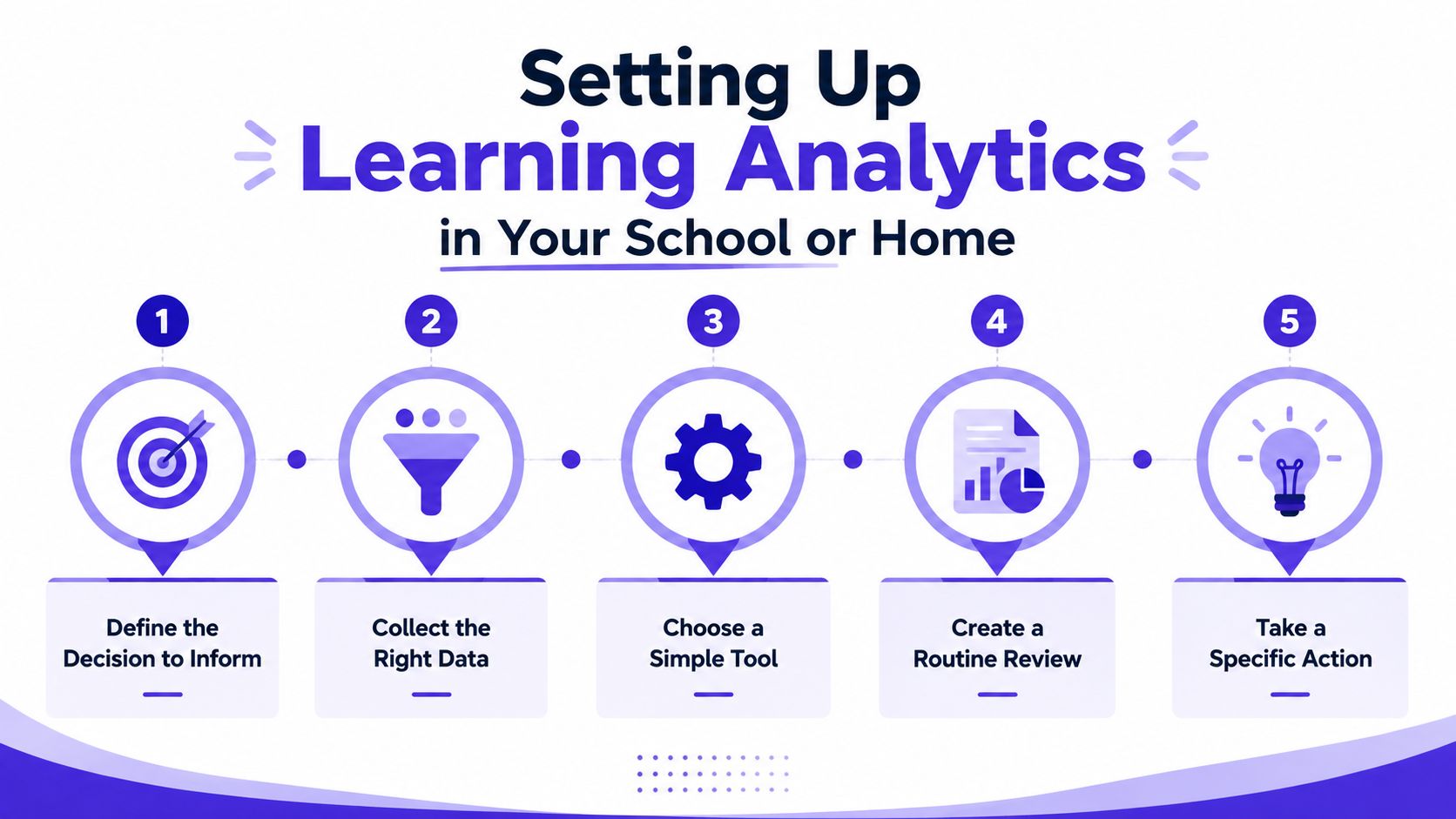
The easiest way to get this wrong is to start with the tool. The better way is to start with the decision. If you know what you're trying to improve, the rest becomes much simpler.
Start with one decision
A school might want to know which students need intervention. A parent might want to know whether their child is revising the right topics. A tutor might want to know whether their student is improving on mark scheme language. Pick one decision first, because everything else should serve it.
Use the right data sources
Choose data that matches the exam board and the subject. If you're preparing for AQA, Edexcel, OCR or WJEC, the platform needs to reflect the command words, topic structure and marks that show up in the paper. A generic quiz score won't tell you much if it doesn't map onto the exam.
Set a small number of baseline measures
Topic mastery is a strong place to begin, along with retention after spaced review. Those two together tell you whether a student is only recognising content or genuinely holding onto it. For teachers, that makes it much easier to separate a temporary wobble from a real gap.
Review weekly, not constantly
Daily checking tends to create noise. Weekly review is usually enough to spot a pattern without turning the process into a second job. The point is to notice whether the same weak topic keeps appearing and whether the next intervention changed anything.
Change one thing and check again
If a student keeps missing questions on a single topic, adjust the revision plan and measure the result. If a class isn't improving after intervention, change the input, not just the expectation. One tool that helps here is AI Powered Revision, because it combines practice, feedback and progress tracking in one place rather than scattering the data across different apps.
Common mistakes show up fast. People collect too much data and act on none of it. They also mistake activity for progress, which sounds harmless until a student has done lots of work and still can't answer the question under exam pressure.
Privacy, Ethics and Inclusive Use of Learner Data
More data isn't automatically better. That's the bit parents and teachers are right to challenge, because once a system starts tracking learner behaviour, the questions get bigger than grades. Who sees the data, how it's used, and whether it treats all learners fairly matter just as much as the dashboard itself.
UK schools also have to think carefully about privacy, transparency and exam rules. JCQ expectations around how work is produced and supported mean tools need to fit real school practice, not undermine it. If a platform is pushing opaque decisions or hidden automation, that should raise a red flag.
The inclusivity problem nobody should ignore
A systematic review found that learning analytics research on inclusiveness and disability is still very limited, with few empirical studies overall and none before 2016. That gap matters because analytics can easily favour the learner whose behaviour looks “normal” on the screen, while missing the student with SEND, neurodivergence, sensory needs, or patchy digital access.
The practical question is simple. Does the system measure fair things? If a dashboard punishes a learner for slower reading, inconsistent access, or a different way of processing tasks, then the data isn't neutral. It's just narrow.
Questions to ask before trusting a provider
- What data do you collect, and why? If the answer is vague, the risk is usually higher than it needs to be.
- Can teachers and parents understand the logic? Transparent profiling matters more than fancy wording.
- How do you check for bias? If the model never gets audited for fairness, it can bake in unfairness.
- What can a learner override or challenge? A genuine support tool should leave room for human judgement.
- Does it reduce workload, or just add another dashboard? If staff can't act on it, the data isn't helping.
You can see this kind of thinking reflected in our commitment to student privacy, which is the right place to start any serious conversation about learner data. The best analytics tools don't just collect information. They make their limits clear.
Measuring Impact Without Drowning in Dashboards
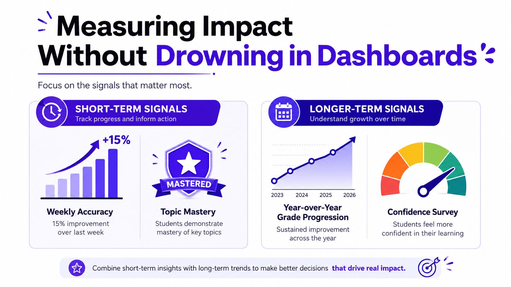
A dashboard only proves something if it changes the outcome. The simplest way to test that is to track a small number of signals before and after a change, then compare what happened to the students who used the intervention.
The broader evidence is reassuring. A European Commission Joint Research Centre review found that, as of June 2016, 26 of 28 pieces of evidence supported a positive or neutral impact on learning outcomes European Commission Joint Research Centre review. A 2021 review in higher education also found that learning analytics is most often used for at-risk identification, personalised support and retention, which makes sense because those are the places where data can still lead to action systematic review in higher education. The practical lesson is simple, measure a few things well, not everything badly.
What to track first
Short-term signals should show whether the next revision cycle is working. Weekly accuracy on weak topics is a strong one. So is topic mastery, especially when a student keeps returning to the same area.
Longer-term signals should show whether the gains stick. Mock performance, retention after a gap, and a simple confidence check all help here. If the student looks better for three days and forgets it by Friday, the system hasn't really worked yet.
Keep the reporting readable
If you're presenting the data to students, parents or staff, clarity matters more than decoration. For a useful guide on making charts legible and accessible, Tips for charts, colour, and accessibility is a sensible reference point because the whole job is to help people see the pattern, not admire the graph.
Impact check: if the data leads to a clearer next step, and the next step leads to better revision, then the analytics is doing its job.
A simple checklist works well this term. Pick one weak topic, one weekly metric, one longer-term outcome, and one intervention. Compare the students who used the change with the ones who didn't, then keep the version that helped.
If you want revision data that points to the next step, not just another score to worry about, take a look at MasteryMind. It aligns practice to AQA, Edexcel, OCR and WJEC, gives exam-style feedback, and tracks topic mastery so students, parents and teachers can see what to do next.
Ready to master this topic?
Practise with quizzes, blurt exercises and exam questions on MasteryMind.
7 days Premium · Then free forever · No card, no charge