Rate Concentration Graphs Explained for GCSE and A-Level
You're halfway through a paper, you turn the page, and there's a graph that doesn't look like the neat revision sheet version. The points are a bit messy, the curve is awkward, and the question still expects you to say what order the reaction is. That's exactly where rate concentration graphs matter, because they turn “I think I know this” into “I can read the data and justify my answer.”
At the simplest level, these graphs show how rate changes as concentration changes. The core idea is straightforward, but the exam version is rarely perfectly tidy. Real practical data can be scattered, curved, or inconvenient, so the skill is not just remembering the textbook shape, it's learning how to read what the graph is really saying. The GCSE and A-Level context matters here, because timed sampling, colourimetry, gas collection, and mass-loss measurements all make the picture messier than the clean diagrams in revision notes, as the chemistry student reference on rate graphs and orders points out (Chemistry Student on rate graphs and orders).
If you've ever stared at a graph and thought, “I know this topic, but this question is trying to trick me,” you're in the right place. The good news is that the graph is usually giving you clues before you even touch a calculator.
What Rate Concentration Graphs Actually Show You
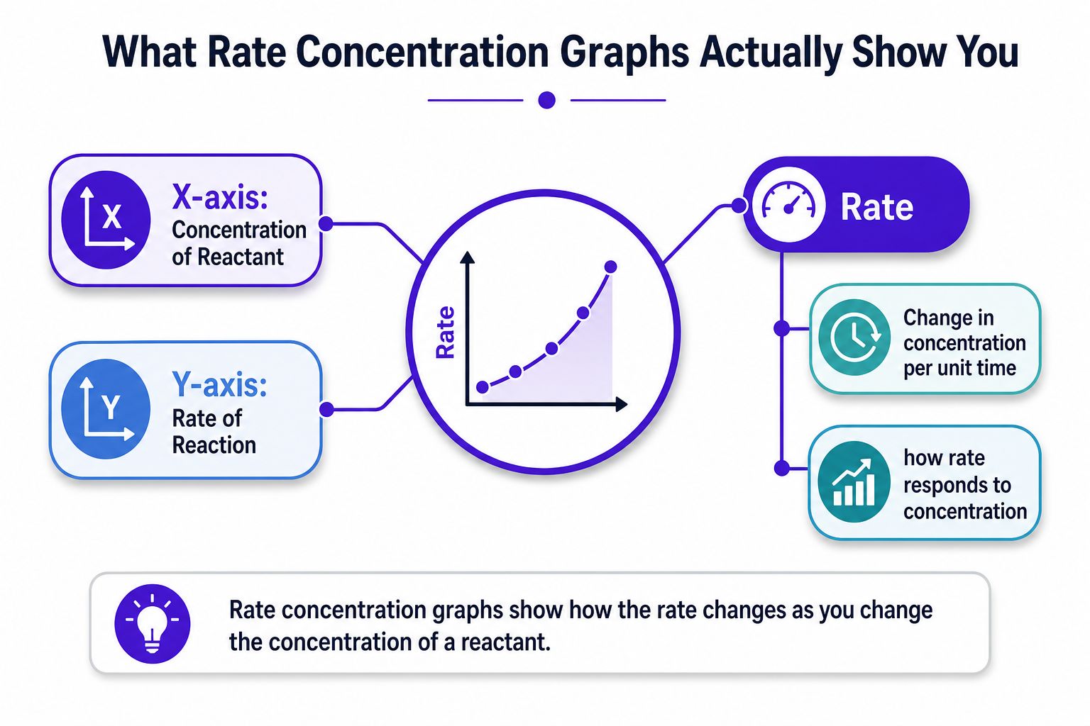
A rate concentration graph is a way of showing how rate of reaction changes as concentration changes. The x-axis gives the concentration, the y-axis gives the rate, and the pattern tells you how closely those two things are linked. That is the point of the graph, even when the values are a little rough or the question uses unfamiliar wording.
A useful way to read it is to ask a simple question. If more reactant is added, does the rate stay the same, rise in a direct way, or climb more sharply? The answer tells you whether concentration is doing much of the work in that reaction. That is why these graphs matter so much in chemistry, because they test whether you can read the relationship from the evidence instead of just repeating a definition.
Start with the axes, then read the story
Practical rule: if you misread the axes, everything else falls apart. Check that rate is on the y-axis and concentration is on the x-axis before you decide anything about the order.
Here is what is really going on. The graph is not just a picture of results, it is a model of how the rate responds to concentration. A flat line means the rate is staying constant as concentration changes. A straight rising line means the rate is increasing in a direct relationship. A curve means the response is changing as concentration increases, so the link is not a simple straight-line one.
That is why a rate concentration graph is so useful in kinetics. It lets you infer the order of reaction from the shape instead of guessing from the balanced equation, which does not give order. For students who want a quick revision base for chemistry topics across GCSE and A-Level, the broader subject area is here: Chemistry A-Level GCSE.
It works like a map for the data. Once you can read the route the line is taking, the graph stops feeling like a trick and starts acting like evidence.
The Three Shapes You Need to Recognise
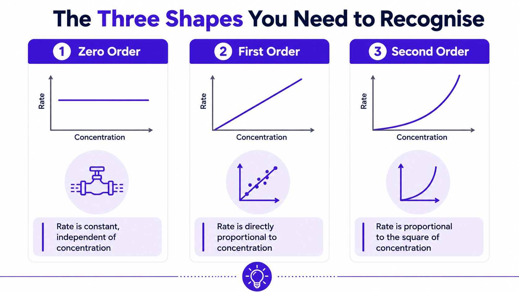
The exam usually comes back to three shapes, and once you know them, a lot of questions stop feeling mysterious. The concentration goes on the x-axis, the rate goes on the y-axis, and the line or curve tells you whether the reaction is zero, first, or second order. You are not memorising random drawings. You are learning three different response patterns.
Zero order means the rate stays flat
A zero-order graph is a horizontal line. That tells you the rate stays constant even when concentration changes. In plain English, adding more reactant does not speed things up, at least not in the range shown.
A simple way to remember it is a tap that is already fully open. Pour in more water, and the flow from the tap does not increase. The supply has reached its limit. In chemistry terms, the graph says concentration is not the thing controlling the speed.
First order means the rate rises in direct proportion
A first-order graph is a straight line rising from the origin. If concentration doubles, rate doubles. If concentration triples, rate triples. The relationship is tidy and proportional.
Think of ordering taxis in a city with a normal supply. Twice as many people needing a taxi can lead to twice as many taxis being used, at least in this simplified picture. The important part is the directness of the response. The graph is straight because the change is steady and predictable.
Second order means the rate rises more sharply
A second-order graph curves upward. The rate increases faster than the concentration increase itself, so the graph bends rather than staying straight. That extra bend is the clue.
A useful memory hook is a car full of passengers. Adding one more person changes the outcome a bit, but not in a simple one-to-one way once the system starts to strain. The same basic idea applies here. The graph is telling you the rate is becoming much more sensitive to concentration.
| Order | What the graph looks like | What it means in plain English |
|---|---|---|
| Zero order | Flat line | Rate does not change with concentration |
| First order | Straight rising line | Rate changes in direct proportion |
| Second order | Curved rise | Rate increases faster as concentration rises |
Finding the Order From the Graph
A lot of students freeze at this point because they think a graph question needs a special trick. It usually does not. It needs two sensible readings, a clear ratio, and the patience to read what the graph is doing.
Compare two points carefully
Start with two points that are easy to read. Pick points on the clearest part of the line or curve, not the messy bits where the scatter makes the values hard to trust. Read off the concentration at each point, then read off the rate at each point.
Now compare the changes. If concentration goes from 0.20 to 0.40, that is a doubling. If the rate goes from 3.0 to 6.0, that is also a doubling. If concentration doubles and the rate also doubles, the ratio is 2 to 2, so the change in rate matches the change in concentration.
Here is a fresh mini-example. Suppose one point on the graph shows concentration of 0.10 mol dm⁻³ and rate of 4 units, and another shows concentration of 0.30 mol dm⁻³ and rate of 12 units. The concentration has gone up by a factor of 3, and the rate has also gone up by a factor of 3. If the rate change matches the concentration change by the same factor, the relationship is proportional. If the rate changes by a different factor, the relationship is not proportional in that same way.
The important part is the method. State the two readings, compare the factors, and show the ratio clearly. That is what earns the mark, even if the graph is not perfectly neat.
When a graph looks awkward, use the clearest section of the line or curve, not the noisiest part. Examiners want sensible reasoning, not heroic guesses from bad points.
Use initial rates when one graph is not enough
Some questions give separate experiments with different starting concentrations. That is the initial rates method. It helps because you compare rates right at the start, before the reaction curve has had time to bend, flatten, or drift away from the clean part of the data.
The working is the same idea as before, but the layout is different. Read the starting concentration in one experiment, read the starting rate, then do the same for the next experiment. Compare the factors step by step. If concentration changes by one factor and rate changes by another, write both factors down before you jump to a conclusion. That keeps your method visible and stops you from guessing.
A good exam answer shows the numbers first and the interpretation second. That way the marker can follow the logic even if the final wording is a little rough. If the data are slightly noisy, use the clearest values available and say so in your working.
For practice questions that mirror that kind of exam thinking, a set of A-Level Past papers is the kind of thing students should use repeatedly, not once.
Linear and Log Plots That Reveal the Answer
A graph does not always hand over the answer in a tidy curve. In many kinetics questions, the useful move is to transform the data so the pattern becomes easier to read, because a straight line is simpler to analyse than a bendy one. That is the point where the algebra helps the chemistry.
These transformed graphs are a separate tool from the rate versus concentration graphs discussed earlier. Here, the focus is on how a quantity changes with time, or how the rate changes after a mathematical transformation, so do not mix the two ideas together. The common forms are [A] vs time, ln[A] vs time, and 1/[A] vs time, depending on the order you are testing.
Straight lines make the order easier to spot
The basic rate law idea is simple. Rate depends on concentration, and the relationship can be written in a form that turns a curve into a line. For kinetics work, a straight line is useful because the gradient is easier to measure, and in the right form the gradient can show the order.
That is why teaching materials often use transformed plots such as [A] vs time, ln[A] vs time, or 1/[A] vs time, depending on the order. A log-log plot is another useful check when the question is asking for a more general relationship between rate and concentration. The chemistry student reference and the video material in the brief both point towards this more realistic approach to kinetics analysis, instead of stopping at idealised textbook shapes (Chemistry Student on rate graphs and orders, log-log and experimental order discussion).
Units matter more than people think
Students often lose easy marks here. The units of k change with the order of the reaction, so one set of units does not fit every case. If you have transformed the graph correctly and found the slope, the units still need to match the order you have identified.
| Order | Rate vs concentration shape | Linear plot form | Units of k |
|---|---|---|---|
| Zero order | Flat line | [A] vs time | concentration per time |
| First order | Straight rising line | ln[A] vs time | 1/time |
| Second order | Upward curve | 1/[A] vs time | 1/(concentration × time) |
If the question gives you a straight line after a transformation, the logic is straightforward. A straight line means the transformation has worked, the gradient gives the order information in the form used by the question, and the intercept can be used to read off the constant when needed. The point is not to get lost in the maths. The point is to use the maths to make the chemistry clearer.
For more practice questions that mirror that style of exam thinking, A-Level Past papers are worth using repeatedly, not just once.
Worked Examples That Mirror Real Exam Questions
A lot of students can follow the idea in principle, then go blank the moment they see real numbers. That's normal. Exam marks usually come from showing a chain of reasoning, so the examples below are written the way a marker would want to see the thinking unfold.
Example one, initial rates with two reactants
Suppose a question gives three experiments for a reaction involving reactants A and B.
- In the first two experiments, B stays the same, A doubles, and the rate doubles.
- In the next two experiments, A stays the same, B doubles, and the rate quadruples.
From the first comparison, the rate is directly proportional to A, so the reaction is first order in A. From the second comparison, doubling B makes the rate go up by four times, so the reaction is second order in B. That gives a rate law of the form Rate = k[A][B]².
To find k, you substitute one complete experiment into the equation. The marker is looking for a correct rearrangement, sensible substitution, and the right units at the end. If your arithmetic slips but your method is clean, you still have a chance of method marks because the logic is visible.
Example two, a log plot with a gradient
Now take a graph of ln(rate) against ln(concentration). If the points fall on a straight line, the gradient tells you the order. That is the whole reason this plot is so useful. A straight line here is not just “pretty”, it is evidence that the relationship follows a power law.
If the gradient is positive, the rate rises with concentration. If the line is steeper, the dependence is stronger. The intercept gives you ln(k), so you can find k by reversing the log if the question asks for it. That is the marker-friendly route: state the gradient, link it to order, then use the intercept for the constant.
A good habit is to write the equation you are using before you start calculating. That keeps your working organised and makes it much easier for the examiner to see whether your reasoning matches the graph.
When Real Lab Data Refuse to Behave
Textbook graphs are tidy because textbooks are trying to teach the idea, not the mess. Real data often arrive with scatter, curved sections, or a shape that seems to change depending on where you look. That does not mean the question is broken. It means you need to think like a chemist, not a memoriser.
Noise comes from the practical method
Timed sampling, colour changes that are hard to judge, gas collection, mass loss, and imperfect mixing can all make points wander away from a perfect line. A graph can still be useful even if every point is not sitting neatly where you want it. The question is whether the overall trend supports a sensible order, not whether the graph looks polished enough for a poster.
A reaction can also look first-order over one concentration range and behave differently elsewhere. That is why order must be determined experimentally, not assumed from the shape of one idealised sketch. If a single graph is ambiguous, a log-log analysis or a fresh set of initial rates can give a clearer answer than trying to force the curve into a simple label.
Be sceptical in a useful way
A graph that does not fit neatly can still be telling the truth. The trick is to ask whether the data are noisy, whether the reaction may be mixed-order, or whether you've only looked at one concentration range.
Strong exam answers stand out. They don't pretend the data are perfect. They explain the limits of the graph, point to the section that is most trustworthy, and avoid overclaiming. If a question stem hints at slow mixing, unstable temperature, or a reading method that could wobble, that is not background noise. That is the examiner giving you a clue.
For students who want more structured practice with this kind of realistic uncertainty, Online Revision for A-Level is the kind of place to build the habit of reading data carefully instead of only memorising ideal shapes.
Common Mistakes and Exam Tips That Save Marks
Most lost marks on this topic come from very ordinary mistakes, which is annoying because they're easy to fix. The good news is that once you know the traps, you can dodge them quickly in the exam room.
The errors that keep showing up
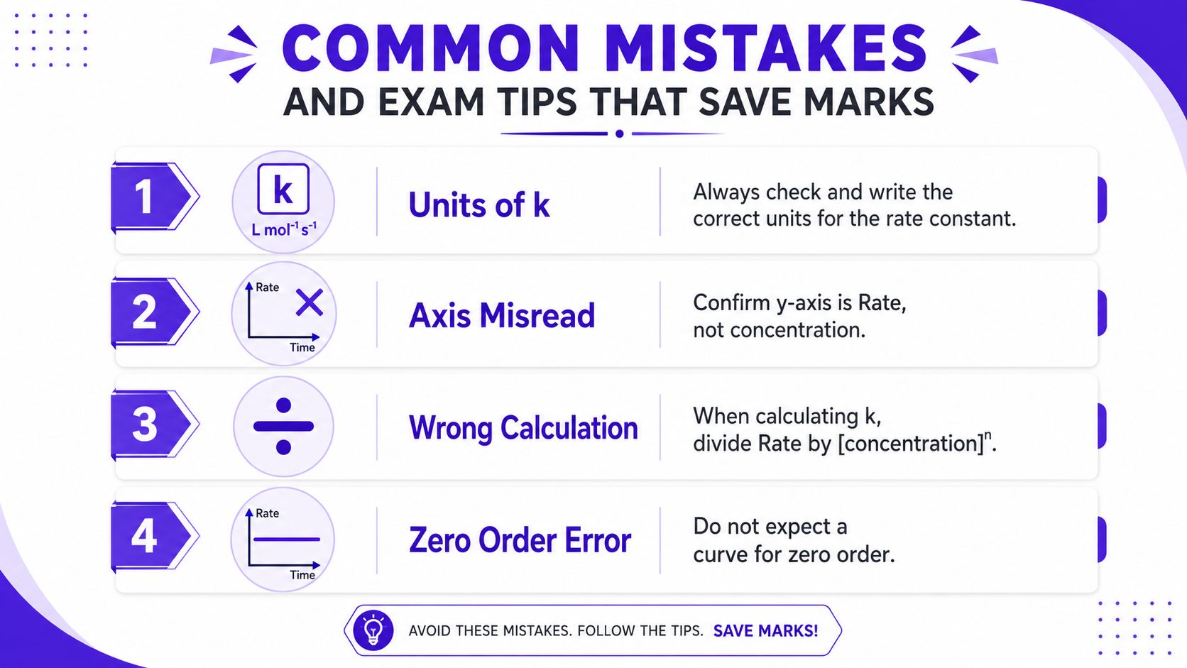
- Units of k: Always write the units that match the order you've found. If you don't check this, the final answer can look confident and still be wrong.
- Axis misread: Confirm that the y-axis is rate, not concentration. This one mistake can send the whole answer off course.
- Wrong calculation: When you work out the constant, divide rate by the concentration term raised to the correct power.
- Zero-order confusion: Don't expect a curve where the graph should be flat. Zero order is a straight horizontal line.
The habits that save marks fast
Write the equation at the top of your working before you calculate anything. Use the full grid when choosing points, because tiny ruler movements can change your answer more than you think. Label axes clearly if you draw your own graph, and don't round early unless the question forces you to.
For quick revision and timed question practice, Exam Practice for GCSE is the sort of training that helps students stop guessing and start checking their reasoning.
The best last-minute test is simple. Can you look at the graph, name the order, justify the shape, and explain the units of k without drifting into waffle? If the answer is yes, you're in good shape.
If you want more practice reading rate concentration graphs the way examiners mark them, use MasteryMind to drill graph questions, quick quizzes, and examiner-style feedback built around UK specs. Visit MasteryMind and use it to turn messy kinetics questions into marks you can rely on.
Ready to master this topic?
Practise with quizzes, blurt exercises and exam questions on MasteryMind.
7 days Premium · Then free forever · No card, no charge