AQA · GCSE · Combined Science
Course version: 8464 · Version from Sept 2018
Plot and draw appropriate graphs selecting appropriate scales for the axes.
Full specification wording
Levels of organisation: plot and draw appropriate graphs selecting appropriate scales for the axes.
Graph plotting is a core practical skill in biology.
Checked against the AQA 8464 specification (opens in a new tab) on .
- Point 7 of 11
- 4 key terms
Study notes
From the checked teaching notes for this specification point.
The idea
Graph plotting is a core practical skill in biology. When investigating how a factor such as light intensity affects the rate of photosynthesis, you must choose which variable goes on each axis, select a scale that uses most of the grid, and plot points accurately before drawing a line or curve of best fit. The independent variable goes on the x-axis and the dependent variable on the y-axis. Choose a scale so the data spans most of the grid, for example 1 cm per 10 units, and label each axis with quantity and unit. Plot each point with a small cross, then draw a smooth line or curve of best fit rather than joining points dot-to-dot. Examiners assess whether axes, scales, plotting and line of best fit are all appropriate for the data.
What earns the marks
- Label the x-axis with the independent variable and the y-axis with the dependent variable, including correct units such as light intensity in lux or rate in cm³/min.
- Choose a scale that uses at least half of each axis and allows every data value to be plotted, for example 2 cm per 10 °C rather than 1 cm per 100 °C.
- Plot each point accurately using a small cross or dot, reading the scale carefully so points sit within half a small square of the true value.
- Draw a single smooth line or curve of best fit that passes through or near the points, rather than joining points with straight segments.
- Use a ruler for straight-line relationships and a smooth freehand curve for non-linear relationships, extending the line only within the plotted data range unless told otherwise.
Common mistakes and how to put them right
Putting the dependent variable on the x-axis.
Put it right: Place the variable you chose to change on the x-axis and the measured result on the y-axis.
Choosing a scale that leaves most of the grid empty, such as 1 cm per 100 units when data range from 10 to 40.
Put it right: Rescale so the data fill the grid, for example 1 cm per 5 units.
Joining points dot-to-dot with straight lines.
Put it right: Draw a single smooth line or curve of best fit that shows the overall trend.
Exam tips
- Before plotting, check the range of each variable and write the scale on the axis so each major gridline represents a sensible round number.
- Plot points with a sharp pencil and small crosses so the examiner can see exactly where each value lies.
- If the relationship is non-linear, draw one smooth curve rather than a series of straight lines, and do not force the line through the origin unless the data support it.
Try the lesson
The start of the Levels of organisation: plot and draw appropriate graphs selecting appropriate scales for the axes. lesson, made from checked teaching notes for this specification point.
Have a go first
A student plots a bar chart of the number of each type of organism found in a pond sample. The counts are 4, 12, 8 and 16. Which scale for the vertical axis is most appropriate?
Listen
Graph plotting is a core practical skill in biology. When investigating how a factor such as light intensity affects the rate of photosynthesis, you must choose which variable goes on each axis, select a scale that uses most of the grid, and plot points accurately before drawing a line or curve of best fit. The independent variable goes on the x-axis and the dependent variable on the y-axis. Choose a scale so the data spans most of the grid, for example 1 cm per 10 units, and label each axis with quantity and unit. Plot each point with a small cross, then draw a smooth line or curve of best fit rather than joining points dot-to-dot. Examiners assess whether axes, scales, plotting and line of best fit are all appropriate for the data. A strong answer earns marks for these points. Label the x-axis with the independent variable and the y-axis with the dependent variable, including correct units such as light intensity in lux or rate in cm³/min. Choose a scale that uses at least half of each axis and allows every data value to be plotted, for example 2 cm per 10 °C rather than 1 cm per 100 °C. Plot each point accurately using a small cross or dot, reading the scale carefully so points sit within half a small square of the true value. Draw a single smooth line or curve of best fit that passes through or near the points, rather than joining points with straight segments. A common slip: Putting the dependent variable on the x-axis: the error is swapping axes. Instead, place the variable you chose to change on the x-axis and the measured result on the y-axis. Exam tip: Before plotting, check the range of each variable and write the scale on the axis so each major gridline represents a sensible round number.
See it
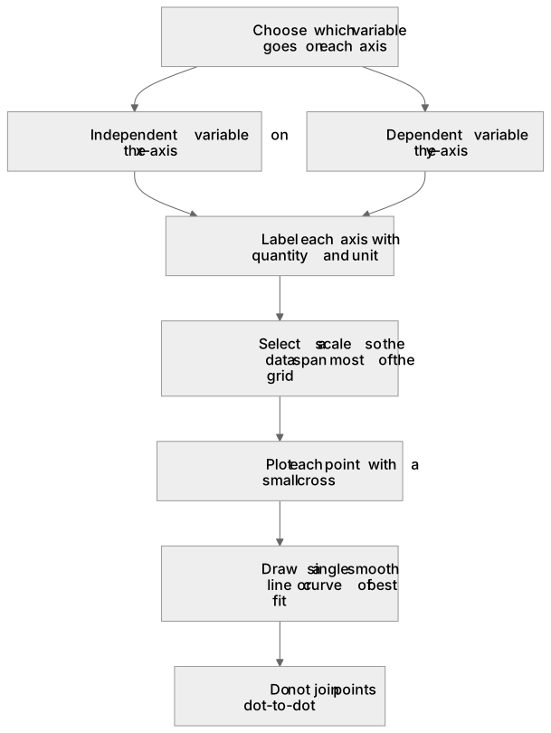
Key words
Say what each word means before you turn the card.
Variables and axis convention
Try answering aloud or in your head before turning the card.
Scale selection and grid use
Try answering aloud or in your head before turning the card.
Accuracy of plotting
Try answering aloud or in your head before turning the card.
Line or curve of best fit
Try answering aloud or in your head before turning the card.
See every definition
- Variables and axis convention
- The independent variable goes on the x-axis and the dependent variable on the y-axis.
- Scale selection and grid use
- Choose a scale so the data spans most of the grid, and label each axis with quantity and unit.
- Accuracy of plotting
- Plot each point with a small cross, reading the scale carefully so points sit within half a small square of the true value.
- Line or curve of best fit
- Draw a smooth line or curve of best fit rather than joining points dot-to-dot.
Label the diagram
Some boxes have lost their names. Pick the right name for each number.
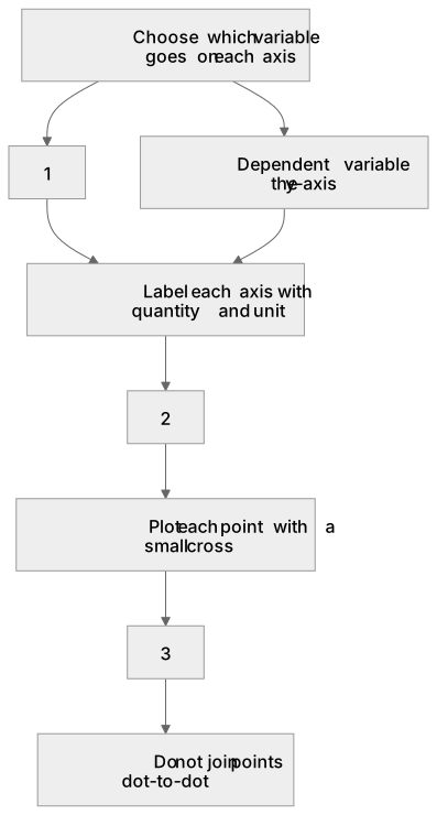
1Box 1
2Box 2
3Box 3
There is more to this lesson
The full lesson goes on to check your understanding and help you earn the marks. Create a free account to carry on, with your progress saved.
A week of Premium from your first lesson · Then the free plan continues · No card, no charge
Test your understanding of Levels of organisation: plot and draw appropriate graphs selecting appropriate scales for the axes.
Active recall beats re-reading. Take an instant quiz now to test what you’ve learned and lock it into long-term memory.
A week of Premium from your first lesson · Then the free plan continues · No card, no charge