OCR · GCSE · Further Mathematics
Box Plots
Master the art of constructing and interpreting box plots for your OCR GCSE Further Mathematics exam. This guide breaks down how to earn full marks on questions about quartiles, skewness, and comparing distributions, turning a tricky topic into guaranteed marks.
- 5 min read
- 3 worked examples
- 5 practice questions
- 6 key terms
Study Notes

Overview
Welcome to your deep dive into Box Plots (Specification reference 5.3), a key data representation topic in OCR Level 2 Further Mathematics. Box plots, or box-and-whisker diagrams, are a powerful tool for visualising the spread and central tendency of a dataset. They provide a concise five-number summary that allows for rapid comparison between different groups. In your exam, you won't just be asked to draw them; you'll be expected to interpret them with a high degree of sophistication. This includes calculating and comparing medians and interquartile ranges (IQRs), and identifying skewness. Examiners use this topic to test your ability to move beyond simple calculations and make reasoned, contextual judgements about data. A typical question might present you with two box plots and ask you to 'Compare the distributions', a command word that requires a specific, two-part answer to secure all the marks. Mastering this topic provides a strong foundation for understanding statistical analysis and its connection to real-world data interpretation.
Key Concepts
Concept 1: The Five-Number Summary
A box plot is built from just five key values that summarise the entire dataset. To find them, your first step is always to arrange the data in ascending order. Failure to do so is a critical error from which you cannot recover in a question.
- Minimum: The smallest value in the dataset.
- Lower Quartile (Q1): The median of the lower half of the data. It marks the 25th percentile.
- Median (Q2): The middle value of the entire dataset. It marks the 50th percentile.
- Upper Quartile (Q3): The median of the upper half of the data. It marks the 75th percentile.
- Maximum: The largest value in the dataset.
Example: Find the five-number summary for the data: 1, 8, 5, 3, 9, 8, 2, 10, 7
- Step 1: Order the data.
1, 2, 3, 5, 7, 8, 8, 9, 10(There are 9 values, so n=9) - **Step 2: Find the Median (Q2).**The middle value is the
(n+1)/2term.(9+1)/2 = 5. The 5th value is 7. So, Median = 7. - **Step 3: Find the Lower Quartile (Q1).**This is the median of the data to the left of the median:
1, 2, 3, 5. As there are an even number of values, we find the mean of the middle two:(2+3)/2 = 2.5. So, Q1 = 2.5. - **Step 4: Find the Upper Quartile (Q3).**This is the median of the data to the right of the median:
8, 8, 9, 10. The mean of the middle two is(8+9)/2 = 8.5. So, Q3 = 8.5. - Step 5: Identify Minimum and Maximum.
Minimum = 1, Maximum = 10.
Concept 2: The Interquartile Range (IQR)
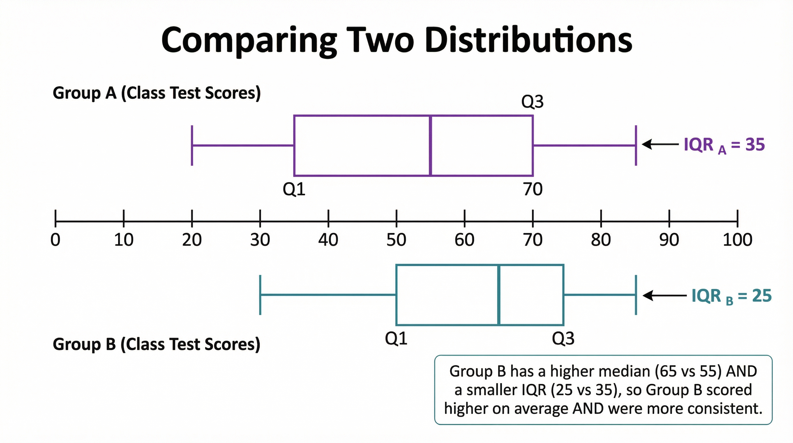
The IQR is a crucial measure of statistical spread or dispersion. It represents the range in which the middle 50% of the data lies. A smaller IQR indicates that the data points are clustered closely around the median, suggesting greater consistency. A larger IQR indicates the data is more spread out.
Formula: IQR = Upper Quartile (Q3) - Lower Quartile (Q1)
From our example above, the IQR would be 8.5 - 2.5 = 6.
In an exam, when comparing IQRs, you must use comparative language and link it to context. For instance, 'Group A has a smaller IQR than Group B, which means their performance was more consistent.' The word consistent is highly valued by examiners.
Concept 3: Identifying Skewness
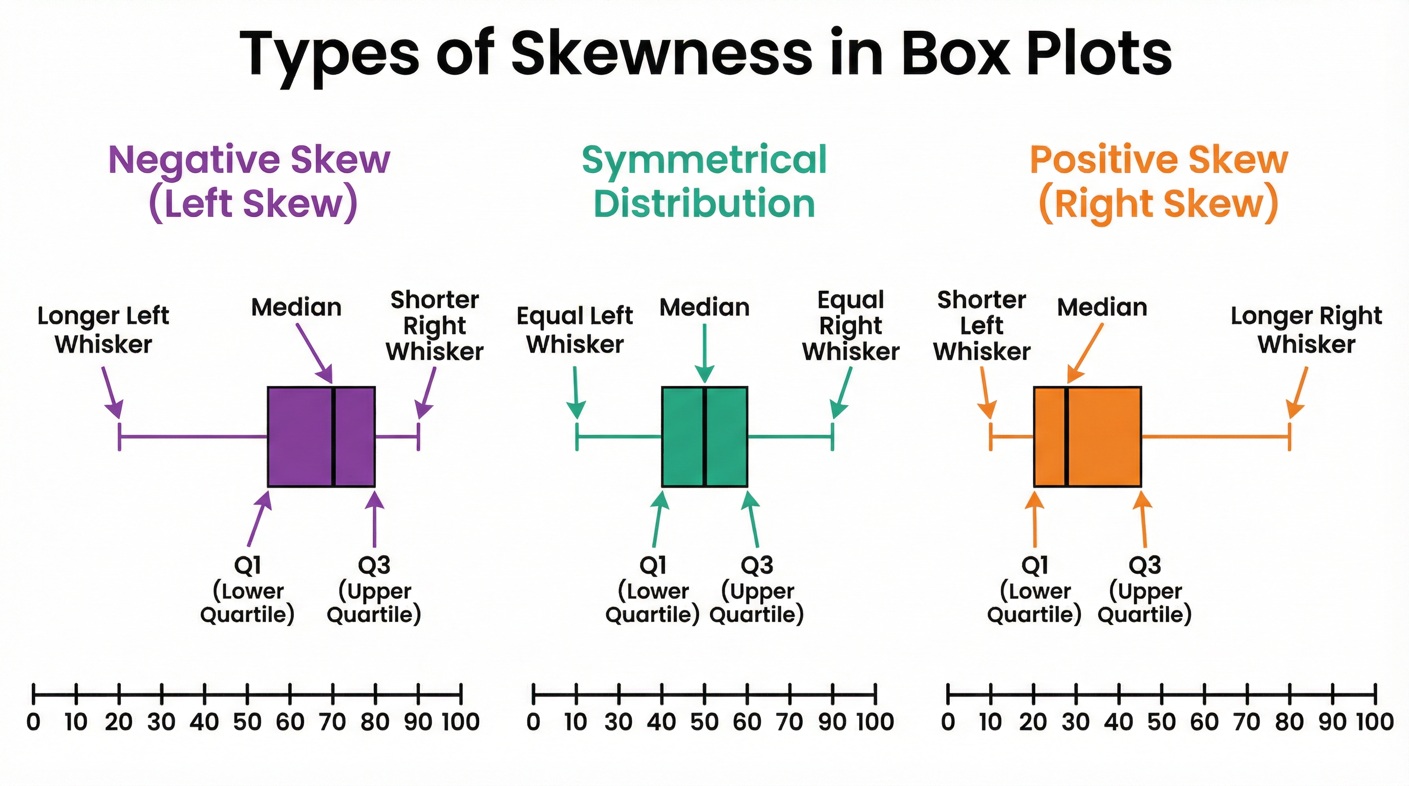
Skewness describes the asymmetry of a distribution. A box plot gives clear visual clues about the skew.
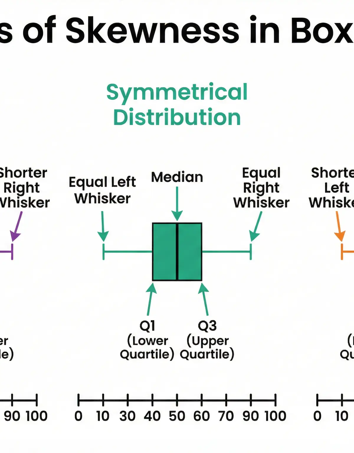
- Symmetrical Distribution: The median is located exactly in the middle of the box (Q1 to Q3), and the whiskers are of roughly equal length. This indicates the data is evenly spread around the centre.
- Positive Skew (or Right-Skewed): The median is closer to the lower quartile (Q1). This often results in the right-hand side of the box and the right whisker being longer than the left. It suggests a larger number of lower values and a tail of higher values.
- Negative Skew (or Left-Skewed): The median is closer to the upper quartile (Q3). This often results in the left-hand side of the box and the left whisker being longer than the left. It suggests a larger number of higher values and a tail of lower values.
Examiners may ask you to 'Describe the skewness'. A good answer would be: 'The distribution is positively skewed, as the median is positioned closer to the lower quartile.'
Mathematical Relationships
- Median Position (from raw data):
(n+1)/2wherenis the number of data points. - Interquartile Range (IQR):
Q3 - Q1(Must memorise) - Range:
Maximum - Minimum(Must memorise)
Practical Applications
Box plots are used extensively in the real world to compare data sets quickly. For example:
- Business: A company might use box plots to compare the monthly sales figures of two different stores to see which is more successful and which is more consistent.
- Science: Biologists could compare the heights of plants grown with two different types of fertiliser.
- Finance: An analyst might compare the daily price fluctuations of two different stocks to assess volatility (consistency).
In all these cases, the goal is the same: use the median to compare the average and the IQR to compare the spread or consistency.

Visual Resources
2 diagrams and illustrations
Interactive Diagrams
2 interactive diagrams to visualise key concepts
Conceptual Flow Outline
Flowchart showing the step-by-step process for constructing a box plot from a list of data.
Conceptual Flow Outline
Concept map for answering a 'Compare distributions' exam question.
Worked Examples
3 worked examples — open one to explore the question and available guidance.
Practice Questions
Test your understanding — click to reveal model answers
The following data represents the scores of 10 students in a quiz: 12, 15, 9, 18, 25, 15, 21, 13, 15, 19. Calculate the interquartile range.
Hint: Remember the very first step before you can find any quartiles. Then find the median of the lower and upper halves of the data.
A box plot summarises the reaction times of a group of people. The box plot has Q1 at 0.4s, a median at 0.5s, and Q3 at 0.8s. Describe the skewness of the distribution and explain what it means in this context.
Hint: Look at where the median (0.5s) is positioned between the two quartiles (0.4s and 0.8s). Is it closer to one than the other?
The times taken for two groups of runners, Group X and Group Y, to complete a race are shown in the parallel box plots below. Compare the distributions of the race times for the two groups.
[Box Plot X: Min=50, Q1=55, Med=60, Q3=62, Max=65]
[Box Plot Y: Min=45, Q1=52, Med=58, Q3=64, Max=75]
Hint: You need to make two points. One about the average (median) and one about the consistency (IQR). Use the MIC mnemonic: Median, IQR, Context.
For a dataset of 20 numbers, the quartiles are Q1=10 and Q3=22. The numbers 2 and 45 are added to the dataset. What is the largest possible value of the new interquartile range?
Hint: The original dataset had 20 numbers. The new one has 22. Think about how adding a very low and a very high number will affect the positions of the new Q1 and Q3.
Draw a box plot for the following data, and mark any outliers (values > 1.5xIQR from the box) with an 'x' and draw the whisker to the next highest/lowest value.
Data: 10, 50, 52, 53, 55, 58, 60, 62, 90
Hint: First, find the five-number summary. Then calculate the outlier boundaries. If any values are outside these boundaries, they are outliers.
Test your understanding of Box Plots
Active recall beats re-reading. Take an instant quiz now to test what you’ve learned and lock it into long-term memory.
7 days Premium · Then free forever · No card, no charge