OCR · GCSE · Further Mathematics
Cumulative Frequency
Master Cumulative Frequency for your OCR GCSE Further Maths exam. This guide breaks down how to construct and interpret cumulative frequency graphs, calculate key statistics like the median and IQR, and compare datasets to secure top marks.
- 5 min read
- 3 worked examples
- 5 practice questions
- 6 key terms
Study Notes

Overview
Cumulative Frequency is a fundamental statistical tool in Further Mathematics, allowing us to analyse grouped data in more depth than a simple frequency table. It involves creating a running total of frequencies to build a cumulative frequency curve, also known as an ogive. From this graph, candidates are expected to estimate key statistical measures like the median, quartiles, and percentiles, which are crucial for understanding the distribution of a dataset. Examiners frequently test this topic as it combines accurate graph drawing (AO1), interpretation (AO2), and problem-solving (AO3), often in the context of comparing two different datasets. Mastery of this topic provides a strong foundation for understanding more advanced statistical concepts and is a reliable way to pick up multiple marks in the Data and Probability section of the paper.
Key Concepts
Concept 1: Constructing a Cumulative Frequency Table
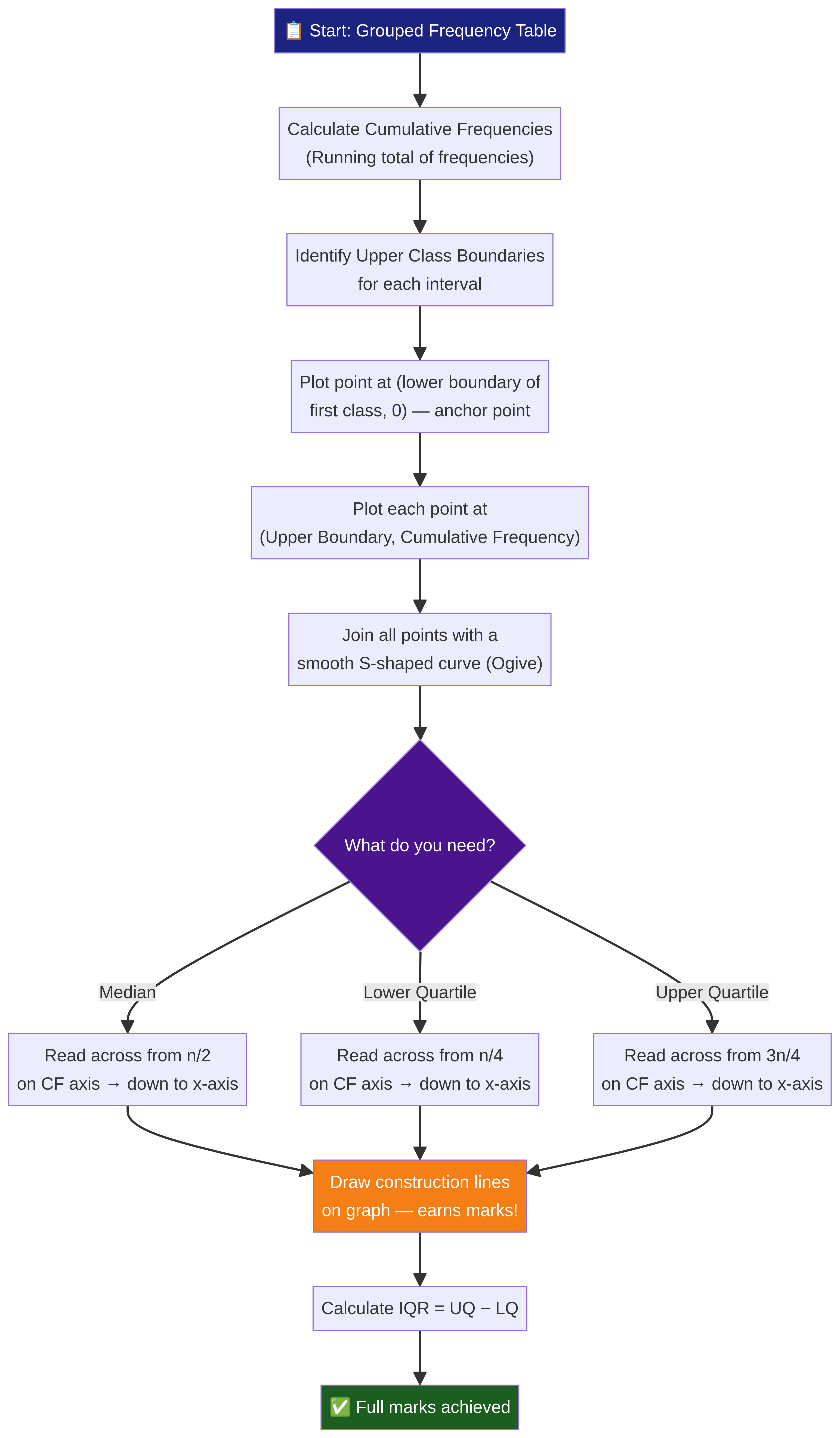
Before any graph can be drawn, you must first calculate the cumulative frequencies. This is a running total of the frequencies for each group. You simply add the frequency of the current group to the cumulative frequency of the group before it. The final cumulative frequency must equal the total number of data points (the sum of all frequencies). This acts as a vital check for your arithmetic.
Example: If the frequencies for four consecutive groups are 5, 12, 23, and 10, the cumulative frequencies would be 5, (5+12=) 17, (17+23=) 40, and (40+10=) 50.
Concept 2: Plotting the Cumulative Frequency Curve (Ogive)
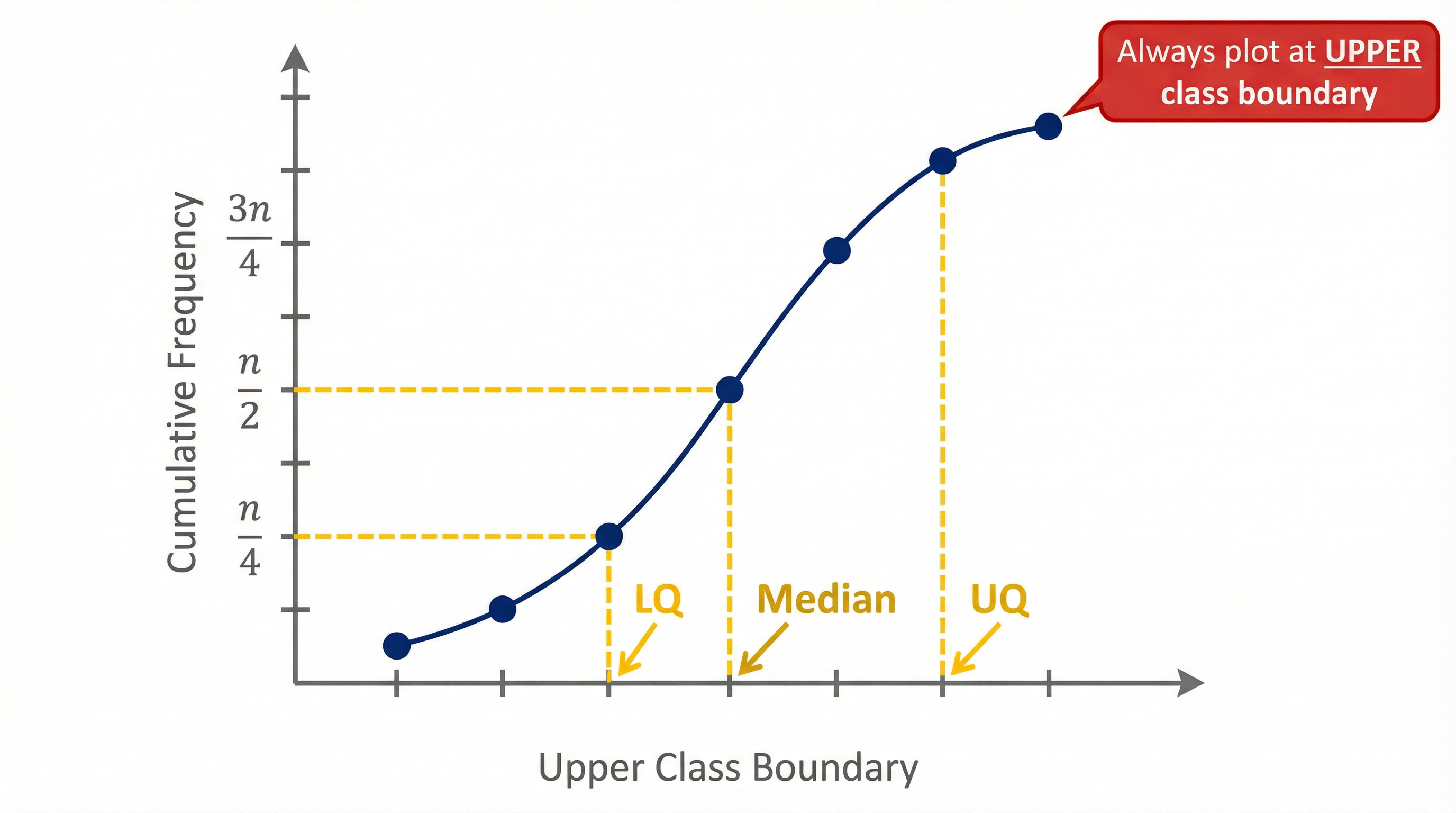
This is where precision is key to earning marks. A cumulative frequency curve is plotted using the upper class boundary of each interval on the x-axis and the corresponding cumulative frequency on the y-axis. A common mistake is to use the midpoint, which will shift your entire graph. Crucially, the curve must be anchored at the start: you must plot a point at the lower class boundary of the first interval with a cumulative frequency of 0. The points are then joined with a smooth S-shaped curve or, acceptably, with straight lines.

Concept 3: Estimating Median and Quartiles
Once the graph is drawn, it can be used to estimate key measures of location. These are found by reading from the y-axis (Cumulative Frequency) across to the curve and then down to the x-axis.
- Median (Q2): The middle value. Found at the n/2-th position in the data. Read across from 1/2 of the total frequency.
- Lower Quartile (LQ / Q1): The value 25% of the way through the data. Found at the n/4-th position. Read across from 1/4 of the total frequency.
- Upper Quartile (UQ / Q3): The value 75% of the way through the data. Found at the 3n/4-th position. Read across from 3/4 of the total frequency.
Examiners award marks for showing clear construction lines on your graph for these readings.
Concept 4: The Interquartile Range (IQR)
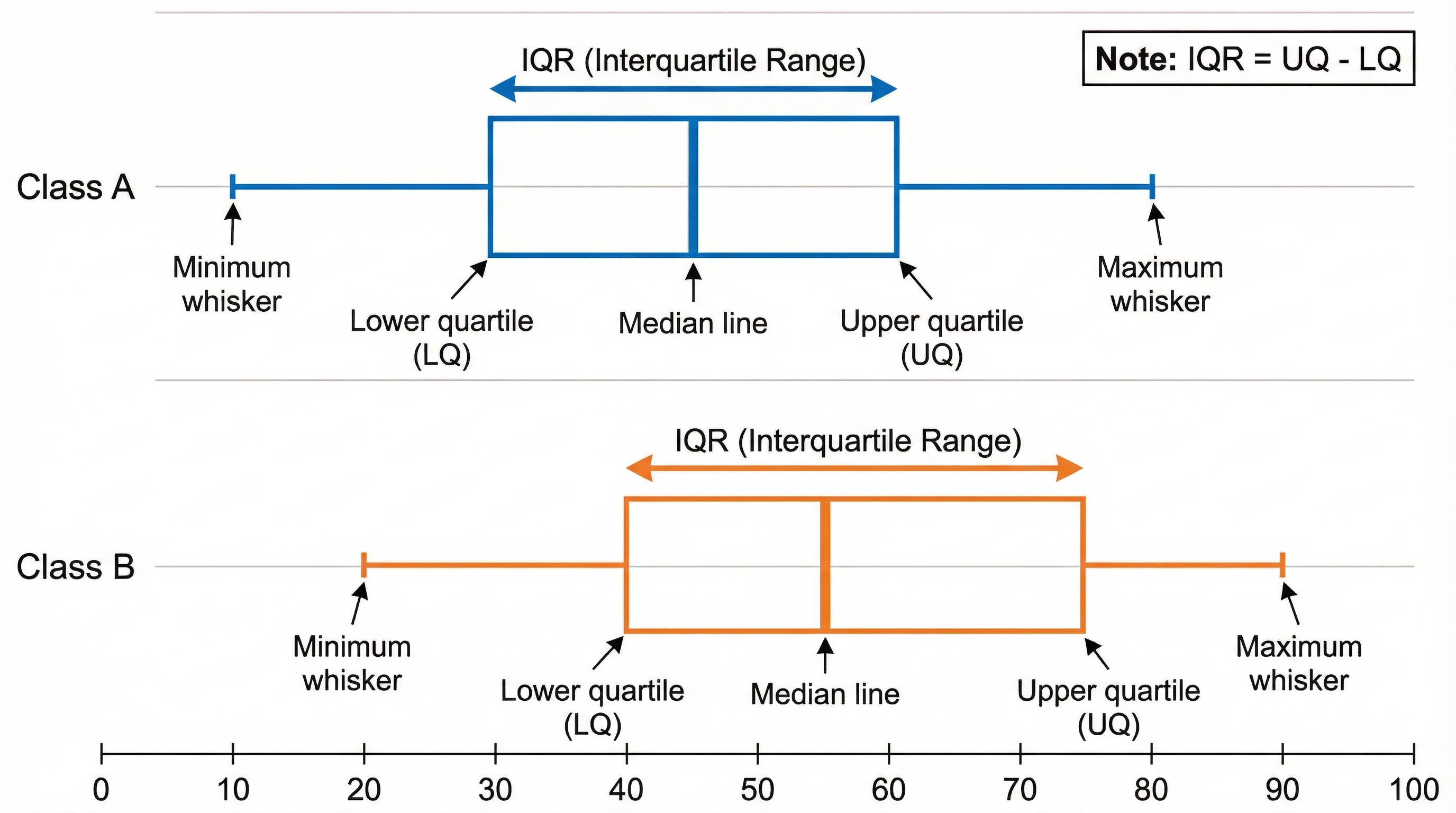
The IQR is a measure of statistical dispersion, or spread. It represents the range of the middle 50% of the data and is less affected by outliers than the simple range. It is a crucial tool for comparing the consistency of two datasets.
Mathematical/Scientific Relationships
- Interquartile Range (IQR):
IQR = Upper Quartile (UQ) - Lower Quartile (LQ)(Must memorise) - Median Position:
n/2where 'n' is the total frequency. (Must memorise) - Lower Quartile Position:
n/4(Must memorise) - Upper Quartile Position:
3n/4(Must memorise) - Percentile Position: For the P-th percentile, find
(P/100) * non the cumulative frequency axis. (Must memorise)
Practical Applications
Cumulative frequency is used in many real-world scenarios to understand distributions. For example:
- Business: Analysing the distribution of customer spending or sales figures to identify key price points.
- Quality Control: Monitoring the weights or dimensions of manufactured products to see how many fall outside acceptable limits.
- Education: Analysing exam scores to understand the overall performance of a cohort and to set grade boundaries.
- Healthcare: Studying the distribution of patient recovery times or blood pressure readings.

Podcast Episode
Listen to our 10-minute deep-dive podcast on this topic, covering core concepts, exam technique, and a quick-fire quiz to test your knowledge.
Visual Resources
4 diagrams and illustrations
Interactive Diagrams
2 interactive diagrams to visualise key concepts
Conceptual Flow Outline
A flowchart showing the complete process from a frequency table to calculating the IQR, highlighting key mark-earning steps.
Conceptual Flow Outline
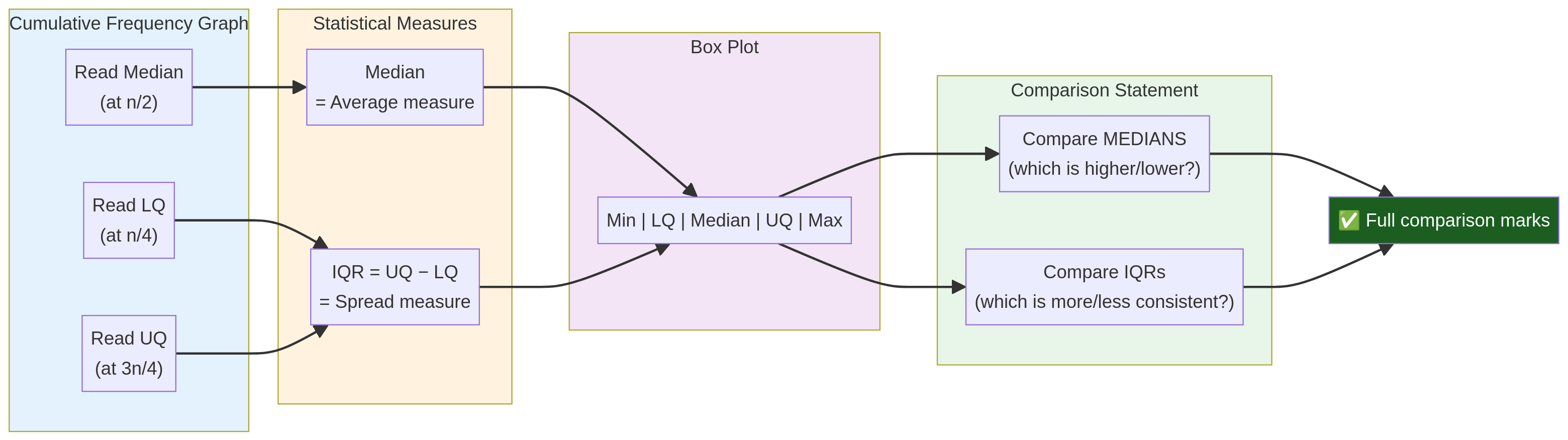
A concept map showing how readings from a cumulative frequency graph are used to calculate statistics (Median, IQR) and construct box plots, leading to a full comparison.
Worked Examples
3 worked examples — open one to explore the question and available guidance.
Practice Questions
Test your understanding — click to reveal model answers
The heights of 100 year 11 students were recorded. The table shows the information. Calculate an estimate for the mean height.
Hint: This is a trick question! You cannot calculate the mean from a standard cumulative frequency table. What information is missing? This is a synoptic link to the 'Averages from a table' topic.
A cumulative frequency graph shows the scores of 200 candidates in a test. The lower quartile is 35 marks and the interquartile range is 22 marks. Find the upper quartile.
Hint: Rearrange the formula for the IQR.
Draw a box plot for a dataset with the following summary statistics: Minimum=12, Maximum=98, Median=54, LQ=30, UQ=70.
Hint: You need a scale, a box from LQ to UQ, a line for the median, and two whiskers.
The top 10% of candidates in the test (total 200 candidates) are awarded a distinction. Use your cumulative frequency graph to estimate the minimum mark needed for a distinction.
Hint: The top 10% are the ones with the highest scores. Where are they on the cumulative frequency axis?
Two different groups of students, Group A and Group B, took the same test. Their results are summarised in the box plots below. Compare the performance of the two groups.
Hint: You must compare two things: a measure of average (median) and a measure of spread (IQR or range).
Test your understanding of Cumulative Frequency
Active recall beats re-reading. Take an instant quiz now to test what you’ve learned and lock it into long-term memory.
7 days Premium · Then free forever · No card, no charge