Data Handling
Master OCR GCSE Data Handling with this guide, covering everything from basic charts to advanced histograms and cumulative frequency. Learn to interpret data, nail exam questions, and secure top marks.
Study Notes

Overview
Data Handling is a cornerstone of mathematics, focusing on the collection, presentation, and analysis of information. For your OCR GCSE exam, this topic is crucial as it appears in every paper, testing your ability to not only construct statistical diagrams but also to critically interpret and compare them. This guide will take you from foundational concepts like bar charts and averages, essential for all candidates, to the more demanding Higher Tier topics such as histograms with unequal class widths and cumulative frequency analysis. By mastering these skills, you will be equipped to tackle a wide range of exam questions, from straightforward data representation to complex, multi-step problems requiring you to draw conclusions and justify your reasoning. A strong grasp of data handling is not just about passing your maths GCSE; it is about developing the critical thinking skills needed to understand and question the statistics you encounter every day.
Key Concepts
Concept 1: Averages and Measures of Spread
Understanding how to describe a dataset is fundamental. This involves calculating measures of central tendency (averages) and measures of spread (consistency).
- Mean: The sum of all data points divided by the number of data points. It gives a good overall picture but can be skewed by extreme values (outliers).
- Median: The middle value when the data is arranged in order. It is not affected by outliers, making it a robust measure of the average.
- Mode: The most frequently occurring value. A dataset can have one mode (unimodal), two modes (bimodal), or more.
- Range: The difference between the highest and lowest values. It is a simple measure of spread but can be misleading if there are outliers.
- Interquartile Range (IQR): The difference between the upper quartile (Q3) and the lower quartile (Q1). It measures the spread of the middle 50% of the data and is not affected by outliers, making it a more reliable measure of spread than the range.
Concept 2: Grouped Frequency Tables
Often, data is presented in groups or classes (e.g., 10 < h ≤ 20). You need to be able to work with this format.
- Modal Class: The class with the highest frequency.
- Estimate of the Mean: You cannot find the exact mean from grouped data. Instead, you calculate an estimate by assuming every value in a class is equal to the midpoint. The formula is: Estimated Mean = Σ(f × x) / Σf, where 'f' is the frequency and 'x' is the midpoint of the class.
Concept 3: Histograms (Higher Tier)
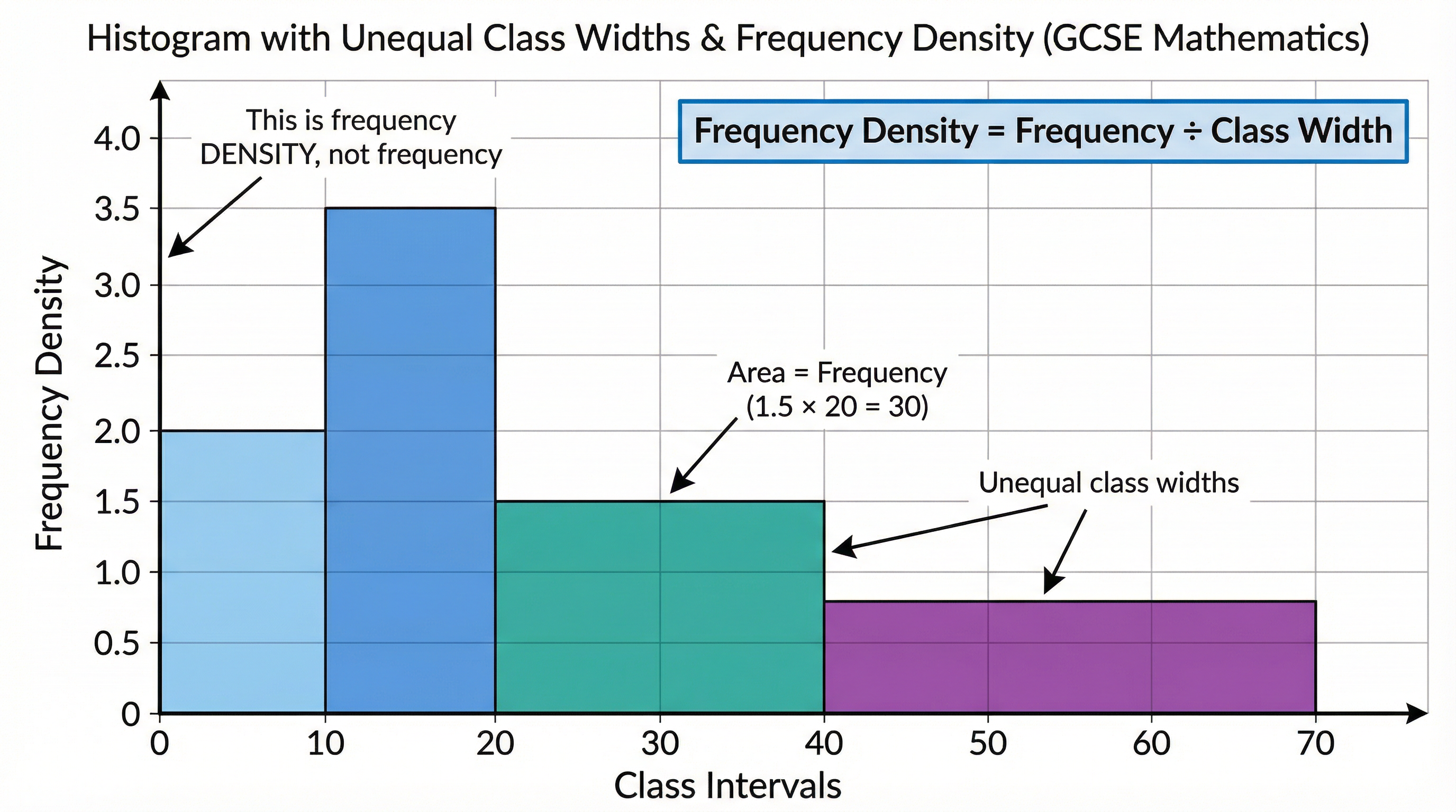
Histograms are used to represent continuous data. For GCSE Higher Tier, you must be able to handle histograms with unequal class widths. This is a common area where marks are lost.
- Key Principle: In a histogram, the area of the bar represents the frequency.
- Frequency Density: Because Area = Frequency, it follows that Height = Frequency / Width. This 'height' is called Frequency Density. You MUST plot Frequency Density on the y-axis.
- Formula: Frequency Density = Frequency / Class Width
Concept 4: Cumulative Frequency (Higher Tier)
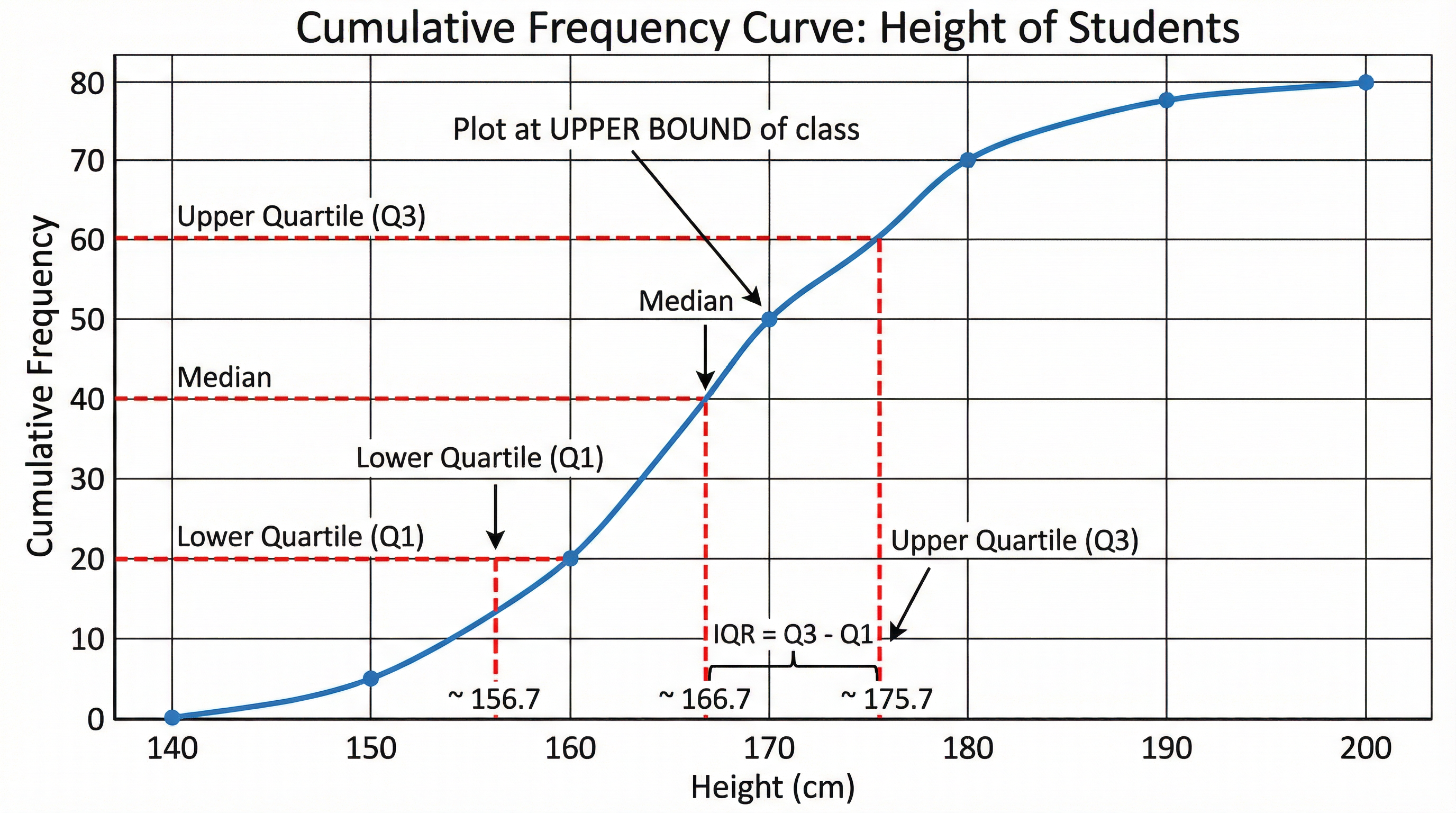
Cumulative frequency is the running total of the frequencies. A cumulative frequency graph is a powerful tool for estimating the median and quartiles.
- Plotting: Always plot the cumulative frequency at the upper bound of each class interval.
- Shape: The graph should be a smooth 'S'-shaped curve.
- Estimating Values: You can use the graph to find the median (at 50% of the total frequency), the lower quartile (at 25%), and the upper quartile (at 75%).
Concept 5: Box Plots (Higher Tier)
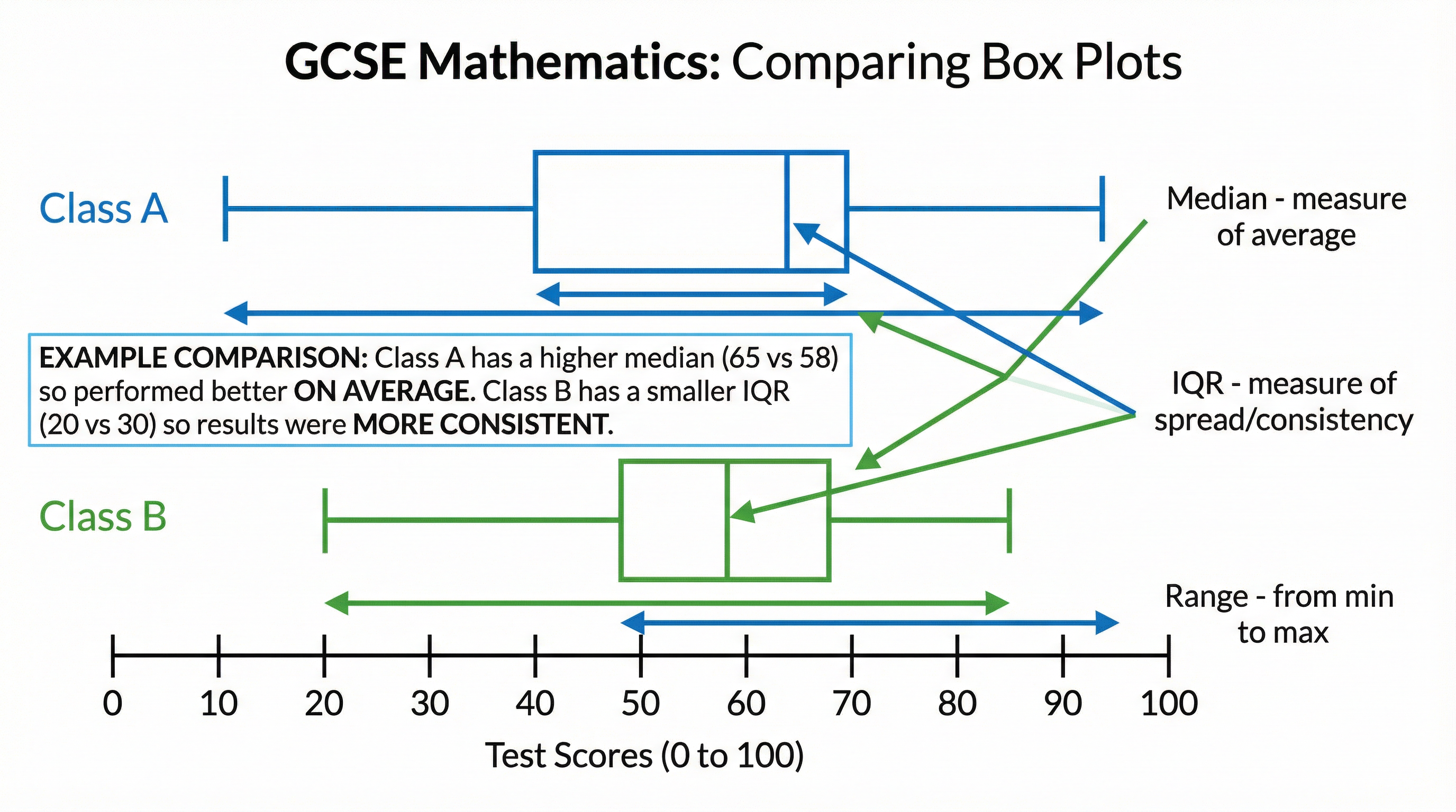
Box plots (or box-and-whisker diagrams) are a visual representation of the five-figure summary: Minimum, Lower Quartile (Q1), Median (Q2), Upper Quartile (Q3), and Maximum.
- Comparison: They are excellent for comparing two or more datasets. When comparing, you MUST comment on both a measure of location (the median) and a measure of spread (the IQR or range).
Mathematical/Scientific Relationships
- Estimated Mean from Grouped Data:
x̄ ≈ Σ(f × x) / Σf(Must memorise) - Frequency Density:
Frequency Density = Frequency / Class Width(Must memorise) - Interquartile Range (IQR):
IQR = Q3 - Q1(Must memorise)
Practical Applications
Data handling is used everywhere, from analysing business performance and scientific experiments to understanding social trends. For example, the Office for National Statistics (ONS) uses these techniques to analyse census data, helping the government to plan for services like schools and hospitals. In business, a company might use box plots to compare the performance of two different sales teams. Understanding how to critically read a chart is a vital life skill to avoid being misled by biased or poorly constructed graphics in the media.
Visual Resources
3 diagrams and illustrations
Interactive Diagrams
2 interactive diagrams to visualise key concepts
Conceptual Flow Outline
A flowchart to help decide which data handling technique to use for different types of questions.
Diagram could not be rendered
A Gantt chart providing a sample revision schedule for the Data Handling topic.
Worked Examples
3 detailed examples with solutions and examiner commentary
Practice Questions
Test your understanding — click to reveal model answers
A survey of 60 shoppers showed how much they spent on food. The cumulative frequency graph shows this information. Use the graph to find an estimate for the median amount spent.
Hint: The median is the value for the middle person. Where on the y-axis would you find the middle of 60 shoppers?
The table gives information about the weights of 50 packages. Find an estimate for the mean weight.
Hint: You can't use the exact weights, so what is the best estimate for the weight of all packages in a group?
A histogram is drawn for the heights of a group of students. The bar for the class 150 < h ≤ 160 has a width of 2cm and a height of 5cm. The bar for the class 160 < h ≤ 180 has a width of 4cm. Find the height of this second bar if there were 40 students in the 160 < h ≤ 180 class.
Hint: Remember that Area = Frequency. What is the 'real' class width, not the diagram width?
Two friends, Sam and Tom, record their 100m sprint times. The box plots summarise their results. Compare their performance.
Hint: You need to make two points of comparison. One about their average time, and one about how consistent they are.
A researcher is investigating the heights of plants. She plots a cumulative frequency graph. Explain how she can use the graph to find the number of plants with a height greater than 60cm.
Hint: The graph shows the number of plants with a height LESS than or equal to a certain value.