Data representation (tables, charts, graphs) — WJEC GCSE study guide illustration

    Data representation (tables, charts, graphs)

    WJEC
    GCSE
    Mathematics

    This guide provides a comprehensive overview of Data Representation for WJEC GCSE Mathematics, focusing on the precise construction and interpretation of statistical diagrams. It covers everything from frequency polygons to histograms with unequal class widths, equipping you with the skills to earn maximum marks.

    5
    Min Read
    3
    Examples
    5
    Questions
    6
    Key Terms
    🎙 Podcast Episode
    Data representation (tables, charts, graphs)
    0:00-0:00

    Study Notes

    Header image for Data Representation

    Overview

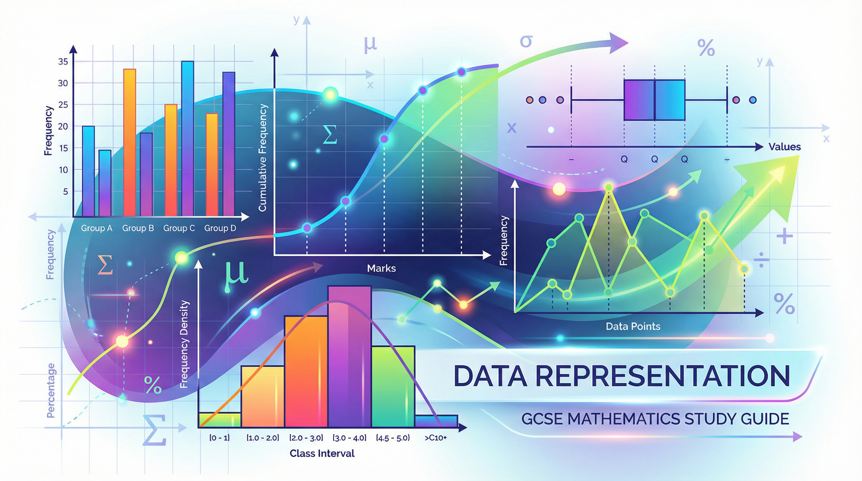
    Data Representation (WJEC 4.2) is a cornerstone of the GCSE Mathematics curriculum, focusing on how we visually present and interpret numerical information. This topic is not just about drawing neat charts; it's about telling a story with data. Examiners are looking for candidates who can accurately construct a range of diagrams and, crucially, use them to make insightful comparisons and draw valid conclusions. From frequency polygons and cumulative frequency curves to the more demanding histograms with unequal class widths (Higher tier), mastering this area is essential for exam success. A strong grasp of data representation also provides a foundation for understanding probability and statistical testing, making it a key synoptic link across the specification. Expect to see questions that require you to both draw a chart from a table of data and interpret a given chart to find averages, spreads, or compare distributions.

    GCSE Maths Mastery Podcast: Data Representation

    Key Concepts

    Concept 1: Frequency Polygons

    A frequency polygon is used to represent grouped frequency data. Unlike a bar chart, it helps to show the shape of the distribution more clearly. The key principle is to plot frequency against the midpoint of each class interval. Once all points are plotted, they are joined with straight lines using a ruler to form a polygon. It is a common error to join the points with a smooth curve, which is incorrect and will lose marks. To complete the polygon, it should be anchored to the horizontal axis by extending the lines to the midpoints of the classes immediately before the first class and after the last class (where the frequency is zero).

    Example: For a class interval of '10-20' with a frequency of 8, you would plot the point at (15, 8).

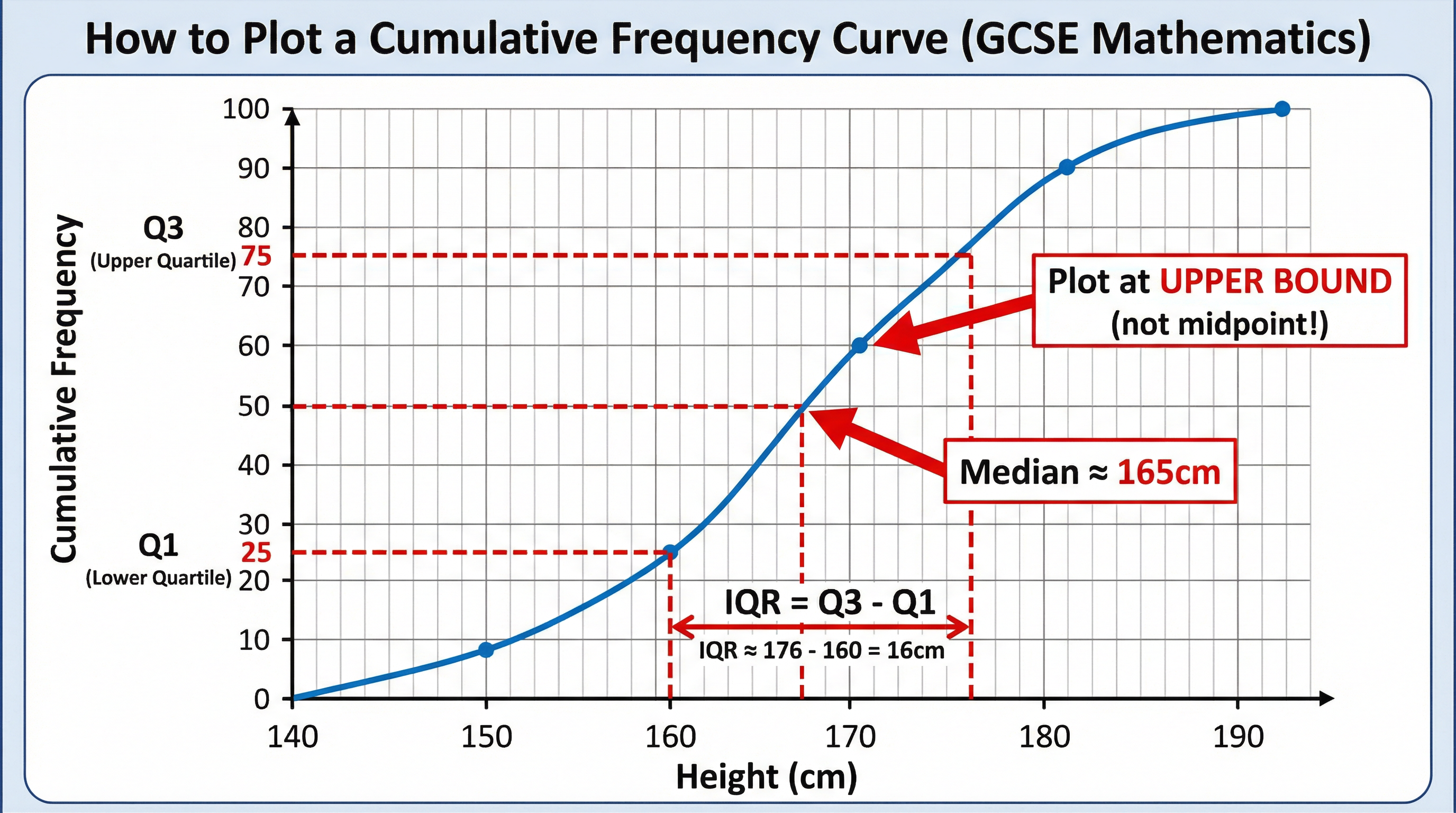
    Concept 2: Cumulative Frequency Curves

    Cumulative frequency is a running total of the frequencies. A cumulative frequency curve (or ogive) is a graphical representation of this information, which is particularly useful for estimating the median and quartiles of a distribution. The most critical rule for candidates to remember is that cumulative frequency values are plotted against the upper bound of each class interval, not the midpoint. A failure to do so is one of the most common mistakes. After plotting the points, they are joined with a smooth, S-shaped curve.

    Example: If the cumulative frequency for the class '10-20' is 25, you plot the point at (20, 25).

    How to plot a cumulative frequency curve and find the median/IQR.

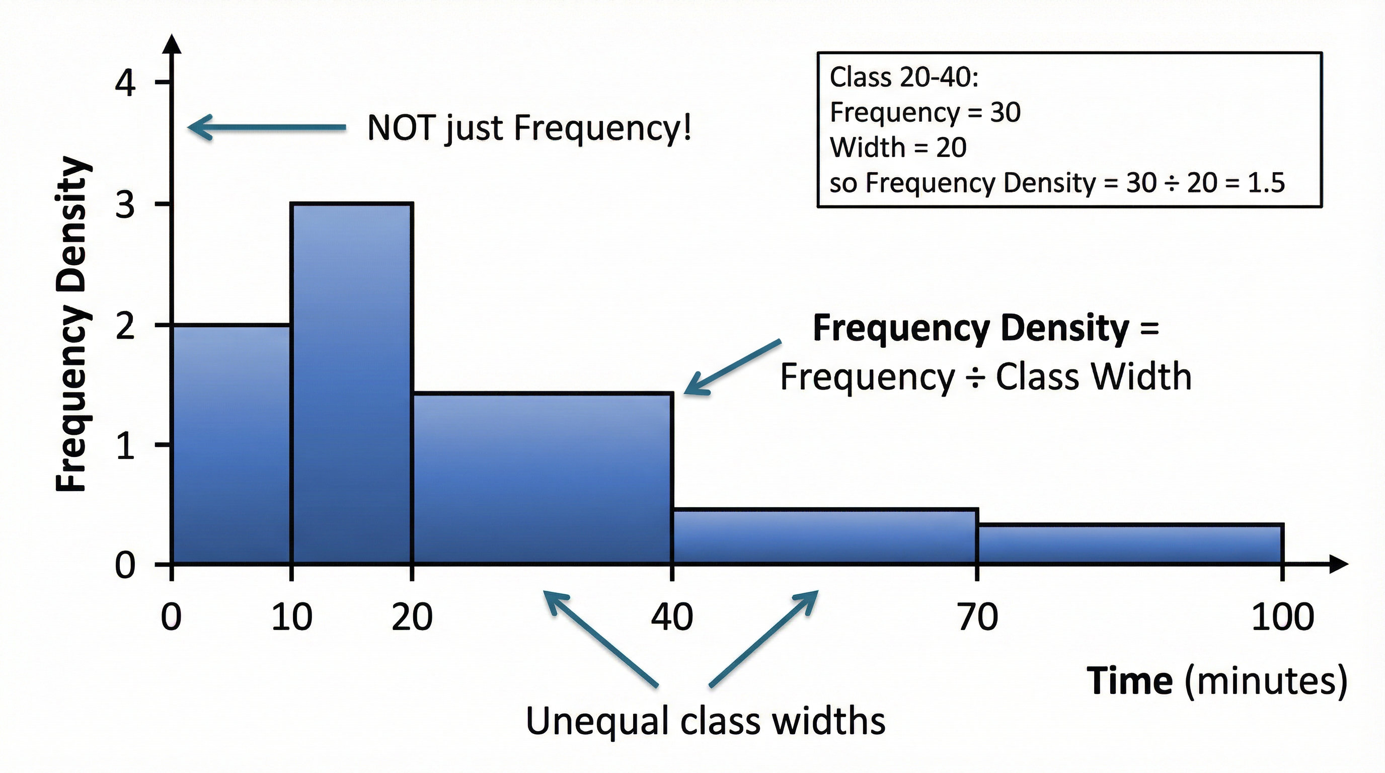
    Concept 3: Histograms with Unequal Class Widths (Higher Tier Only)

    Histograms are used for continuous data. While they look similar to bar charts, there are no gaps between the bars. For Higher tier candidates, a key challenge is constructing histograms where the class intervals have different widths. In this case, the height of each bar does not represent the frequency. Instead, we must calculate and plot the Frequency Density. The area of the bar (Frequency Density x Class Width) represents the frequency. The vertical axis must be labelled 'Frequency Density'.

    Key features of a histogram with unequal class widths.

    Mathematical/Scientific Relationships

    • Frequency Density: Frequency Density = Frequency / Class Width (Must memorise)
    • Median from a Cumulative Frequency Curve: Find the value on the horizontal axis corresponding to 50% of the total frequency.
    • Lower Quartile (Q1): Find the value corresponding to 25% of the total frequency.
    • Upper Quartile (Q3): Find the value corresponding to 75% of the total frequency.
    • Interquartile Range (IQR): IQR = Q3 - Q1 (Must memorise). This is a measure of spread or consistency.

    Practical Applications

    Data representation is used everywhere in the real world. Governments use it to present census data on population demographics. Scientists use it to show the results of experiments, for example, plotting the growth of plants over time. In business, sales figures are often represented using charts to track performance and identify trends. Understanding how to read and create these diagrams is a vital life skill for interpreting information presented in the media and making informed decisions.

    Worked Examples

    3 detailed examples with solutions and examiner commentary

    Practice Questions

    Test your understanding — click to reveal model answers

    Q1

    The frequency polygon shows the distribution of the weights of 50 apples. What is the modal class?

    1 marks
    foundation

    Hint: The mode is the most frequent value. Where is the peak of the polygon?

    Q2

    A cumulative frequency curve is drawn for the heights of 120 plants. Estimate the interquartile range.

    3 marks
    standard

    Hint: Find the values for the upper quartile (Q3 at 75%) and lower quartile (Q1 at 25%) and then find the difference.

    Q3

    A table shows the ages of people in a cinema. The 0-20 age group has a frequency of 40. In a histogram, the bar for this group has a width of 5cm and a height of 4cm. The 20-30 age group has a frequency of 30. What is the height of the bar for the 20-30 age group?

    4 marks
    challenging

    Hint: The area of the bar represents the frequency. Find the scale that links area to frequency.

    Q4

    Describe a key difference in the method of construction between a frequency polygon and a cumulative frequency curve.

    2 marks
    standard

    Hint: Think about where you plot the points and how you join them.

    Q5

    A histogram is drawn for data with unequal class widths. The bar for the class 10-15 has a frequency density of 6. What is the frequency for this class?

    2 marks
    standard

    Hint: Frequency = Frequency Density x Class Width.

    Key Terms

    Essential vocabulary to know

    More Mathematics Study Guides

    View all

    Geometry and Measures Skills: Volume

    Edexcel
    GCSE

    Master the essential skill of calculating volume for your Edexcel GCSE Maths exam. This guide breaks down everything from simple prisms to complex composite solids, giving you the formulas, exam techniques, and memory hooks needed to secure top marks.

    Statistics Skills: Averages (Mean, Median, Mode)

    Edexcel
    GCSE

    Master the essential Statistics skills of Mean, Median, and Mode for your Edexcel GCSE Maths exam. This guide breaks down how to calculate, interpret, and compare averages, securing you top marks on these guaranteed-to-appear questions.

    Vectors

    AQA
    GCSE

    This guide provides a comprehensive overview of Vectors for AQA GCSE Mathematics, covering everything from basic column notation to complex geometric proofs. It's designed to help you secure every possible mark by focusing on examiner expectations, common pitfalls, and powerful memory techniques.

    Powers and roots

    OCR
    GCSE

    Unlock the power of numbers! This guide demystifies powers and roots for your OCR GCSE Maths exam, showing you how to master index laws and tackle complex calculations with confidence. From basic squares to tricky fractional indices, we'll equip you with the techniques to secure every last mark.

    Vectors

    OCR
    GCSE

    Master OCR GCSE Vectors with this guide, packed with examiner tips and interactive content. We'll break down everything from basic column vectors to complex geometric proofs, showing you how to secure every mark and turn a tricky topic into one of your strengths.

    Data collection (sampling, questionnaires)

    WJEC
    GCSE

    Master WJEC GCSE Mathematics Data Collection (4.1) by learning how to design flawless questionnaires and calculate representative samples. This guide will show you how to secure every mark by avoiding common pitfalls and applying examiner-approved techniques for sampling and data presentation.