AQA · A-Level · Psychology
Course version: 7182-2025 · Exams from 2027
Plot two variables from experimental or other data (to include: sketching…
Full specification wording
Graphs: Plot two variables from experimental or other data (to include: sketching a scatter diagram using two sets of data from a correlational investigation)
Plotting two variables from experimental or other data requires selecting an appropriate graph.
Checked against the AQA 7182-2025 specification (opens in a new tab) on .
- Point 2 of 2
- 3 key terms
Study notes
From the checked teaching notes for this specification point.
The idea
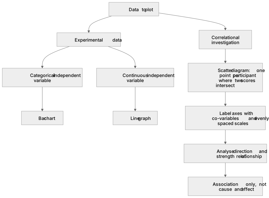
Plotting two variables from experimental or other data requires selecting an appropriate graph. For experimental data, a bar chart plots a categorical independent variable against a continuous dependent variable (e.g., mean words recalled for two groups). A line graph plots a continuous independent variable against a continuous dependent variable. You must also be able to sketch a scatter diagram using two sets of data from a correlational investigation. Each point represents a participant's scores on both co-variables. Axes must be clearly labelled and evenly scaled. The plot is analysed for the direction and strength of the relationship; points rising from left to right indicate a positive correlation.
What earns the marks
- Accurately plotting two variables from experimental data, selecting bar charts for categorical independent variables and line graphs for continuous variables.
- Sketching a scatter diagram using two sets of data from a correlational investigation by plotting one point for each participant where their two scores intersect.
- Ensuring both axes on a scatter diagram are clearly labelled with the co-variables and feature evenly spaced numerical scales.
- Identifying the relationship shown by the points (positive, negative, or zero correlation) and expressing it in terms of the specific co-variables.
- Recognising that a scatter diagram displays an association between two measured variables and cannot be used to establish a cause-and-effect relationship.
Common mistakes and how to put them right
Connecting the points in a scatter diagram with a line in the order they were plotted.
Put it right: Leave the individual points unconnected to accurately represent a correlational investigation.
Using a scatter diagram to plot experimental data that features a categorical independent variable.
Put it right: Select a bar chart to plot a categorical independent variable against a continuous dependent variable.
Using causal language when interpreting a scatter diagram, such as stating one variable 'caused' a change in the other.
Put it right: Use associative language, as correlational data does not involve manipulation of variables.
Exam tips
- When instructed to sketch a scatter diagram using two sets of data from a correlational investigation, always include a descriptive title and ensure your axis scales are linear and evenly spaced.
- If asked to interpret a scatter diagram, explicitly state the direction (e.g., positive) and strength (e.g., strong) of the correlation, referencing the specific co-variables plotted.
Try the lesson
The start of the Graphs: Plot two variables from experimental or other data (to include: sketching a scatter diagram using two sets of data from a correlational investigation) lesson, made from checked teaching notes for this specification point.
Have a go first
A psychologist conducts a correlational investigation to explore the relationship between hours of sleep and scores on a concentration test. How should the researcher plot these two variables to sketch a scatter diagram?
Listen
Plotting two variables from experimental or other data requires selecting an appropriate graph. For experimental data, a bar chart plots a categorical independent variable against a continuous dependent variable (e.g., mean words recalled for two groups). A line graph plots a continuous independent variable against a continuous dependent variable. You must also be able to sketch a scatter diagram using two sets of data from a correlational investigation. Each point represents a participant's scores on both co-variables. Axes must be clearly labelled and evenly scaled. The plot is analysed for the direction and strength of the relationship; points rising from left to right indicate a positive correlation. A strong answer earns marks for these points. Accurately plotting two variables from experimental data, selecting bar charts for categorical independent variables and line graphs for continuous variables. Sketching a scatter diagram using two sets of data from a correlational investigation by plotting one point for each participant where their two scores intersect. Ensuring both axes on a scatter diagram are clearly labelled with the co-variables and feature evenly spaced numerical scales. Identifying the relationship shown by the points (positive, negative, or zero correlation) and expressing it in terms of the specific co-variables. A common slip: Connecting the points in a scatter diagram with a line in the order they were plotted. Instead, Leave the individual points unconnected to accurately represent a correlational investigation. Exam tip: When instructed to sketch a scatter diagram using two sets of data from a correlational investigation, always include a descriptive title and ensure your axis scales are linear and evenly spaced.
See it
Key words
Say what each word means before you turn the card.
Bar chart
Try answering aloud or in your head before turning the card.
Line graph
Try answering aloud or in your head before turning the card.
Positive correlation
Try answering aloud or in your head before turning the card.
See every definition
- Bar chart
- A graph that plots a categorical independent variable against a continuous dependent variable, for example mean words recalled for two groups.
- Line graph
- A graph that plots a continuous independent variable against a continuous dependent variable.
- Positive correlation
- A relationship in which points on the plot rise from left to right.
Label the diagram
Some boxes have lost their names. Pick the right name for each number.
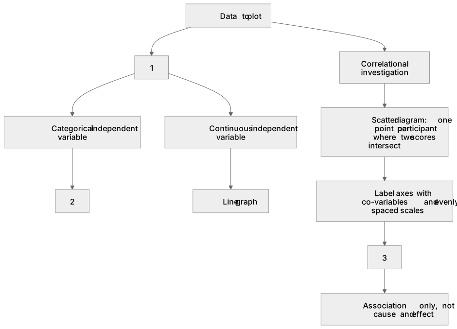
1Box 1
2Box 2
3Box 3
There is more to this lesson
The full lesson goes on to check your understanding and help you earn the marks. Create a free account to carry on, with your progress saved.
A week of Premium from your first lesson · Then the free plan continues · No card, no charge
Test your understanding of Graphs: Plot two variables from experimental or other data (to include: sketching a scatter diagram using two sets of data from a correlational investigation)
Active recall beats re-reading. Take an instant quiz now to test what you’ve learned and lock it into long-term memory.
A week of Premium from your first lesson · Then the free plan continues · No card, no charge