Inflation and Unemployment Explained for GCSE and A-Level
You're sat in class, the paper's on your desk, and the topic looks familiar but slippery. One minute it's about prices in the shops, the next it's about your mate not finding work, then the teacher starts talking about policy and diagrams and everyone starts guessing.
That's why inflation and unemployment keeps coming up in GCSE and A-Level economics. It feels simple at first, prices rising and jobs falling, but examiners love it because the topic tests whether you can think clearly when the economy sends mixed signals. A parent worries about bills, a teenager wants a Saturday job, and the Bank of England has to decide whether to cool demand or protect jobs. Those are not separate stories, they're the same economy pulling in different directions.
The easiest way to beat this topic is to stop treating it like a list of definitions and start treating it like a pattern. Prices can rise while unemployment stays low. Unemployment can rise while inflation stays high. Sometimes both get worse together, which is exactly where the best exam answers begin.
If you want a quick revision start before reading on, Online Revision for GCSE is a useful place to test yourself on the basics while the ideas are still fresh.
The Two Forces That Shape Every Economy
Think about a household that's watching food prices climb while one parent's overtime dries up. That's the pressure behind this topic. Inflation makes money buy less. Unemployment means labour is being wasted, because people want work and can't get it.
The reason examiners keep returning to this pair is simple. Governments rarely get to choose one problem in isolation. If demand is too hot, prices can rise. If demand is too weak, firms stop hiring and unemployment can rise. The whole debate is about balance, and that's why it shows up in essays about growth, living standards, policy and stability.
Why students lose marks fast
Most weak answers jump straight into a diagram without saying what the forces do in the economy. That's a mistake. You need to say that inflation reduces purchasing power, while unemployment reduces output, income and confidence. Then the examiner can see that you understand the economic problem, not just the diagram.
Practical rule: if a question says “explain”, start with the people affected, then move to the policy consequence. That keeps your answer anchored in reality instead of floating in theory.
The best way to remember the pair is this. Inflation is the problem of money losing value. Unemployment is the problem of people losing opportunity. In exam terms, that's a clean opening line for almost any short answer or essay intro.
A strong revision habit is to keep asking one question, “What happens to households, firms and the government when both move in the wrong direction?” That question forces you to think beyond definitions, which is exactly where higher-level marks live.
Defining Inflation and Unemployment
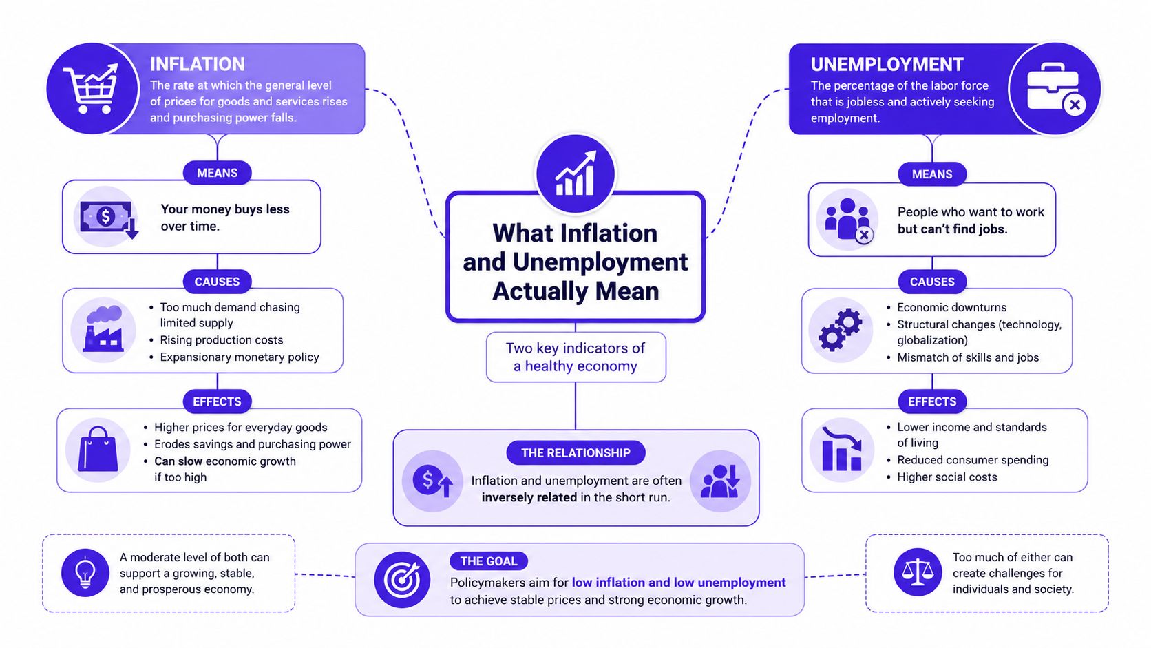
Inflation is the rise in the average price level over time. If a £10 note buys less at the till than it used to, inflation is the reason. In the UK, exam boards usually expect you to know CPI, the Consumer Prices Index, and sometimes RPI, the Retail Prices Index, so don't mix them up. CPI is the main official measure, while RPI is older and still appears in some historical examples and exam questions.
Unemployment means people who want a job, are available for work, and can't find one. A simple way to remember it is wasted talent. A person ready to work but stuck at home is like a parked car with fuel in the tank, useful, but not being used.
The classic causes also matter. Demand-pull inflation happens when total spending rises too quickly. Cost-push inflation happens when production costs rise and firms pass them on. For unemployment, you need the trio of frictional, structural and cyclical. Frictional is the short gap between jobs, structural is a mismatch of skills or location, and cyclical rises when the economy slows down.
The old UK RPI inflation reached 25.4% in 1975, while unemployment rose above 1 million in 1976 and kept climbing later in the decade, a classic reminder that the simple trade-off does not always hold (Pew Research on inflation and unemployment through the decades). That example matters because it shows why a neat textbook definition is never enough on its own. In exam terms, the 1970s are the warning label.
If you're revising for a 2-mark define question, keep it tight. Say what the term is, then add the UK measure if needed. If you're writing about causes, name the type. That is where lots of students lose marks, by describing the result but not classifying the type properly.
For a quick support check on the topic split, MasteryMind's Economics support for students can help you test whether you're using the right measure and the right cause.
The Phillips Curve and Why It Breaks
The original idea
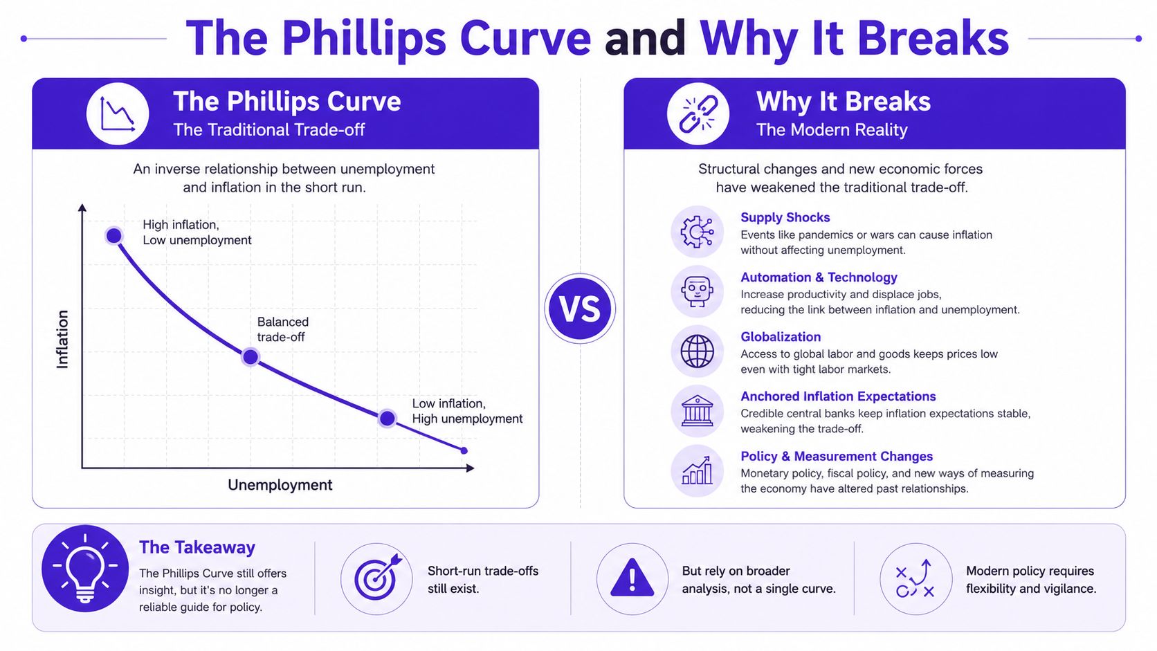
The Phillips curve starts with a very tidy idea. A. W. H. Phillips used British wage and unemployment data from 1861 to 1957 to show an inverse relationship between unemployment and wage inflation (AEA chart on Phillips's original work). When unemployment was low, wages tended to rise faster. When unemployment was high, wage growth tended to slow.
That became the famous downward-sloping curve in economics classrooms. The logic feels intuitive. If firms are competing for workers, they have to offer better pay. If lots of workers are looking for jobs, firms feel less pressure to raise wages. Students usually get this part right, which is why the curve appears so often in exams.
Where the curve goes wrong
The exam trap is to treat that picture as permanent. It isn't. A later, more exam-friendly version of the idea swapped wages for prices, but the deeper warning stayed the same. The short-run trade-off can look real, but it doesn't behave like a law of nature.
AO3 line to remember: a diagram can show a relationship, but it doesn't prove that the relationship will stay stable when expectations, shocks and policy change.
That's the line many students miss. In the short run, lower unemployment can go with faster inflation. In the long run, the relationship can weaken or disappear as firms and workers change their behaviour. The classic exam phrase here is natural rate of unemployment. It means the economy has a level of joblessness that can't be pushed away by demand management alone.
A useful way to write this in an essay is to say that the Phillips curve is best seen as a short-run trade-off, not a guarantee. That earns you analysis marks because you're not just repeating the curve, you're testing its limits. Examiners love that move because it shows you understand the diagram and the economy behind it.
Stagflation and the 1970s UK Lesson
A student who only learns the tidy version of the Phillips curve will struggle the moment the economy stops behaving neatly. The 1970s in the UK are the clearest warning. Prices were rising fast, and unemployment was rising too. That combination is called stagflation, and it shattered the easy idea that policymakers could always trade a bit more inflation for a bit less unemployment.
The UK's RPI inflation hit 25.4% in 1975, then unemployment rose above 1 million in 1976 and kept climbing later in the decade. For exam purposes, that kind of example is gold, because it is concrete and it shows the economy breaking the simple inverse pattern students are often taught. The point is not just that inflation and unemployment moved at the same time, but that they moved in the wrong direction together. That is the exact moment where the standard diagram stops looking convincing.
Why the usual policy logic failed
Once inflation and unemployment rise together, the usual demand-side answer becomes much harder to defend. Cut interest rates to support jobs, and inflation can worsen. Raise rates to bring inflation down, and unemployment can rise further. Examiners like this as an evaluation point because it shows policy is not always a clean choice between one good outcome and one bad outcome. Sometimes policymakers face two bad outcomes at once.
The deeper lesson is that supply problems matter. If firms face higher costs across the economy, output can fall even while prices keep rising. That is why stagflation matters in essays about the Phillips curve. It shows the curve works better in demand-led situations than in supply-shock conditions, and that is exactly the sort of AO3 line that earns marks.
A strong paragraph on stagflation should do three jobs. Name the episode. Explain why it broke the simple trade-off. Show the policy problem it created. That structure matters because it separates a 4-mark description from a 6-mark analysis, where the examiner wants more than a label and a diagram description.
The 1970s are not just a case study, they are a warning label.
Use that example well and you are doing more than memorising economics. You are showing that theory has limits, that the UK experience can overturn a neat classroom story, and that the best answers are the ones that connect the diagram to a messy real economy.
Why the Curve Has Flattened Since 2008
The modern puzzle
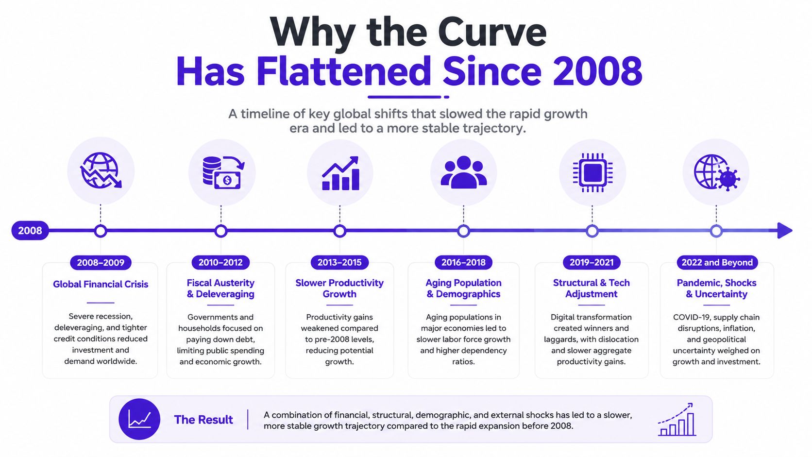
A lot of students still write as if unemployment automatically pushes inflation down in a strong, predictable way. The newer evidence is more awkward than that. The Brookings Hutchins Center says that from 1986 to 2007 the effect of unemployment on inflation was less than half of its earlier size, and since 2008 it has largely disappeared. A 2014 Federal Reserve memo estimated that a 1 percentage point rise in unemployment was associated with only about a 0.3 percentage point fall in inflation over the following year (Brookings on the Phillips curve).
That tells you the curve has flattened. The old inverse relationship is weaker, so unemployment is a poorer shortcut for predicting inflation than it used to be. This is exactly the kind of update A-Level answers need, because it stops you sounding frozen in a 1960s textbook.
Why it flattened
The best explanation is that inflation is now shaped by more than domestic labour market pressure. Supply shocks, energy prices, import costs and expectations all matter. If firms face higher input costs, prices can rise even if unemployment is not especially low. That makes the link between jobs and prices less direct.
Structural change matters too. Labour markets are different from the ones Phillips observed. Workers move differently, firms set pay differently, and price-setting is less mechanical than it once looked. That's why the curve is best treated as a rough guide, not a reliable rule.
For exam purposes, this is the safest line to use. Say the Phillips curve still helps explain why tight labour markets can put upward pressure on wages and prices, but it no longer gives a dependable one-to-one trade-off. That is a proper evaluation point. It shows the examiner you know the classical model, but you also know why the modern economy is messier.
A strong sentence in an essay might read like this, “The Phillips curve remains useful as a short-run concept, but post-2008 evidence suggests the relationship has flattened and is now less reliable for forecasting inflation.” That's the sort of balanced judgment that earns credit because it is specific, cautious and fully evaluative.
How the UK Actually Responds to the Trade-Off
When UK inflation rises, policymakers usually start with monetary policy. The Bank of England can raise the base rate to cool borrowing and spending, which helps when inflation is being pulled up by too much demand. That's the standard response because it works through households, firms and credit conditions.
Fiscal policy is the other lever. The Treasury can change tax and spending to support demand or reduce it. In a downturn, spending support can protect jobs. In a boom, tighter fiscal policy can stop the economy from overheating. Both tools matter, but they work in different ways and at different speeds.
Why neither tool is perfect
Monetary policy often has a lag. Interest rate changes don't hit prices and employment overnight, so policymakers have to act before the data look fully settled. That's why students should always mention timing in evaluation. If the Bank moves too late, inflation may already be baked in. If it moves too early, it can choke off growth.
Fiscal policy brings another problem, politics. Tax rises and spending cuts are hard to pass, especially when voters feel the pain immediately. That makes fiscal action slower and less predictable. It can also be difficult to target the exact cause of inflation if the problem is coming from imported energy or supply disruption.
Examiner-friendly point: a policy is only good if it matches the cause. Demand-side tools are weak against supply-side shocks.
That sentence is gold in a 6-mark or 25-mark answer because it links policy to diagnosis. If the problem is demand-led inflation, tightening can work. If the problem is a supply shock, the same policy may reduce inflation only at the cost of higher unemployment. That is the trade-off in practice, not just on a diagram.
The cleanest UK conclusion is that policy choices are rarely painless. The government can support jobs, but that may worsen inflation. It can fight inflation, but that may slow the labour market. Strong answers don't pretend there's a magic switch. They show that the economy forces policymakers to choose, compromise and sometimes accept a slower fix.
Who Actually Hurts When Both Numbers Rise
Most exam answers talk about inflation and unemployment as if everyone feels them equally. They don't. The people hit hardest are often the ones with the weakest bargaining power, the least savings or the most unstable attachment to the labour market. That's the distributional angle teachers wish students used more often.
Recent research finds that supply-driven inflation raises unemployment tail risks more than demand-driven inflation, with especially strong effects for job losers, then labour-market re-entrants and new entrants. It also finds that supply-driven inflation has broader and more immediate effects, while demand-driven inflation is more limited and appears in the medium term (recent research on inflation-driven unemployment risks). That matters because headline averages hide who is really paying the price.
The students who usually miss this
A young graduate looking for a first job is not in the same position as an experienced worker in a declining industry. A job loser has to search under pressure. A re-entrant may be returning after caring responsibilities or illness. A new entrant has no work history to lean on. Those are different labour-market states, and they don't get affected equally.
For UK essays, this is a strong AO3 move because it pushes beyond the average inflation rate and the average unemployment rate. It asks who is vulnerable, not just what the headline number says. That's exactly the sort of thinking that makes an answer sound mature.
If you want to practise writing this kind of paragraph properly, Exam Practice for GCSE is a good place to rehearse short, sharp responses before you try a longer essay.
You can also turn this into a neat evaluation line. Say that inflation and unemployment are not just macroeconomic totals, they're lived differently across households and age groups. That gives you a sharper conclusion because it shows the social cost of the trade-off, not just the chart.
Your Exam Cheat Sheet and Model Answers
The safest revision move is to memorise a few anchors and then build from them. Start with the 1975 RPI spike, the UK stagflation example, the Phillips curve's original British data, and the idea of the natural rate of unemployment. Then add the modern caveat that the long-run trade-off doesn't hold in the same way.
A US Congressional Research Service review says economists generally use a natural rate of unemployment, with early-2000s estimates at about 5% to 6%, and that the earlier trade-off between inflation and unemployment did not persist in the long run (CRS review on inflation and unemployment). That's the cleanest long-run evaluation line you can use in an essay.
Model answer skeletons
4-mark explain answer
- AO1: Inflation is the rise in the average price level over time, while unemployment is when people who want work cannot find a job.
- AO2: In the UK, inflation is commonly measured by CPI, and unemployment is measured using the ONS ILO definition.
- AO1 plus AO2: The two can be linked through the Phillips curve, which suggests a short-run trade-off between lower unemployment and higher inflation.
- AO3: This relationship is not always stable, especially when supply shocks or expectations change.
6-mark analyse paragraph
- AO1: The Phillips curve shows an inverse relationship between inflation and unemployment in the short run.
- AO2: In the UK, the 1970s stagflation episode is a strong example of the trade-off breaking down.
- AO3: It shows the curve is not a permanent rule, so policies aimed at reducing unemployment may still leave inflation high if the shock is on the supply side.
UK Inflation-Unemployment Trade-Off Anchors
| Anchor | Figure | Why it matters |
|---|---|---|
| Phillips's British data | 1861 to 1957 | Shows where the original curve idea came from |
| UK RPI inflation peak | 25.4% in 1975 | Classic stagflation example |
| UK unemployment milestone | Above 1 million in 1976 | Proves inflation and unemployment can rise together |
| Natural rate of unemployment | About 5% to 6% | Long-run caveat examiners expect |
| Long-run trade-off | Did not persist | Best evaluation line for essays |
For a final practice step, A-Level Past papers are the fastest way to check whether you can turn these anchors into full marks under time pressure.
If you want to turn this into real exam confidence, use this topic to practise one short definition, one Phillips curve diagram, and one evaluation paragraph with the 1970s UK stagflation example. Then do one timed answer on MasteryMind, check where you lost marks, and rewrite just the weak paragraph until the structure feels automatic.
Ready to master this topic?
Practise with quizzes, blurt exercises and exam questions on MasteryMind.
7 days Premium · Then free forever · No card, no charge