AQA · GCSE · Art and Design
Graphic communication
Graphic Communication involves designing primarily visual material to convey information, ideas, meaning, and emotions. This topic is essential as it bridges creativity with problem-solving, requiring you to meet all four Assessment Objectives through research, experimentation, annotation, and presenting a meaningful final outcome.
- 5 min read
- 3 worked examples
- 4 practice questions
- 6 key terms
Study Notes
Overview
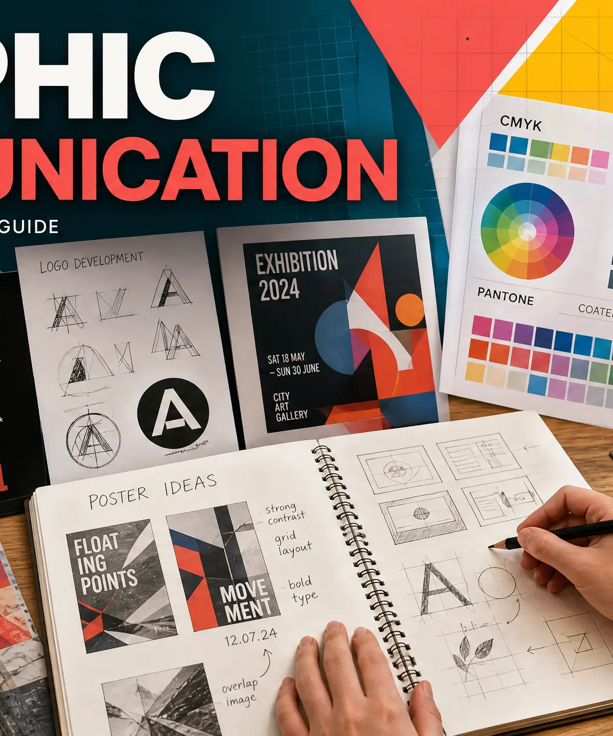
Graphic communication is the process of designing primarily visual material to convey information, ideas, meaning, and emotions in response to a given or self-defined brief. From the apps on your phone to the posters on a wall, graphic communication is all around us. In the context of your GCSE Art and Design course, it represents the intersection of creativity and problem-solving. Examiners are looking for candidates who can not only produce aesthetically pleasing work but also communicate effectively to a specific audience. Your portfolio must evidence a sustained journey from initial engagement with a brief through to the realisation of your intentions.
Listen to our revision podcast for a deep dive into the topic:

Key Knowledge & Theory
Core Concepts
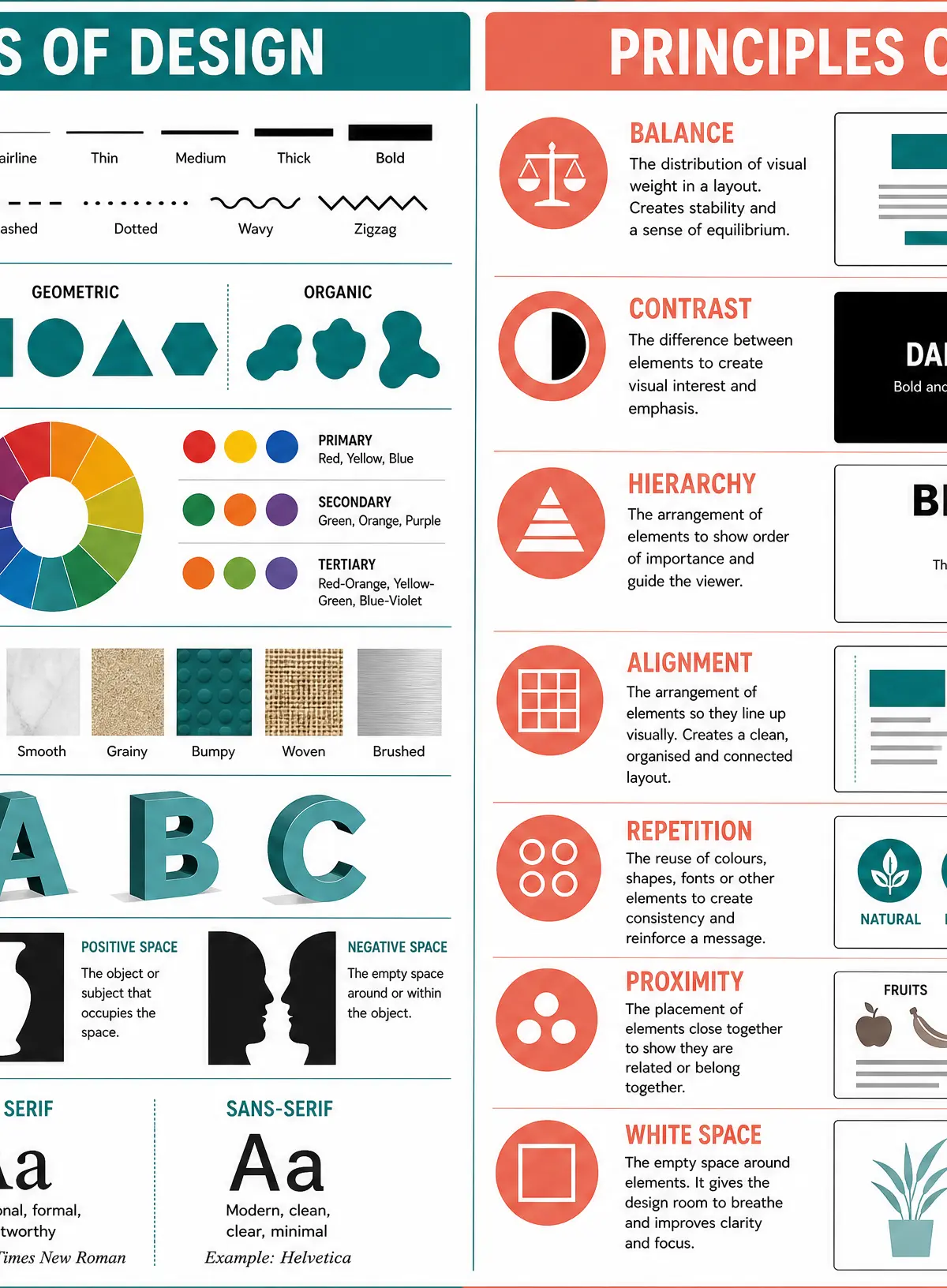
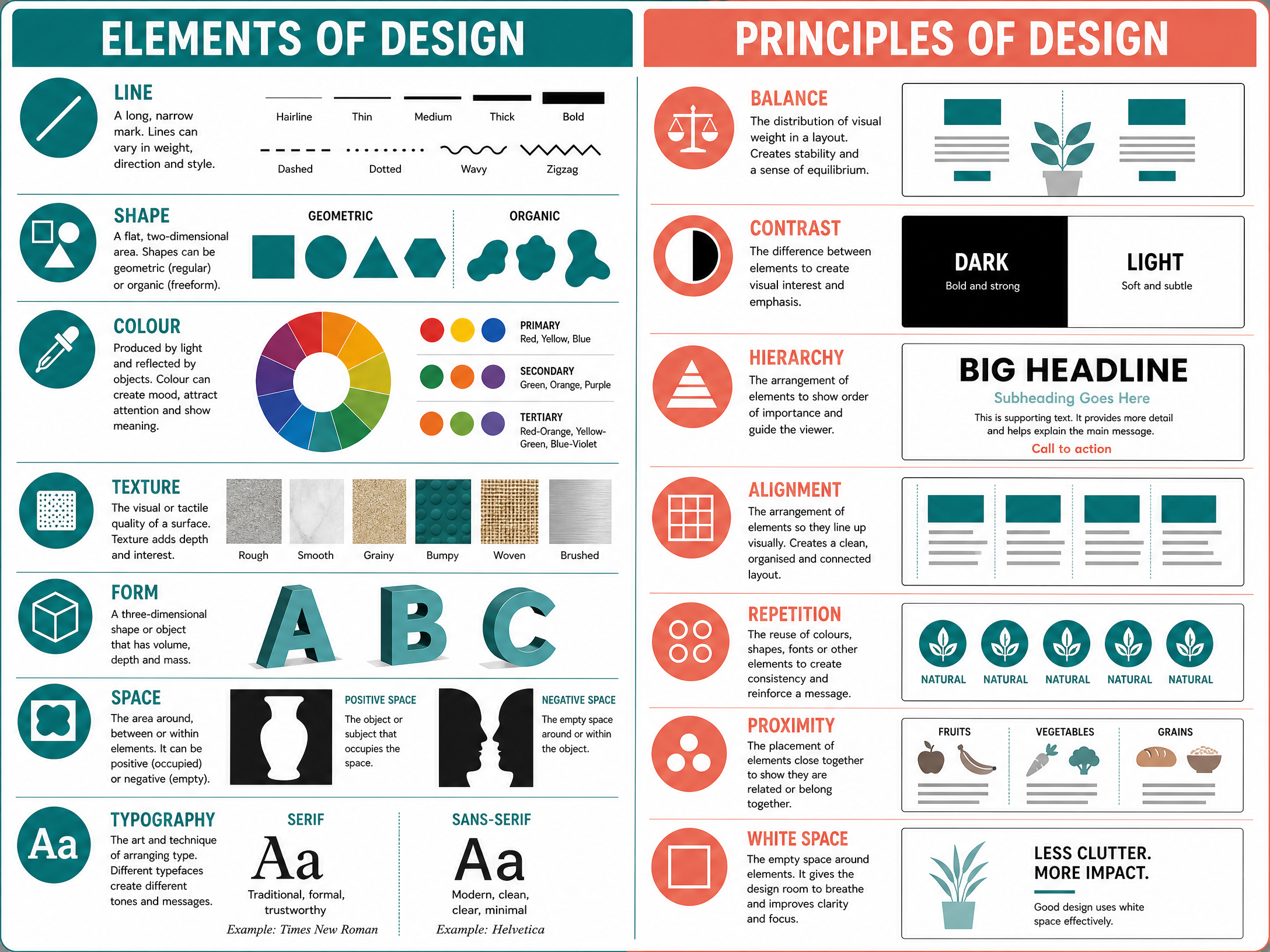
To succeed in Graphic Communication, you must demonstrate an understanding of visual language. This includes mastering typography, visual hierarchy, colour theory, grid systems, and the effective use of white (or negative) space.
Typography is the art of arranging type. Your choice of typeface communicates personality before a single word is read.
Visual Hierarchy is the arrangement of elements to guide the viewer's eye and show order of importance.
Colour Theory involves understanding primary, secondary, and tertiary colours, as well as the psychological impact of warm and cool palettes.
Grid Systems provide underlying structure to a layout, ensuring alignment and consistency.
Key Practitioners
| Name | Period/Style | Key Works | Relevance |
|---|---|---|---|
| Paul Rand | Mid-20th Century / Modernism | IBM, ABC logos | Demonstrates the power of simplicity and geometric marks in corporate identity. |
| Saul Bass | Mid-20th Century / Film Design | Vertigo, Anatomy of a Murder posters | Shows how graphic communication creates emotional impact through reduction and bold shapes. |
| Neville Brody | 1980s / Post-modern Typography | The Face magazine | Treats typography as image, breaking conventional layout rules to push boundaries. |
| April Greiman | 1980s / Digital Design | Does It Make Sense? | Pioneer of using the computer as a creative tool, blurring graphic design and fine art. |
Technical Vocabulary
Candidates must use appropriate specialist vocabulary in their annotations. Essential terms include: Typography, Serif, Sans-serif, Visual Hierarchy, Composition, Grid Layout, Negative Space, CMYK, RGB, Contrast, Alignment, and Vector/Raster graphics.
Practical Skills
Techniques & Processes
Examiners reward the refinement of ideas through experimentation. You should explore a range of techniques:
- Printmaking: Lino cut, screen printing, or monoprinting to create textured, graphic outcomes.
- Digital Design: Using software like Adobe Illustrator or Photoshop for vector graphics, image manipulation, and digital layout.
- Typography Design: Hand-lettering or digital manipulation of existing typefaces to suit a specific brief.
- Collage and Mixed Media: Combining found imagery, textures, and text to create dynamic compositions.
Materials & Equipment
You must demonstrate understanding of appropriate materials and their safe use. This includes knowing when to use traditional media (markers, fine liners, layout pads) versus digital tools (graphics tablets, design software).
Portfolio/Coursework Guidance
Assessment Criteria
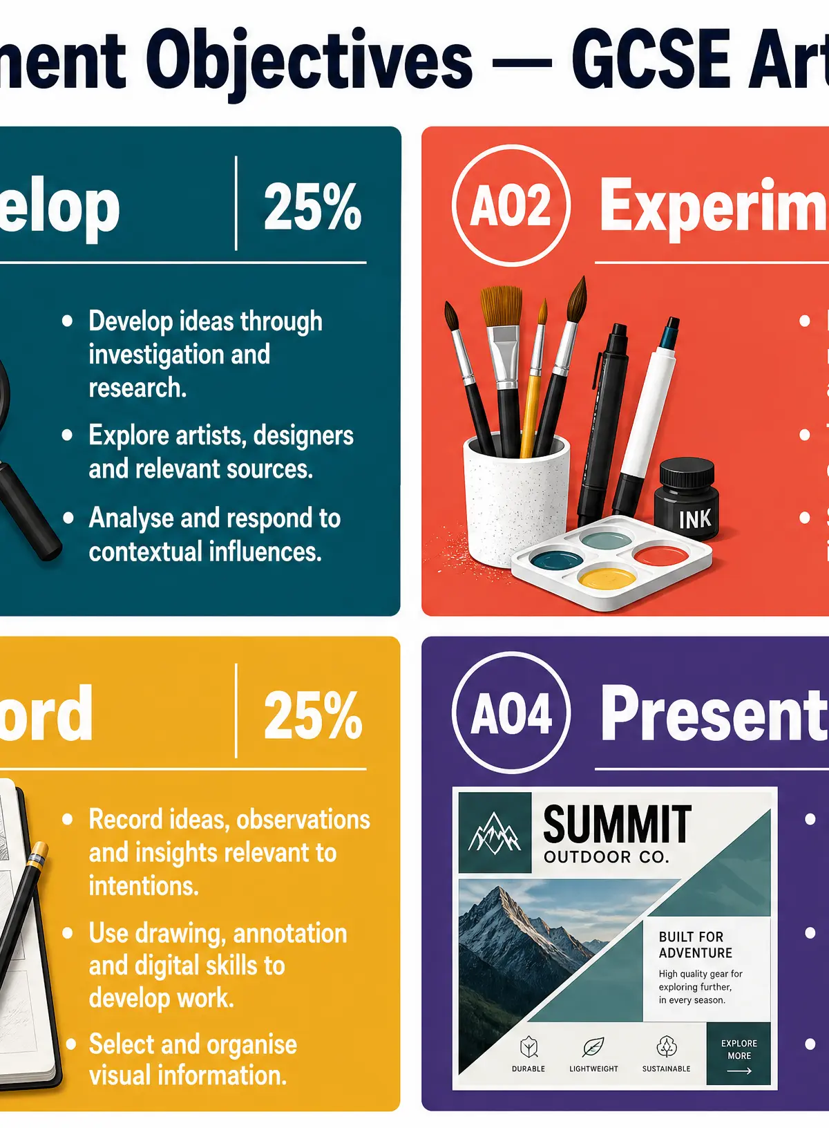
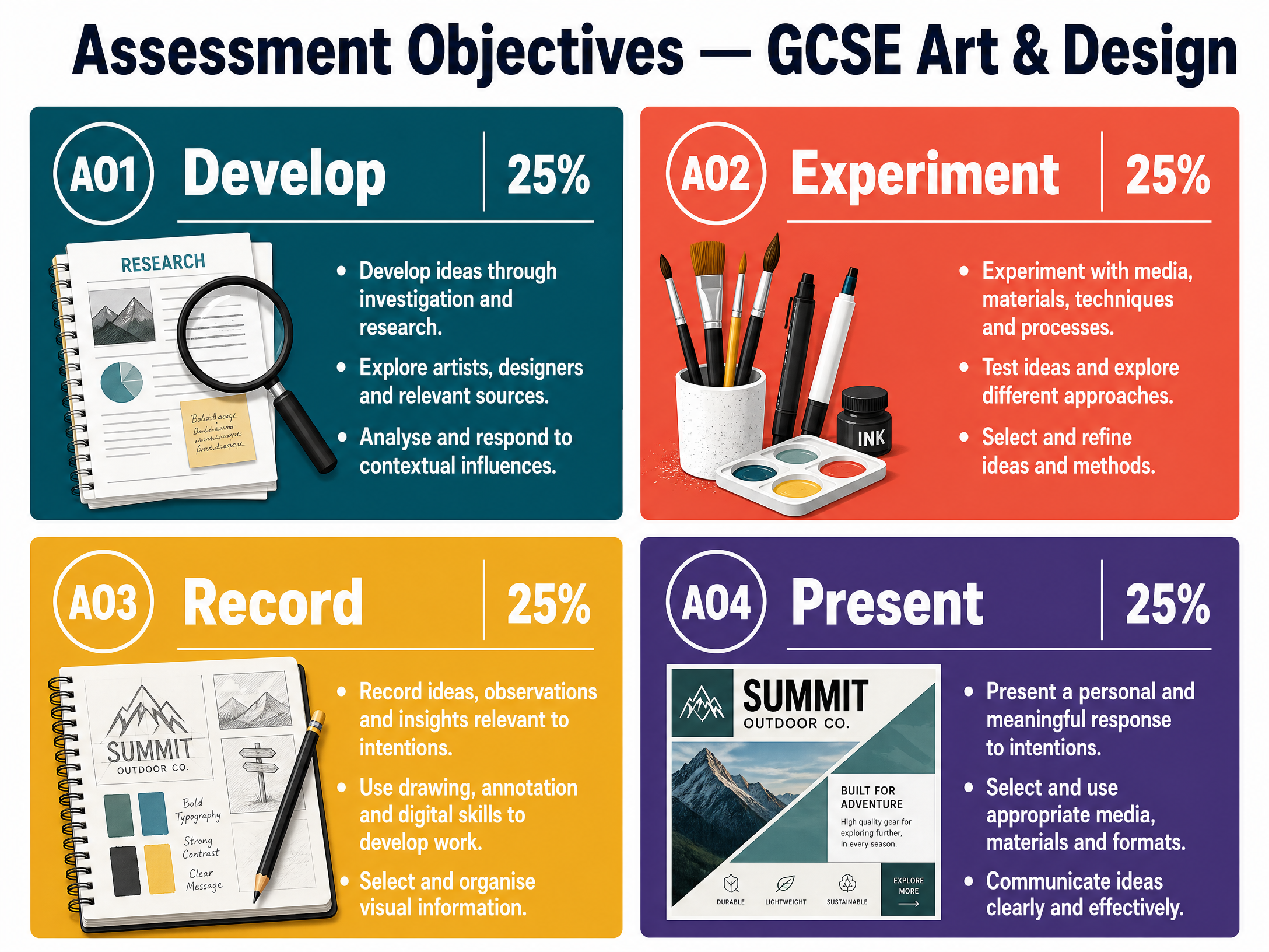
Your work is assessed against four Assessment Objectives (AOs), each worth 25%:
- AO1 (Develop): Develop ideas through investigations informed by selecting and critically analysing sources.
- AO2 (Experiment): Refine ideas as work progresses through experimenting with media, materials, techniques, and processes.
- AO3 (Record): Record ideas, observations, and insights visually and through written annotation.
- AO4 (Present): Present a personal and meaningful response that realises intentions.
Building a Strong Portfolio
A strong portfolio shows a clear journey. Written annotation must be an integral part of the creative process, not a 'bolt-on'. When you experiment with a technique, annotate why you chose it and how successful it was. You must also provide explicit evidence of drawing for different purposes—this can include thumbnail sketches, storyboards, or typographic plans.
Exam Component
Component 2: Externally Set Task
The externally set task is a practical exam. You will receive a paper with starting points and must choose one to respond to. The preparation period is critical. Use this time to research practitioners, experiment with media, and develop your ideas. By the time you enter the 10-hour supervised period, you should know exactly what your final outcome will be. The supervised time is for making, not for deciding.
Visual Resources
2 diagrams and illustrations
Interactive Diagrams
1 interactive diagram to visualise key concepts
Conceptual Flow Outline
The iterative creative process across the Assessment Objectives
Worked Examples
3 worked examples — open one to explore the question and available guidance.
Practice Questions
Test your understanding — click to reveal model answers
Explain how you would use complementary colours to create visual impact in a poster design.
Hint: Think about the colour wheel and what happens when opposites are placed next to each other.
Evaluate your own use of media and techniques in a recent project. How did experimentation lead to refinement?
Hint: Use the 'What, Why, How, What Next' structure. Focus on AO2.
Analyse how Saul Bass used visual language to communicate themes in his film posters.
Hint: Discuss his use of shape, colour palette, and typography, linking visual choices to emotional impact.
Describe how you would ensure your portfolio provides sufficient evidence for AO3 (Record).
Hint: Remember that AO3 involves both visual recording (drawing) and written recording (annotation).