Branding and Identity — OCR GCSE Study Guide
Exam Board: OCR | Level: GCSE
This guide provides a comprehensive overview of Branding and Identity for OCR GCSE Art and Design, focusing on the practical skills and theoretical knowledge required to create a successful corporate identity project. It covers everything from initial research and concept development to final presentation, ensuring candidates are fully prepared to meet the assessment objectives.
## Overview
Branding and Identity is a core component of the Graphic Communication pathway in OCR GCSE Art and Design. It challenges candidates to create a complete visual persona for a product, service, or organisation. This is not simply about designing a logo; it is about building a cohesive and strategic visual system. Success in this area requires a deep understanding of how visual language communicates meaning, a rigorous and well-documented design process, and the technical skill to produce a professional final outcome. Examiners are looking for a journey — from the initial spark of an idea, through analytical research and purposeful experimentation, to a polished and contextualised final design.

## Key Knowledge & Theory
### Core Concepts
To excel, candidates must move beyond purely aesthetic choices and ground their work in established design theory. Understanding these concepts is essential for producing work that has depth and for articulating design decisions in annotations.
* **Semiotics**: The study of signs and symbols. In branding, every colour, shape, and typeface is a sign that communicates a message. For example, a logo using interlocking rings might signify unity or connection.
* **Visual Hierarchy**: The deliberate arrangement of elements to guide the viewer's eye. In a brand's visual language, this ensures that the most important message (e.g., the brand name) is seen first.
* **Colour Psychology**: The understanding that colours have psychological and cultural associations. Blue often suggests trust and reliability (used by banks), while green can signify nature and ethics (used by organic food brands).
* **Typography**: The art of arranging type. This includes not just the choice of typeface (serif for tradition, sans-serif for modernity) but also its manipulation through **kerning** (space between letters), **tracking** (overall letter-spacing), and **leading** (line spacing).
* **Target Audience Analysis**: The process of defining and understanding the specific group of people a brand aims to reach. All design decisions should be justified in relation to the intended audience.
### Key Practitioners/Artists/Composers
| Name | Period/Style | Key Works | Relevance |
|---|---|---|---|
| Paul Rand | Mid-Century Modernism | IBM, ABC, UPS logos | Master of creating simple, timeless, and conceptually rich corporate identities. His work shows that a logo must be a symbol, not just a decoration. |
| Saul Bass | Mid-Century Modernism | AT&T, United Airlines logos | A pioneer of using a single, powerful graphic to distill a brand's essence. His work is a key reference for conceptual logo design. |
| Massimo Vignelli | European Modernism | American Airlines, NYC Subway Map | Champion of systems-based design, using a strict grid and limited typefaces (like Helvetica) to create unified and clear brand identities. |
| Pentagram (Studio) | Contemporary | Countless, e.g., Mastercard, The Co-operative | A modern design consultancy demonstrating how brand identities are applied across vast digital and physical platforms. Excellent for AO1 research. |
### Technical Vocabulary
Using precise terminology in annotations is critical for achieving high marks. Candidates should aim to use these terms accurately to describe and justify their design choices.
* **Wordmark/Logotype**: A logo based solely on the company’s name (e.g., Google).
* **Pictorial Mark**: An icon or graphic symbol-based logo (e.g., Apple's apple).
* **Combination Mark**: A logo that combines a symbol and a wordmark (e.g., Adidas).
* **Kerning**: Adjusting the space between two specific letters.
* **Tracking**: Adjusting the overall spacing of a group of letters.
* **Vector**: A graphic format (like an SVG or AI file) that uses mathematical equations to draw shapes, allowing it to be scaled infinitely without losing quality. Essential for logo design.
* **Raster**: A graphic format (like a JPEG or PNG) made of pixels. Loses quality when scaled up.
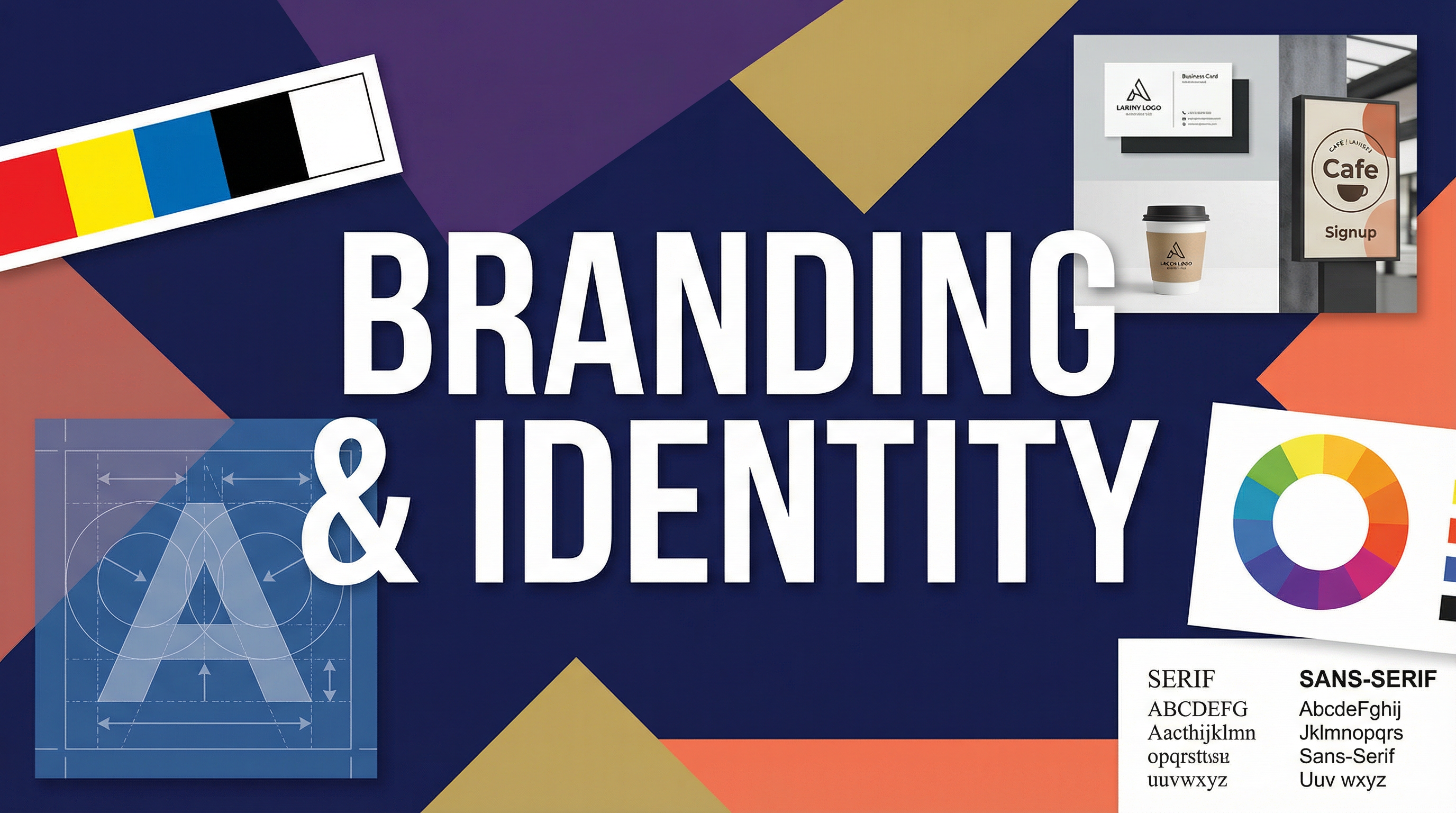
* **Mock-up**: A digital or physical model used to demonstrate a design in a real-world context (e.g., a logo shown on a t-shirt or a business card).
## Practical Skills
### Techniques & Processes
1. **Mind Mapping & Ideation**: Start by brainstorming keywords related to the brand's values, audience, and purpose. This forms the conceptual basis for your visual ideas.
2. **Mood Boarding (with Annotation!)**: Collect images, colours, and typefaces that align with your concept. Crucially, you must **annotate** every choice, explaining *why* it is relevant and what you have learned from it (AO1).
3. **Thumbnail Sketching**: Rapidly sketch dozens of small, rough logo ideas. Do not settle on the first idea. This shows exploration and development (AO2).
4. **Digital Vectorisation**: Take your strongest sketches into software like Adobe Illustrator. Use the pen tool to create clean, scalable vector versions of your logo. Experiment with different line weights and constructions.
5. **Typographic Refinement**: Experiment with kerning, tracking, and case (uppercase, lowercase) to perfect your chosen typeface. Document these experiments with screenshots.
6. **Colour Palette Development**: Create a primary, secondary, and neutral colour palette. Test these colours for accessibility and ensure they work in both print (CMYK) and digital (RGB) contexts.
### Materials & Equipment
* **Sketchbook**: Essential for recording ideas, sketches, and annotations (AO3).
* **Fine Liner Pens & Pencils**: For initial sketches and developing ideas.
* **Adobe Illustrator**: The industry-standard software for creating vector graphics. Its pen tool is a fundamental skill to master.
* **Adobe Photoshop**: Useful for creating mock-ups and applying textures.
* **Digital Mock-up Templates**: Pre-made files (often for Photoshop) that allow you to realistically apply your designs to objects like packaging, signage, and apparel. Essential for AO4.
## Portfolio/Coursework Guidance
### Assessment Criteria
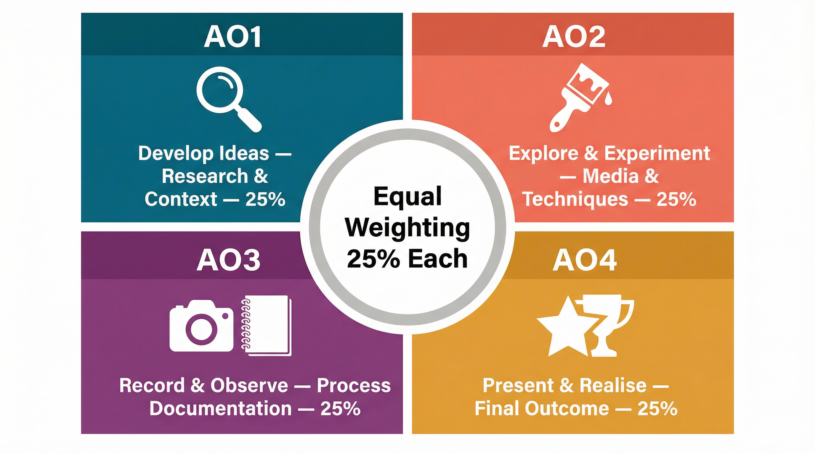
* **AO1: Develop (25%)**: Show you have researched and analysed other designers and brands. Your annotations must deconstruct *how* and *why* existing designs are effective.
* **AO2: Experiment (25%)**: Evidence of trying out different media, techniques, and compositions. Show 'failed' experiments and explain why they were rejected.
* **AO3: Record (25%)**: Your sketchbook/portfolio must be a clear and logical record of your journey. Use annotations to link your thoughts, decisions, and actions.
* **AO4: Present (25%)**: Your final outcome must be well-executed and presented in context. High-quality mock-ups are essential to show how the brand identity works in the real world.
### Building a Strong Portfolio
* **Tell a Story**: Your portfolio should read like a visual diary, showing a clear narrative from initial research to final outcome.
* **Annotate Everything**: Explain your thought process at every stage. Why did you choose that font? Why did you reject that colour? Link every decision back to your research and your target audience.
* **Show Progression**: Don't just show your final logo. Show the 20 rough sketches that came before it, the 5 digital variations you experimented with, and explain why your final design is the most successful solution.
* **Quality over Quantity**: A few pages of deep, analytical research are worth more than a whole sketchbook of unannotated images from Pinterest.
## Exam Component
### Written Exam Knowledge
While the Branding and Identity project is coursework-based, the knowledge you gain is directly relevant to the written exam paper. Questions in the exam will often ask you to analyse unseen images of graphic design or to discuss the work of other designers. You may be asked to:
* Identify the target audience for a given design.
* Explain how colour and typography have been used to create a particular mood or message.
* Analyse the work of a designer you have studied (e.g., Paul Rand).
### Practical Exam Preparation
For the externally set task (the practical exam), you may be given a brief that involves creating a brand identity. The skills you develop in your coursework are directly transferable. You will need to demonstrate your ability to work efficiently through the design process: research, ideation, development, and producing an outcome within a limited time frame. Practice timed mind maps and thumbnail sketching sessions to prepare.