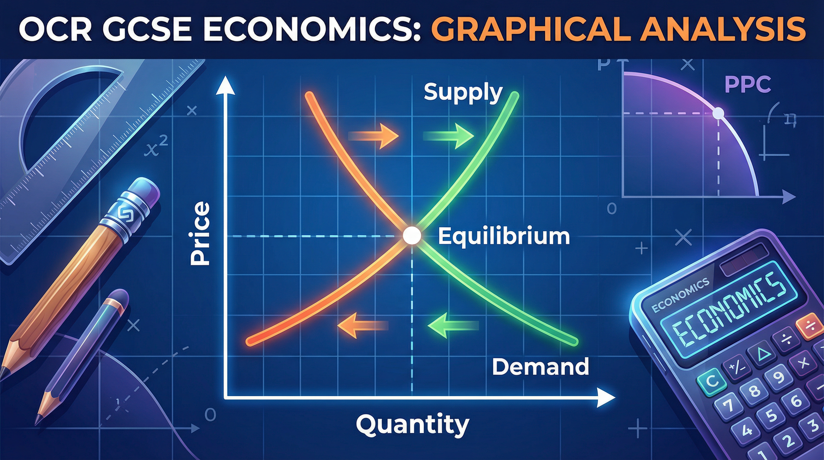
Graphical Analysis (Drawing and Interpreting Graphs) — OCR GCSE Study Guide
Exam Board: OCR | Level: GCSE
Mastering graphical analysis is your secret weapon for the OCR GCSE Economics exam. This guide breaks down how to draw and interpret essential diagrams like Supply & Demand and PPCs, turning confusing lines into easy marks.
## Overview
Graphical analysis is a cornerstone of the OCR J205 Economics specification. It involves the precise construction and interpretation of diagrams to explain economic concepts. Examiners expect candidates to not only draw accurate graphs but also to use them as a tool for analysis, explaining the impact of economic changes on markets and economies. This guide covers the essential diagrams you need to know: Supply and Demand, and the Production Possibility Curve (PPC). We will explore how to construct these diagrams, the difference between shifts and movements, and how to use them to secure high marks. A strong command of these skills is essential for demonstrating AO2 (Application) and AO3 (Analysis) assessment objectives, which together make up 65% of your final grade.

## Key Concepts & Diagrams
### Supply and Demand Diagrams
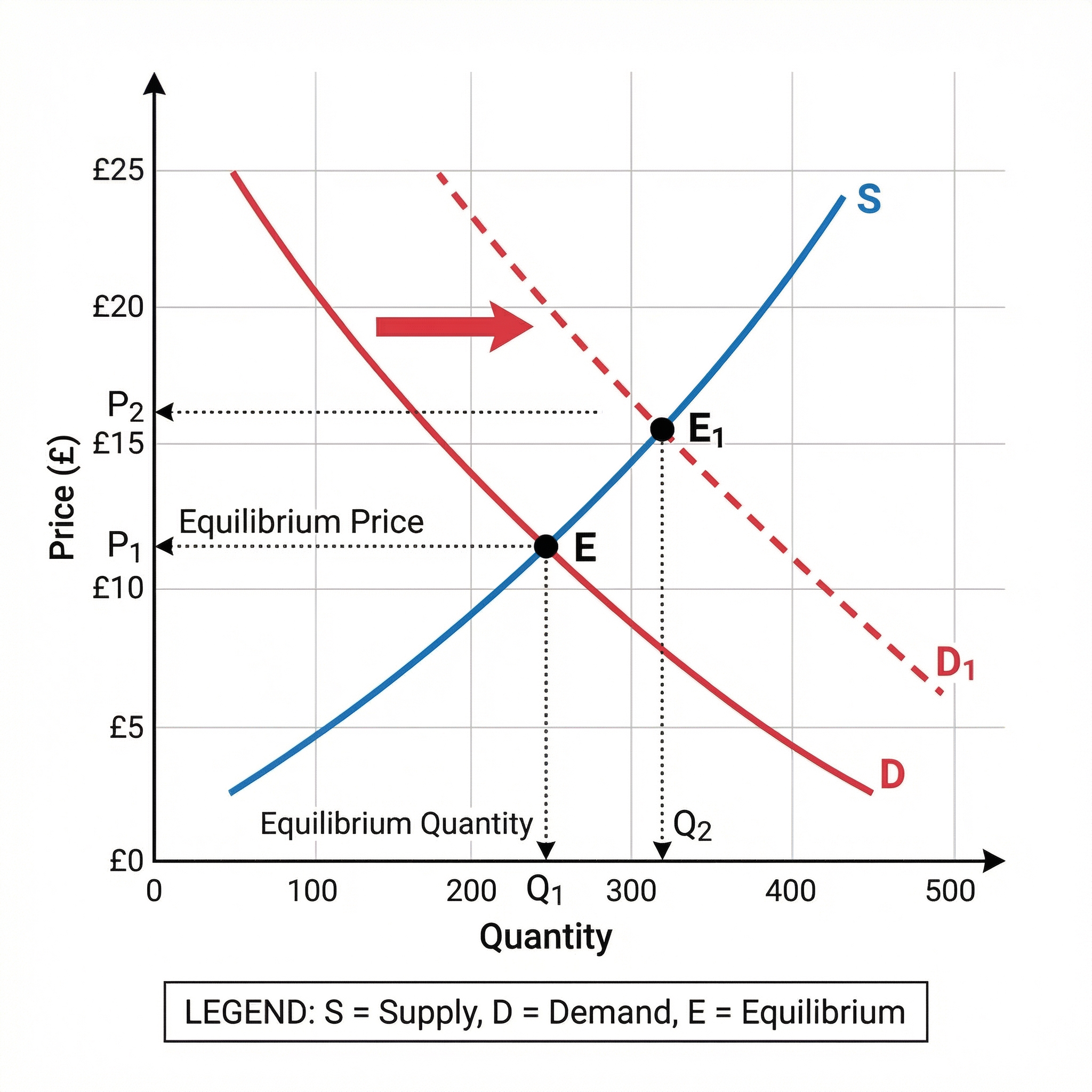
**What it shows**: The relationship between the price of a good or service and the quantity that consumers are willing to buy and producers are willing to sell.
**Why it matters**: This is the fundamental model for understanding how markets work. It allows you to analyse how changes in market conditions (like a change in consumer income or production costs) affect price and quantity.
**Specific Knowledge**: You must be able to draw and label the following:
- **Axes**: Price on the vertical (Y) axis, Quantity on the horizontal (X) axis.
- **Curves**: A downward-sloping demand curve (D) and an upward-sloping supply curve (S).
- **Equilibrium**: The point where the supply and demand curves intersect (E), showing the market-clearing price (P1) and quantity (Q1).
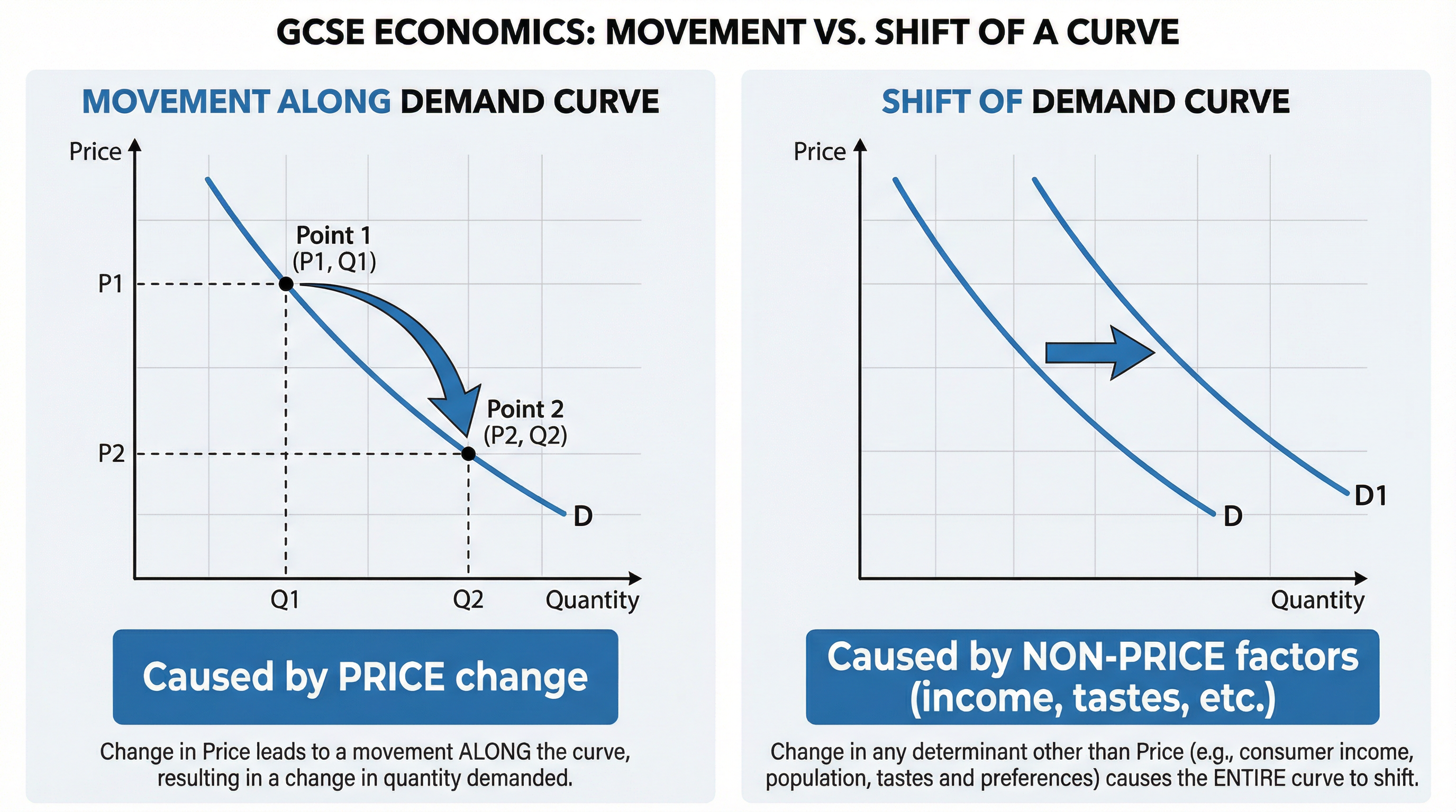
### Movements vs. Shifts
This is a critical distinction that frequently appears in exams and is a common source of error for candidates.
**Movement Along a Curve**: Caused *only* by a change in the price of the good itself. For example, if the price of a coffee decreases, there is a movement *down* along the demand curve (an extension of demand).
**Shift of a Curve**: Caused by a change in any non-price factor. The entire curve moves to a new position.
- **Demand Curve Shifts**: Caused by changes in **P**opulation, **A**dvertising, **S**ubstitutes' price, **I**ncome, **F**ashions and tastes, **I**nterest rates, and **C**omplements' price (mnenomic: **PASIFIC**).
- **Supply Curve Shifts**: Caused by changes in **P**roductivity, **I**ndirect taxes, **N**umber of firms, **T**echnology, **S**ubsidies, **W**eather, and **C**osts of production (mnenomic: **PINTSWC**).
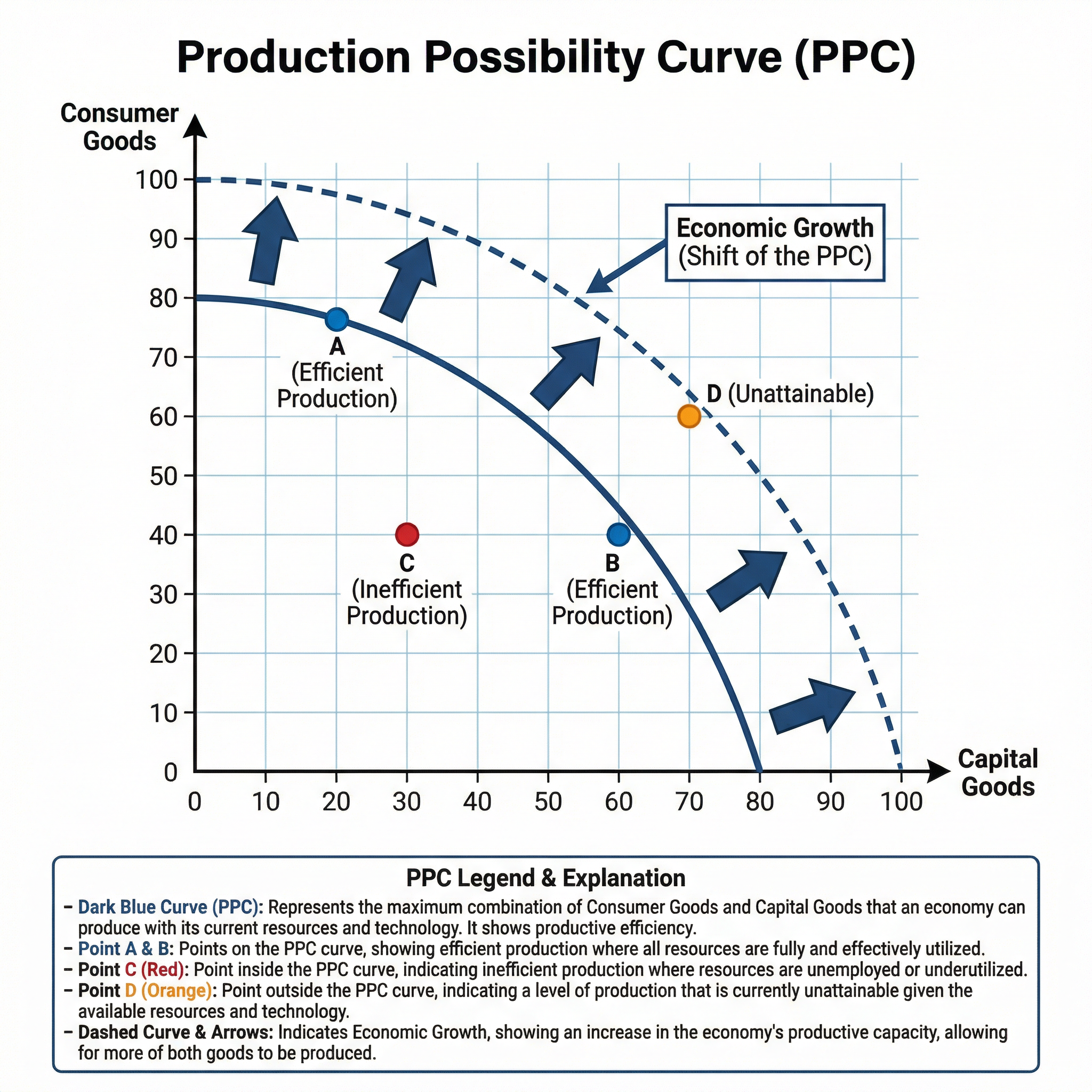
### Production Possibility Curves (PPCs)
**What it shows**: The maximum potential output of two different goods or services that an economy can produce with its current resources and technology.
**Why it matters**: PPCs are used to illustrate fundamental economic concepts like scarcity, choice, opportunity cost, and economic growth.
**Specific Knowledge**: You must be able to draw and interpret:
- **The Curve**: A concave (bowed outwards) curve showing the trade-off between producing two types of goods (e.g., Capital Goods vs. Consumer Goods).
- **Points on the Curve (e.g., A, B)**: Represent efficient production where all resources are fully utilised.
- **Point inside the Curve (e.g., C)**: Represents inefficient production or unemployed resources.
- **Point outside the Curve (e.g., D)**: Represents an output level that is currently unattainable.
- **Shift of the Curve**: An outward shift of the PPC indicates economic growth (e.g., due to new technology or more resources). An inward shift indicates a contraction of the economy.
## Second-Order Concepts
### Causation
Understanding what causes curves to shift is fundamental. For example, an increase in consumer income (cause) leads to an increase in demand for normal goods, shifting the demand curve to the right (effect).
### Consequence
The consequences of a curve shifting are changes in equilibrium price and quantity. A rightward shift in the demand curve leads to the consequence of a higher equilibrium price and a higher equilibrium quantity.
### Change & Continuity
The underlying principles of supply and demand are continuous. However, the position of the curves and the market equilibrium are constantly changing in response to new events and information.
### Significance
The significance of graphical analysis lies in its ability to model and predict market outcomes. For policymakers, understanding these diagrams is significant for making decisions about taxes, subsidies, and regulations.