OCR · GCSE · Psychology
Data Analysis
Master the core of OCR GCSE Psychology's Research Methods with this guide to Data Analysis. This guide is essential for turning raw data into exam marks, focusing on the crucial skills of calculation, interpretation, and evaluation that examiners prioritise.
- 4 min read
- 3 worked examples
- 5 practice questions
- 7 key terms
Study Notes
Overview
Data analysis is a cornerstone of the OCR GCSE Psychology (J203) specification, falling under the vital Research Methods component. It is the process by which psychologists make sense of the results they have collected in their studies. For candidates, this is not just about being ableto perform calculations; it is about understanding what the numbers mean and why one statistical test might be chosen over another. Examiners are looking for competence in both quantitative and qualitative data handling. This includes arithmetic skills, the ability to interpret graphical representations of data, and, crucially, the ability to justify methodological choices. A strong performance in this area is often what separates a good candidate from an excellent one, as it demonstrates a deeper understanding of the scientific process in psychology. This guide will equip you with the specific knowledge and techniques required to analyse data with confidence and precision, directly addressing the demands of AO2 (Application) and AO3 (Evaluation), which together constitute 70% of the marks.

Key Concepts in Data Analysis
Measures of Central Tendency
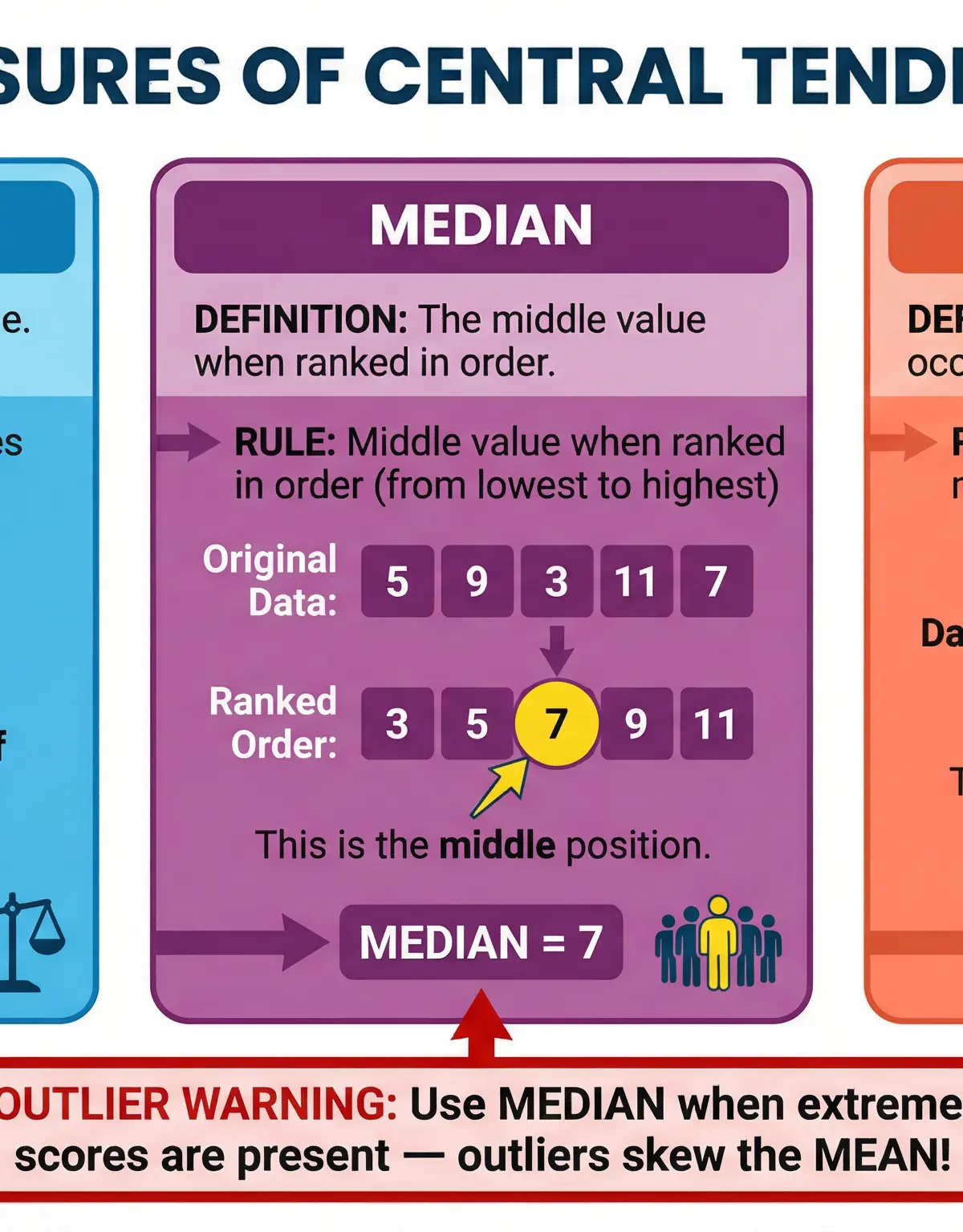
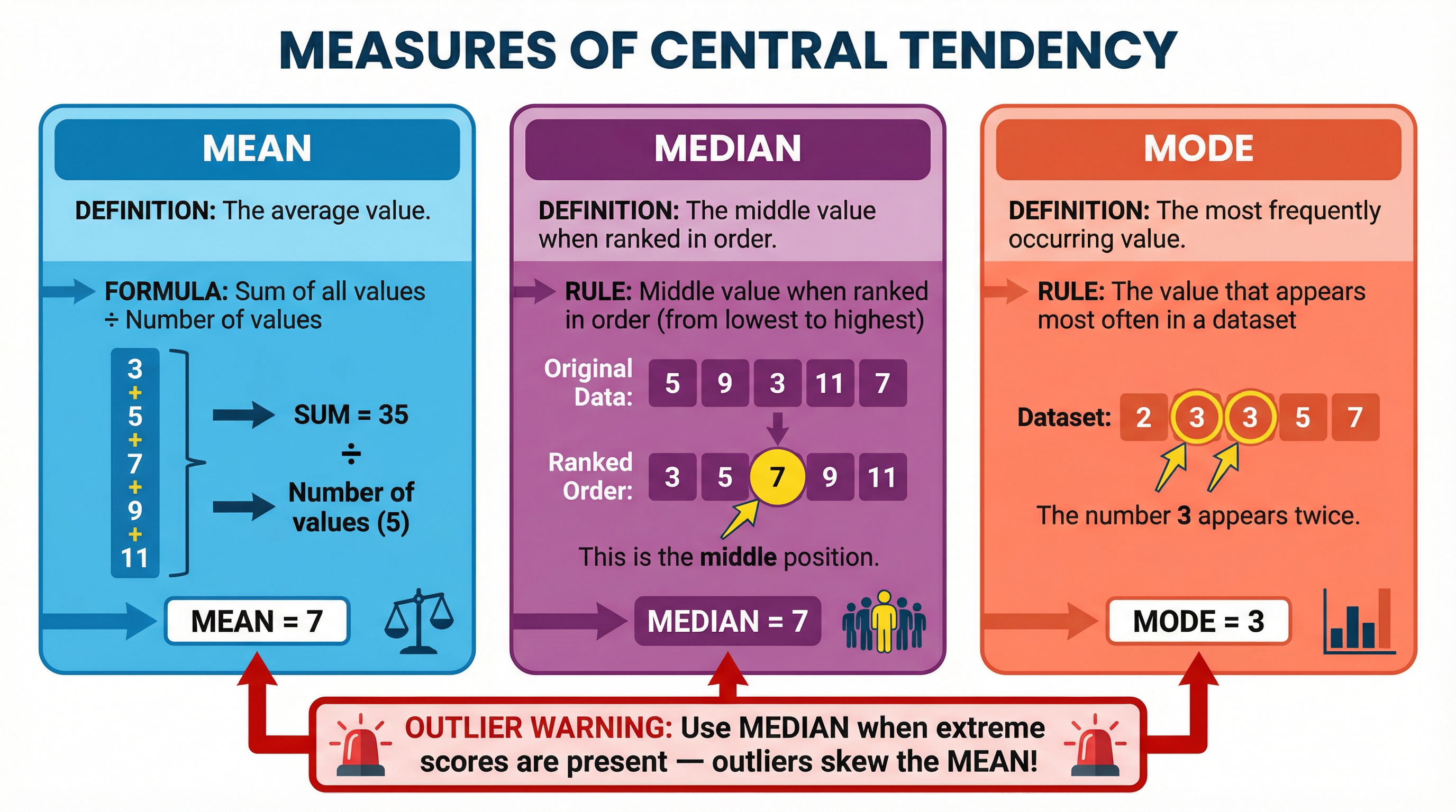
What it is: A single value that attempts to describe a set of data by identifying the central position within that set of data. The main measures are the mean, median, and mode.
Why it matters: Examiners will ask you to calculate these and, more importantly, to justify which is the most appropriate for a given dataset. This is a key AO3 skill.
Specific Knowledge: You must know the definitions and calculations for all three.
Measures of Dispersion
What it is: A measure of how spread out the scores are in a dataset. The main measure you need to know is the range.
Why it matters: The range provides context to the measures of central tendency. A small range indicates the data points are clustered closely together, while a large range indicates they are spread far apart.
Specific Knowledge: Calculation of the range (Highest score - Lowest score). Be aware that, like the mean, the range is affected by outliers.
Data Presentation
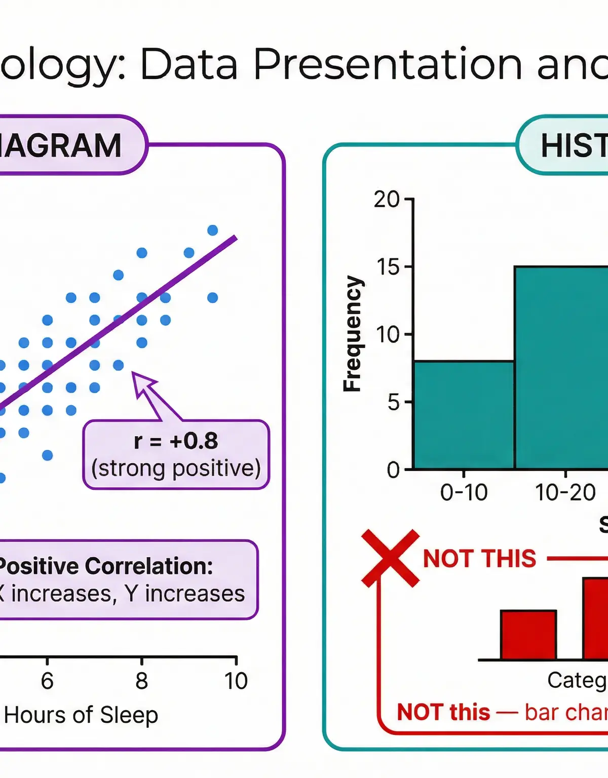
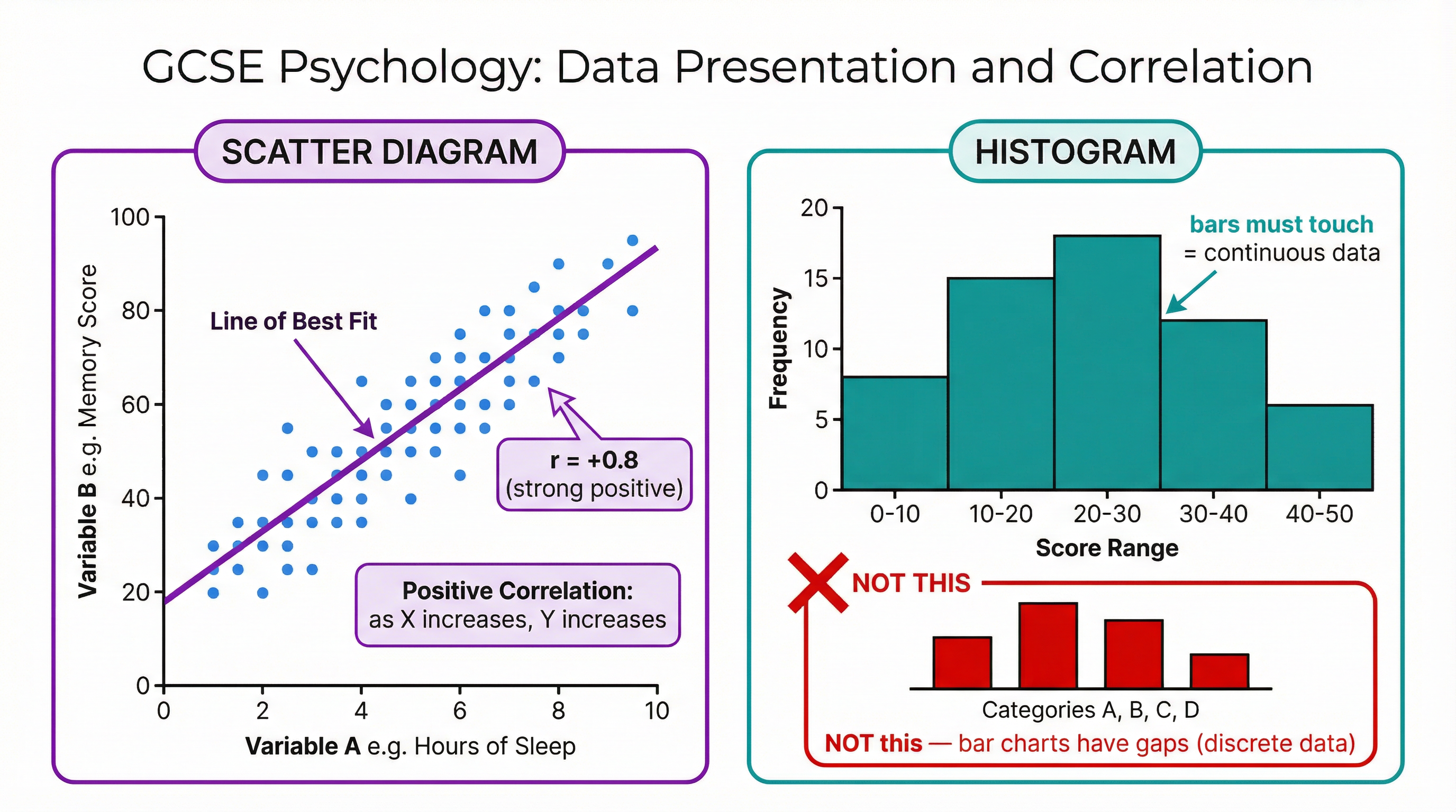
What it is: The various ways in which data can be visually represented. For OCR GCSE, you must be proficient with scatter diagrams and histograms.
Why it matters: These are common formats for presenting data in exam questions. You will be expected to interpret them, and potentially plot them. Marks are awarded for accuracy, correct labelling of axes, and a clear title.
Specific Knowledge: The difference between histograms (continuous data, bars touch) and bar charts (discrete data, bars have gaps). How to plot and interpret scatter diagrams to identify correlations.
Second-Order Concepts
Interpretation vs. Description
When presented with a graph or table, it is not enough to simply describe what you see (e.g., "the bar for Group A is higher than Group B"). You must interpret the data in the context of the study, explaining what the results suggest about the psychological phenomenon being investigated.
Justification of Choices
A common high-mark question involves justifying the use of a particular statistical test or descriptive statistic. For example, you must be able to explain why the median is a better measure than the mean when there are extreme scores (outliers) in a dataset, as the mean would be skewed.
Correlation and Causation
This is arguably the most important concept in data analysis. A correlation between two variables does not mean one causes the other. There could be a third, unmeasured variable influencing both. Examiners will penalise candidates who make causal claims based on correlational data. You must use phrases like "there is a relationship between..." or "as X increases, Y also increases", but not "X causes Y".
Visual Resources
2 diagrams and illustrations
Interactive Diagrams
1 interactive diagram to visualise key concepts
Conceptual Flow Outline
Decision-making flowchart for choosing between the Mean and Median.
Worked Examples
3 worked examples — open one to explore the question and available guidance.
Practice Questions
Test your understanding — click to reveal model answers
A psychologist recorded the number of aggressive acts shown by 10 children in a playground. The results were: 5, 8, 6, 7, 9, 10, 5, 4, 25, 6. Calculate the range for this data. (2 marks)
Hint: Remember the formula for the range and identify the highest and lowest values.
Draw a histogram to represent the following data from a reaction time test. (4 marks)
| Time (seconds) | Frequency |
|---|---|
| 0-10 | 8 |
| 11-20 | 15 |
| 21-30 | 12 |
| 31-40 | 5 |
Hint: Remember the key features of a histogram: labelled axes and touching bars.
A study finds a negative correlation between the amount of sleep a person gets and their level of irritability the next day. Explain what this means. (3 marks)
Hint: Think about what 'negative' means in the context of a relationship between two variables.
Convert 6/20 into a percentage. (1 mark)
Hint: Divide the top number by the bottom number and multiply by 100.
A dataset is: 3, 5, 5, 6, 7, 8, 8, 8, 9. What is the mode? (1 mark)
Hint: Which number appears most often?