OCR · GCSE · Economics
Data Interpretation and Analysis
This study guide focuses on mastering Data Interpretation and Analysis for OCR GCSE Economics (J205). It is a critical skill, accounting for at least 10% of total marks, and this guide provides the tools to turn data into high-scoring analysis.
- 5 min read
- 3 worked examples
- 5 practice questions
- 6 key terms
Study Notes
Overview
Data interpretation and analysis are fundamental skills for any economist. For the OCR GCSE Economics specification (J205), candidates are required to demonstrate quantitative skills that constitute a significant portion of their final grade. This involves not just the ability to perform calculations, but to interpret the results in the context of economic theories and policies. Examiners are looking for candidates who can move beyond simple descriptions of data to provide insightful analysis, drawing connections between statistical trends and their real-world economic implications. This guide will equip you with the necessary techniques to confidently handle data presented in tables, charts, and graphs, ensuring you can secure the maximum marks available for Assessment Objective 2 (AO2), which focuses on application.
Key Concepts in Data Analysis
Reading and Understanding Data Presentation
What it is: The first step in any data question is to understand how the information is presented. You will encounter data in various formats.
Why it matters: Misinterpreting the format is a common source of error. Marks are lost when candidates misread units, axis labels, or the type of data shown.
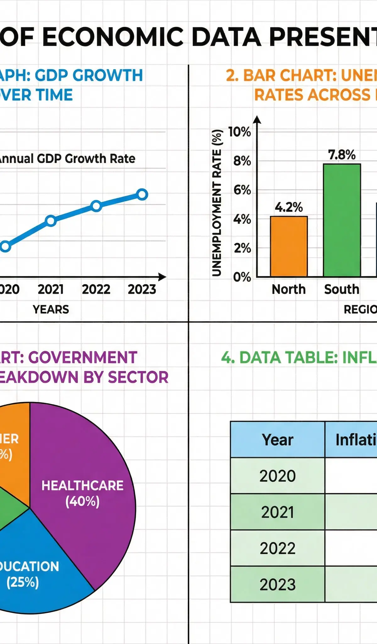
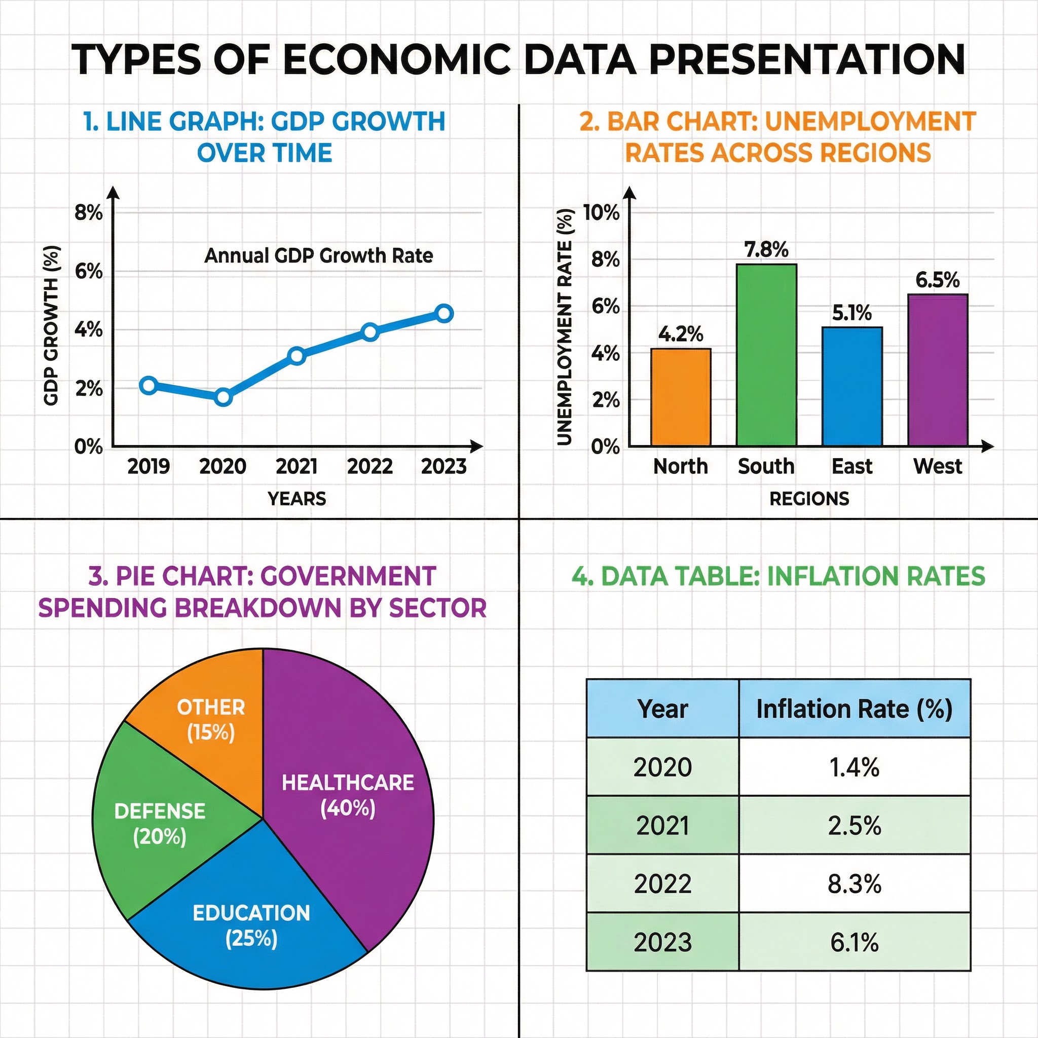
Specific Knowledge: Be familiar with:
- Line Graphs: Typically show trends over time (time-series data), such as GDP growth or inflation rates.
- Bar Charts: Used to compare quantities across different categories, like unemployment rates by region.
- Pie Charts: Illustrate proportions or percentages of a whole, such as the breakdown of government spending.
- Tables: Provide precise data points in a structured format.
Essential Calculations
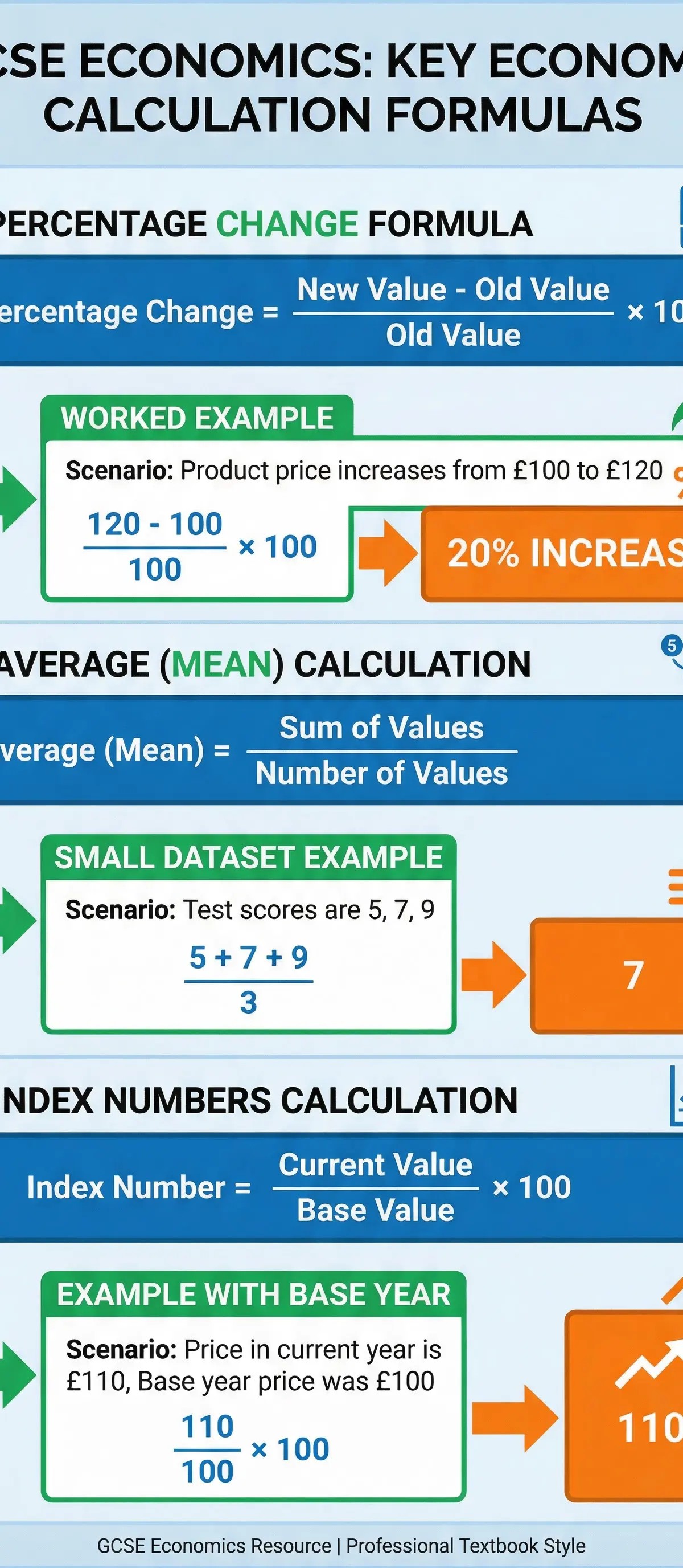
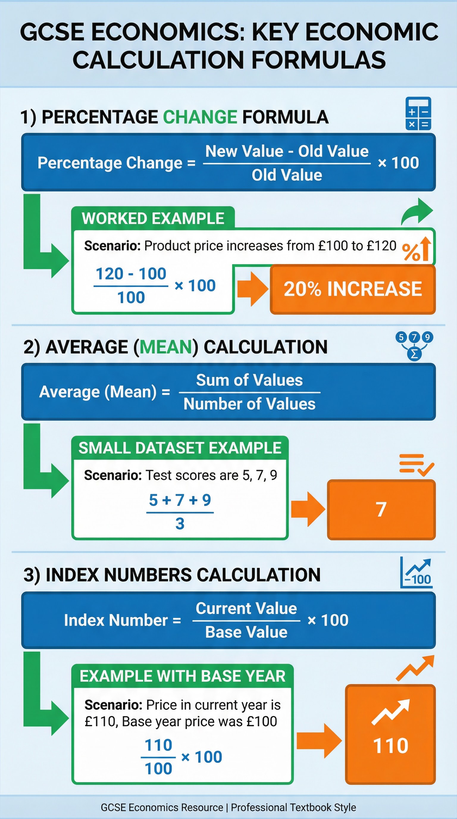
What it is: Performing accurate calculations is a core requirement. You must be able to calculate percentage changes, averages, and index numbers.
Why it matters: Calculation marks are easy to secure if you know the formulas and show your working. Method marks are often awarded even if the final answer has a minor error.
Specific Knowledge: Memorise and practice these formulas:
- Percentage Change:
((New Value - Old Value) / Old Value) * 100 - Mean Average:
Sum of Values / Number of Values - Index Numbers:
(Current Value / Base Year Value) * 100
Second-Order Concepts
Correlation vs. Causation
In economics, it is crucial to distinguish between correlation (two variables moving together) and causation (one variable directly causing a change in another). For instance, ice cream sales and crime rates might both rise in the summer, showing a positive correlation. However, ice cream sales do not cause crime. The actual cause is the warmer weather. Examiners will credit candidates who can identify a potential correlation in the data but avoid making simplistic causal claims, instead suggesting possible underlying economic reasons.
Real vs. Nominal Values
Nominal data is presented at current prices, without adjusting for the effects of inflation. Real data has been adjusted to remove the impact of inflation, providing a more accurate picture of changes in value over time. For example, if nominal wages increase by 5% but inflation is 7%, real wages have actually fallen by 2%. High-level responses will always acknowledge this distinction when analysing time-series data.
Trends and Patterns
Identifying trends (the general direction of movement over time) and patterns (such as seasonal fluctuations) is a key analytical skill. Candidates should not only describe the trend but also use economic theory to explain why it might be occurring. For example, a downward trend in unemployment could be linked to a period of sustained economic growth or specific government policies.
Source Skills
When presented with a data source, your approach should be systematic. First, carefully read the title, axis labels, units, and any accompanying notes to fully understand the context. Second, identify the key messages or trends within the data. Third, select specific data points to quote as evidence in your answer. Finally, use your economic knowledge to explain the patterns you have identified. For evaluation questions, you must also consider the limitations of the data. Is the source dated? Is the sample size representative? Does it ignore other important factors? Acknowledging these limitations demonstrates a sophisticated level of analysis.
Visual Resources
2 diagrams and illustrations
Interactive Diagrams
1 interactive diagram to visualise key concepts
Conceptual Flow Outline
Flowchart for approaching data-based questions in the exam.
Worked Examples
3 worked examples — open one to explore the question and available guidance.
Practice Questions
Test your understanding — click to reveal model answers
The price of a product increased from £50 to £65. Calculate the percentage increase in price. (2 marks)
Hint: Use the percentage change formula. Remember to show your working.
Figure 4 shows the inflation rate for a country over 4 years: 2.5%, 3.0%, 1.5%, 2.0%. Calculate the mean inflation rate over this period. (2 marks)
Hint: Sum the values and divide by the number of values.
Explain how a fall in the value of the pound sterling is likely to affect the data for UK exports. (4 marks)
Hint: Think about the price of UK exports for foreign buyers (SPICED - Strong Pound Imports Cheaper, Exports Dearer).
A table shows that a firm's revenue increased by 10% while its costs increased by 15%. Assess the impact on the firm's profit. (6 marks)
Hint: Profit = Total Revenue - Total Costs. Consider the relative size of revenue and costs.
The UK government announces a plan to increase spending on infrastructure. Using economic theory, explain the likely impact on the UK's GDP data in the following years. (8 marks)
Hint: Consider the multiplier effect and the impact on both aggregate demand and aggregate supply.
Test your understanding of Data Interpretation and Analysis
Active recall beats re-reading. Take an instant quiz now to test what you’ve learned and lock it into long-term memory.
7 days Premium · Then free forever · No card, no charge